Fix It, Design It, Imagine It
A tour of the image tools from the major AI labs, a short lesson on writing prompts, and eight demos: creating a picture, redecorating a room, restoring an old photo, designing a flyer, critiquing your own photos, making a recipe card from a cooking video, building a family website from old postcards, and combining several old snapshots into one portrait. Everything is written out so you can try it at home.
This handout does two things. It shows some of what image models can do for you today, and it compares the latest models from four of the top AI labs (OpenAI, Google, xAI, and Meta) by giving each one the same prompt and the same photos, side by side.
Repair scratches, fading, and creases in old family photos.
Make flyers, invitations, and simple infographics with real words on them.
Describe a picture in plain English and get an image back in seconds.
Last updated November 11, 2026. Tools, free limits, and prices reflect what was available on November 10, 2026.
The eight demos
-
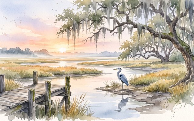 Demo 1
Imagine it
One prompt, six models: a heron in the marsh, then brought to life as a short animation.
-
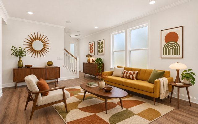 Demo 2
Redecorate a room
Empty a model home's gathering room, restyle it four ways, then fine-tune one spot.
-
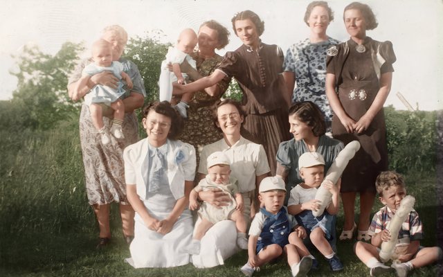 Demo 3
Restore an old photo
A faded 1930s family group, three prompts, six models, and eight faces to compare.
-
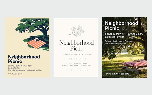 Demo 4
Design a flyer
A neighborhood picnic in three styles, none of them cheesy, plus a scam-warning infographic.
-
 Demo 5
Critique your photo
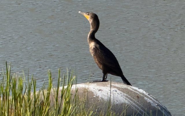
AI as a photography coach: what works, what doesn't, and three things to do next time.
-
 Demo 6
Make a recipe card
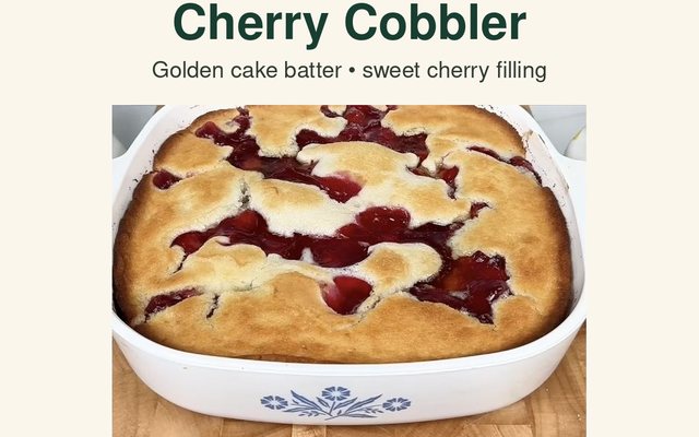
Turn a cooking video into a recipe card you can keep on your phone.
-
 Demo 7
Postcards to a website
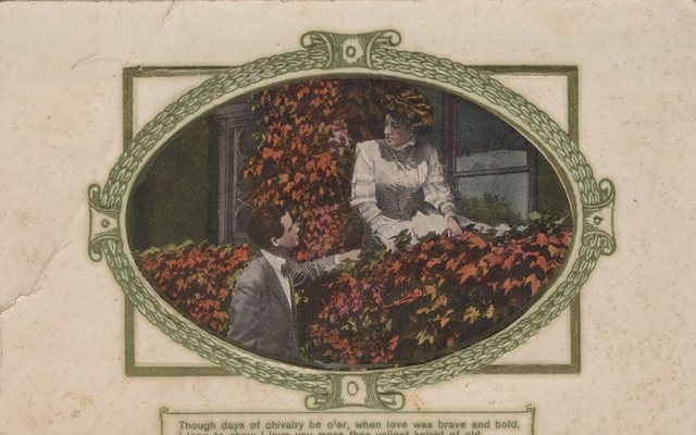
A century-old family postcard collection, transcribed and published as a website.
-
 Demo 8
One portrait from many
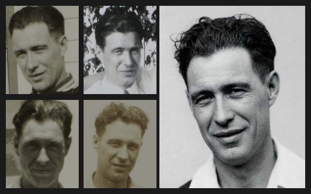
Ten tiny snapshots become one portrait, and then an AI guess at him 30 years later.
The basics: chatbots that make pictures
A chatbot, such as ChatGPT, Gemini, or Copilot, is an AI program you talk to by typing, much like texting. Most of them now come with an image model, a separate AI that turns a written description into a picture, or changes a picture you give it. You don't need a special app. The image tool is built into the chatbot you may already use.
- Ask for a picture in plain words. Most chatbots have an image option in a menu beside the message box, often called Create image. You rarely need it: just start your message with "Create an image of…" or "Draw…", and the chatbot hands the request to its image model.
- To change a photo, attach it first. Click the + button (or paperclip) beside the message box, choose the photo, then say what you want: "Restore this old photo," or "Remove the furniture from this room."
- Then keep talking. The request you type is called a prompt. If the picture isn't right, reply with what to change ("make the sky darker," "no text") and it tries again. Each reply refines the picture.
The AI labs and their image tools
Six companies make most of the AI assistants people use. Five of them can make pictures with their own image models, and all five let you start for free. Paying mostly buys more images, and with Google it also buys a better image model.
| Company | Where to find it | Free | Paid plans | What paying adds |
|---|---|---|---|---|
| OpenAI | ChatGPT chatgpt.com and phone app Image model: ChatGPT Images 2.6 |
Yes. The same image model as paid plans, with a small daily limit. May show ads. | Go $8 · Plus $20 · Pro from $100 | More images. Plus and Pro add images with thinking, which plans complex pictures such as flyers before drawing them. |
| Gemini gemini.google.com and phone app Image models: the Nano Banana family |
Yes. Nano Banana 2, roughly 20 images a day, with a small Gemini mark on each image. | Google AI Plus $7.99 · Pro $19.99 · Ultra from $99.99 | A better model (Nano Banana 2.1), Redo with Pro for Nano Banana Pro, and more images a day. | |
| Meta | Meta AI Meta AI app, and inside Instagram, WhatsApp, and Facebook Image model: Muse Image |
Yes, for "everyday creation." Limits aren't published. | Meta One Core $7.99 · Premium $19.99 | More image and video creation. The plans also include extras in Meta's apps. |
| xAI | Grok grok.com, phone app, and X Image tool: Grok Imagine |
Yes, with limits. Free access was switched off and back on more than once in 2026. | SuperGrok Lite $10 · SuperGrok $30 · higher tiers to $300 | More images, plus video. Grok's content rules are looser than the others'. |
| Microsoft | Copilot copilot.microsoft.com, phone app, and built into Windows and Edge Image models: Microsoft's own MAI-Image family |
Yes, with a daily limit. Limits aren't published. | Microsoft 365 Personal $9.99 · Family $12.99 · Premium $19.99 | More images (Premium allows the most), plus Copilot in Word, Excel, and PowerPoint. On Family, only the account owner gets Copilot. |
| Anthropic | Claude claude.ai and phone app |
No image model. Claude can look at and critique your photos, draw diagrams and simple graphics, and write detailed prompts for the other tools. Plans: Pro $20 ($17 a month paid yearly), Max from $100. | ||
Start with the one you already have an account for. Demos 1, 3, and 4 give the same prompt to six models from OpenAI, Google, xAI, and Meta and show the results side by side, so you can see how yours compares. Any of the five can also follow along with Demos 2, 5, and 8, though the edit tools shown in Demo 2 are ChatGPT's. Demos 6 and 7 need a paid ChatGPT plan.
Free accounts have a daily cap on images, and the companies change these caps often. If you see a message saying you've reached your limit, wait until tomorrow or switch to another tool.
Prices are monthly in U.S. dollars, before sales tax, as checked on November 10, 2026. Paid plans can be cancelled at any time, so you can start free and upgrade later.
Writing a good prompt
The more specific you are, the closer the first result will be. A good image prompt answers six questions:
Putting it together
Here is one sentence that answers all six. Each part is marked with the question it answers.
Create an image of a great blue heron standingSubject in a Lowcountry salt marsh at sunriseSetting, with a weathered wooden dock in the foreground and Spanish moss on the oak treesDetails. Watercolor styleStyle, soft and calmMood. Wide landscape shapeShape.
Begin with "Create an image of" so the tool knows you want a picture, not a written answer. We'll use this exact prompt in Demo 1.
You don't have to get it right the first time. Short follow-ups like "make it brighter," "remove the boat," or "make it look like an oil painting" work well. Change one thing at a time. If the picture needs words on it, put the exact words in quotation marks (see Demo 4).
Going further: let the AI write the prompt
The six questions cover most pictures. Some jobs need a much longer prompt that uses expert vocabulary. The photo restoration prompts in Demo 3 are a good example: they spell out what to repair, what must never change, and how to handle cropping, grain, and color, in the language a photo conservator would use. Few of us could write that from scratch.
You don't have to. Describe what you want in your own words and ask the AI to write the detailed prompt for you. It knows the vocabulary and the usual pitfalls, and it can ask you questions to fill in what it doesn't know.
I want to restore a faded, scratched family photo from the 1940s, but I don't know the technical terms. Before writing anything, ask me a few questions about what I want. Then write a detailed prompt I can give ChatGPT's image tool, organized into what to fix, what must not change, and how to handle cropping and color.
Try the prompt it writes on your photo. If the result isn't right, say what went wrong and ask for a better prompt. It often takes a round or two.
I tried your prompt. The scratches are gone, but my grandmother's face looks smoother and younger than in the original. Revise the prompt to prevent that, and tell me what you changed.
Help me write a prompt for [describe the task]. Ask me questions about my goal, what matters most, and what to avoid, then write the prompt. Keep it in plain English so I can understand and adjust it.
Once a prompt works the way you want, save it. If it's a job you'll repeat, you can turn it into a reusable skill so you never have to paste it again. Demo 2 shows how.
Imagine it: one prompt, six models
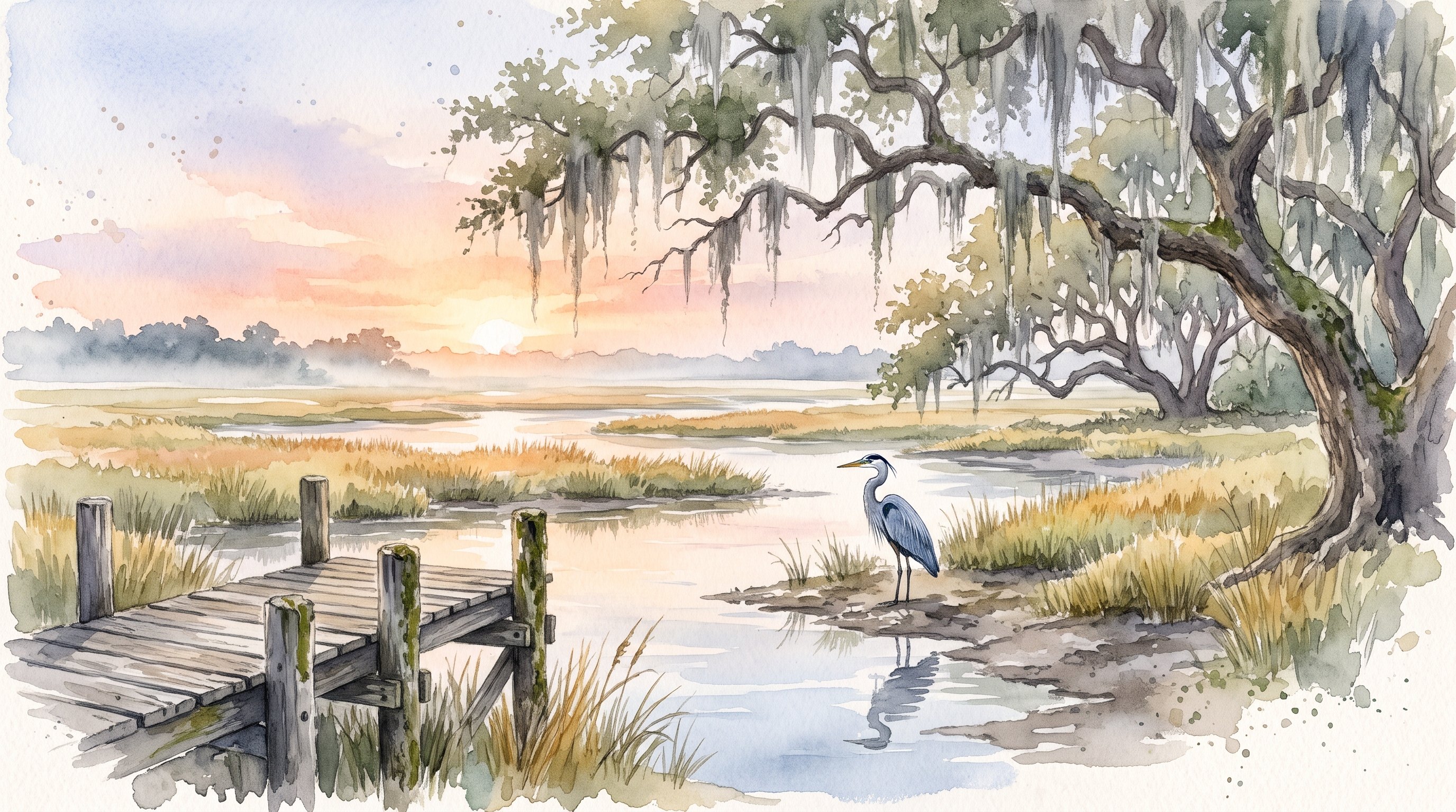
We gave the heron prompt, word for word, to six image models from four of these labs: two each from OpenAI and Google, and one each from xAI and Meta. Click any picture to see it full size.
Create an image of a great blue heron standing in a Lowcountry salt marsh at sunrise, with a weathered wooden dock in the foreground and Spanish moss on the oak trees. Watercolor style, soft and calm. Wide landscape shape.
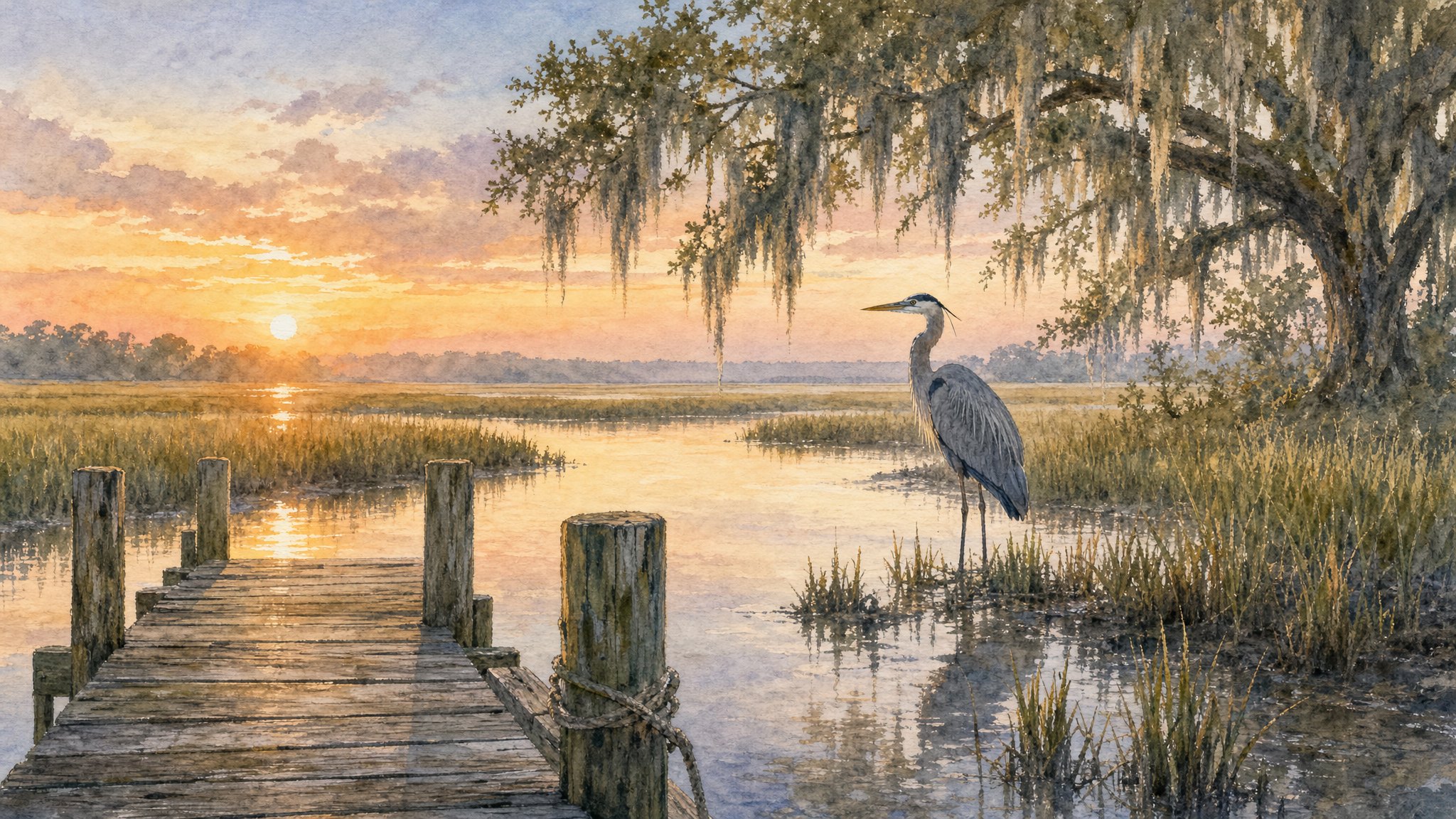
Developer API only; no longer in ChatGPT
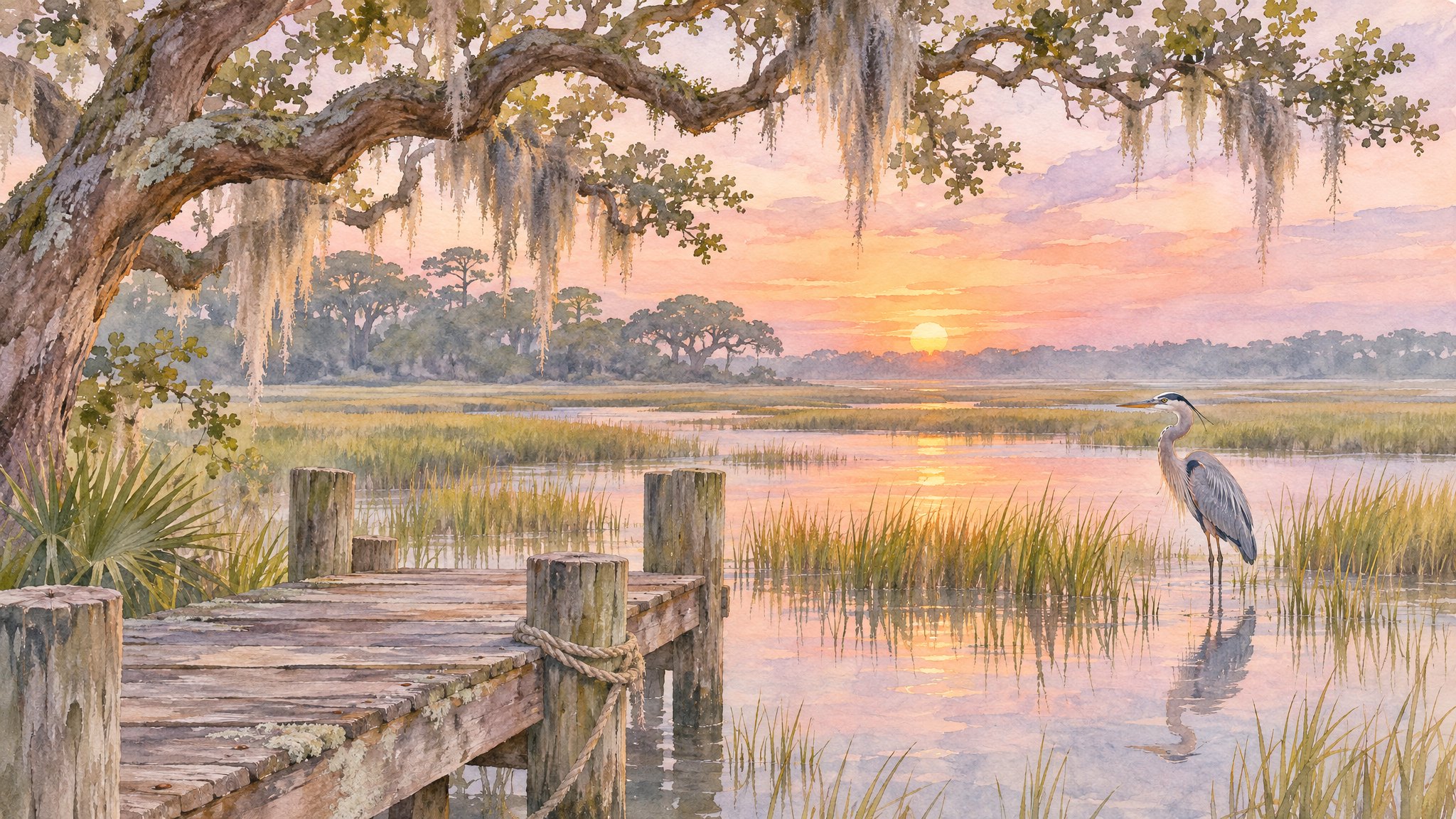
The current ChatGPT model, on every plan
Gemini, on paid plans
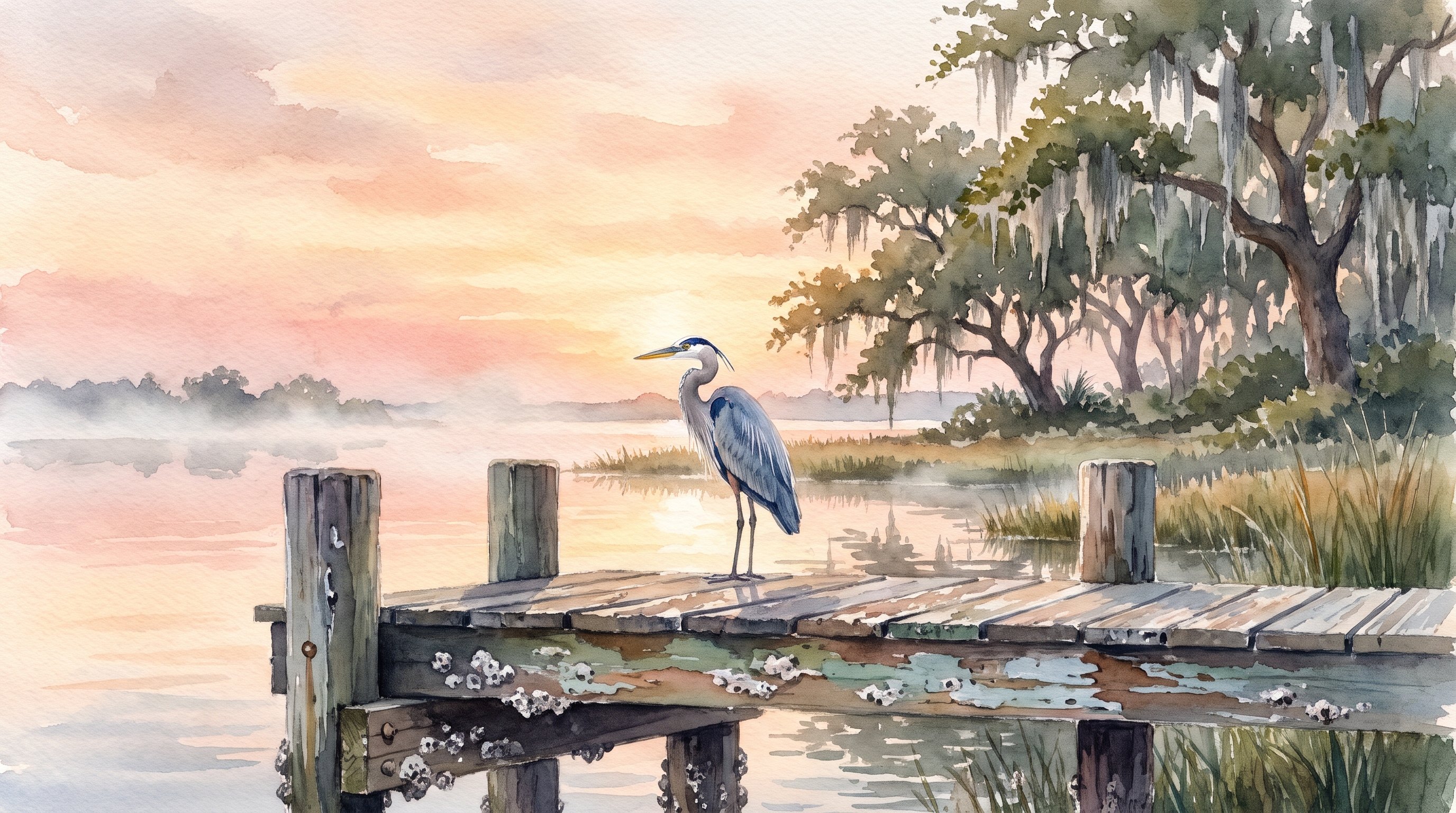
Gemini, paid plans, through Redo with Pro
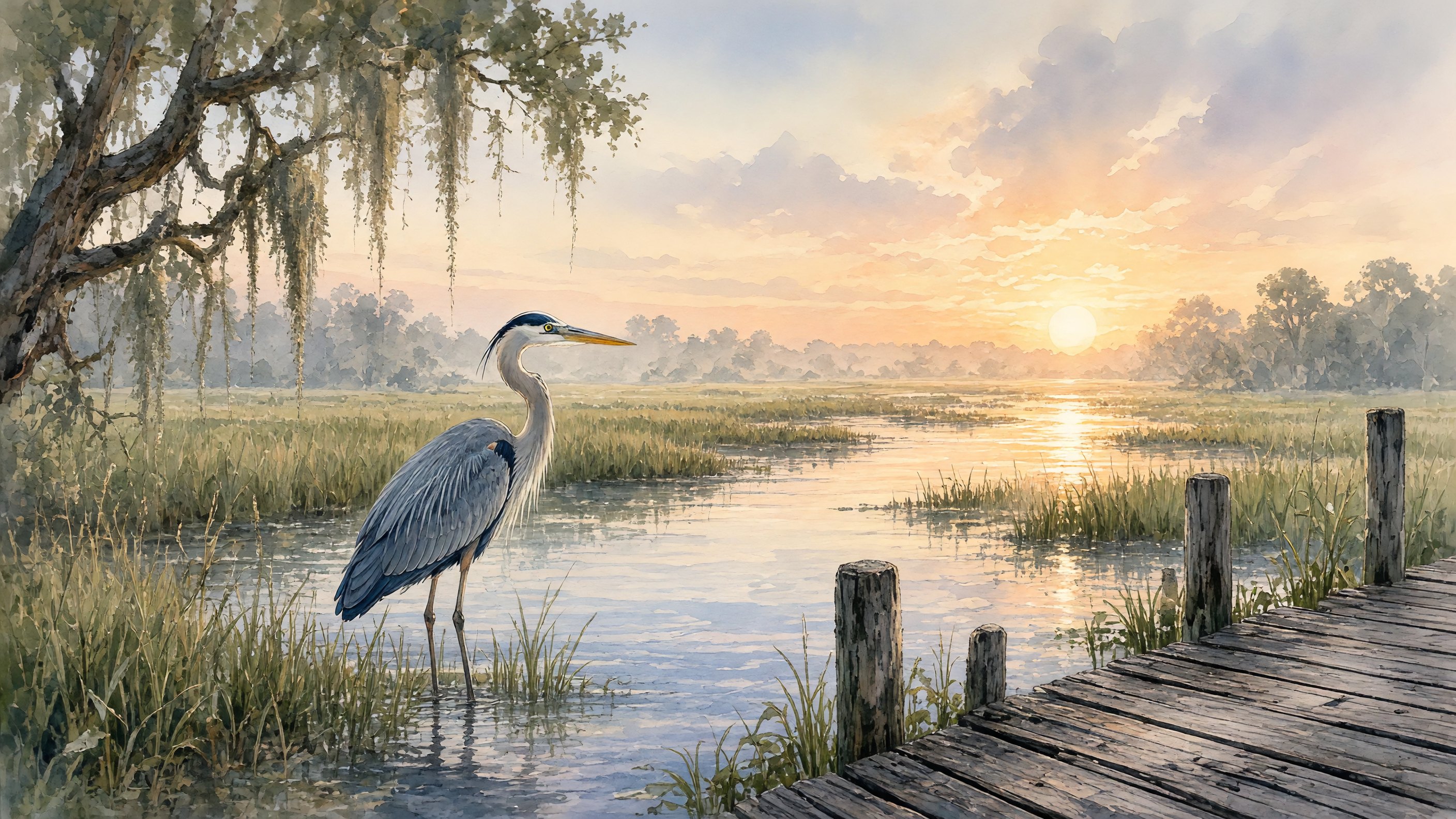
Grok, free with limits and on paid plans
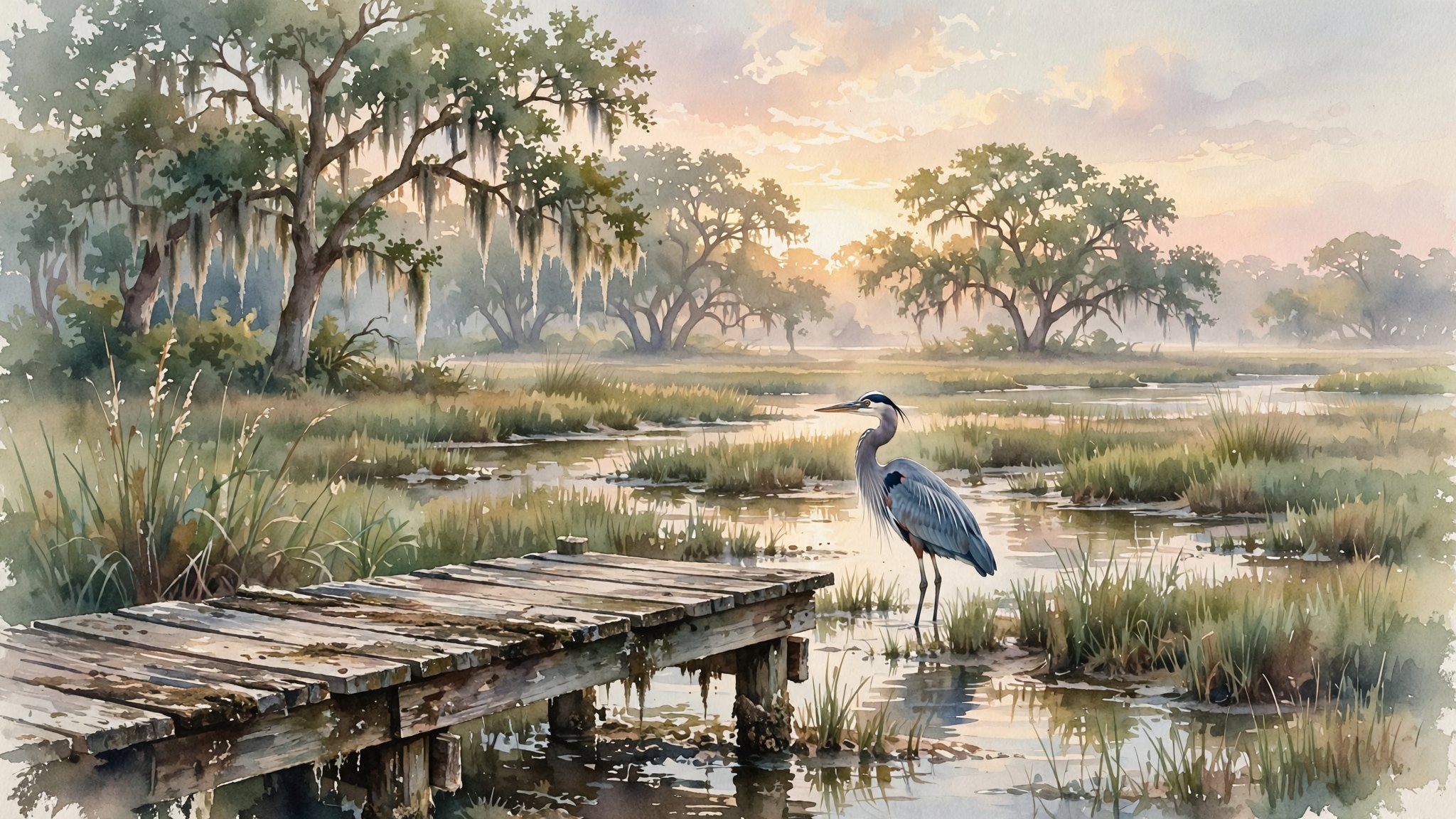
Meta AI, free
What each model did
- GPT Image 2. The richest color and the most detail, in warm gold light, like a finished studio painting. A dock with a rope-wrapped piling leads in from the bottom, under a big oak.
- GPT Image 2.6. Nearly the same layout as GPT Image 2, with a pinker sky, framed by an oak limb. It added a palmetto that the prompt never mentioned.
- Nano Banana 2.1. The most like real watercolor, with unpainted white edges, paint spatters, and mist. The heron is small, on a mud bank.
- Nano Banana Pro. Pale pastels and fog. It put the heron on the dock, not in the marsh, and crusted the dock with barnacles.
- Grok Imagine. The boldest subject: a large heron close to the viewer, with a bright orange-yellow bill. The dock moves to the lower right.
- Muse Image. The softest and most muted, with greener tones, a faint sun, and many live oaks across the background.
Every model followed the checklist: heron, marsh, sunrise, dock, Spanish moss, watercolor, wide shape. The differences come from what the prompt left open, such as where the heron stands and how much detail to paint. If you want a particular layout, say so in the prompt.
Bring it to life: an animated version
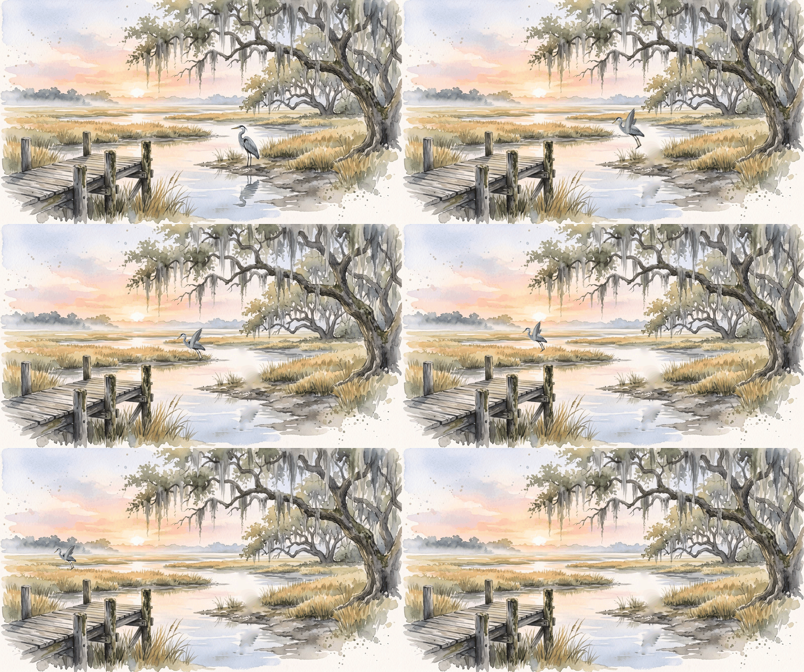
ChatGPT can now turn a still picture into a short animated GIF, and the picture doesn't have to come from ChatGPT. Here we took Google's Nano Banana 2.1 heron from the grid above, attached it in the ChatGPT desktop app, and asked for one simple thing: name what should move, what it should do, and which way it should go.
A GIF is a picture file format that has been around since 1987 and plays almost anywhere: in a web browser, an email, or a text message. An animated GIF is a stack of still pictures, called frames, shown one after another like a flip book. That is the same trick video uses to show movement, but with far fewer pictures. This heron uses 37 frames over about five seconds, while five seconds of ordinary video holds about 150. GIFs have no sound and usually repeat forever, which makes them handy for a quick greeting or a picture that moves on a web page.
Animate the heron so that it takes off and flies away across the marsh, from right to left.
The GIF below came from an even shorter version, "Animate it so that it flies away," and ChatGPT chose the direction itself. Naming the subject, the action, and the direction gives you more control.
Attach the picture
Save the image you want to animate, then click + beside the ChatGPT chat box and attach it. If ChatGPT made the picture, you can simply continue in that chat.
Describe the motion in a sentence
A short request is often enough. ChatGPT works out the in-between frames.
Adjust it if needed
Reply in the same chat: "slow it down," "keep the camera still," or "make it loop smoothly."
- Use the pattern: subject, action, direction. "The heron flies away to the left," "the flag waves in the wind," or "the moss sways gently" gives the tool something definite to animate.
- Your own photos work too. Try waves on a beach or a flag in the wind. Expect some oddities with faces and hands.
- Check it before sharing. Watch the whole loop, and make sure the file you save actually moves.
GIF creation arrived with ChatGPT Images 2.6 on November 4, 2026, and is available on every plan, including Free. OpenAI hasn't published limits on length or how many you can make.
Try it yourself
Open a new chat
In ChatGPT or Gemini, click New chat. In Gemini, you can also choose Create images from the tools menu.
Paste the heron prompt, or write your own
Use the six questions above. Swap in your own subject and setting.
Wait a few seconds
Images usually take 10 to 60 seconds. Leave the page open while it works.
Refine it
Reply in the same chat with one change at a time.
Follow-upMake it early evening instead of sunrise, with a pink and orange sky.
Save the image
Hover over or tap the image and look for the download arrow. On a phone, you can also press and hold the image and choose Save.
Design it: strip a room bare, then redecorate it
Start with a photo of a real room. First, ask the AI to empty it: no furniture, no rugs or curtains, no ceiling fan, just bare walls and floor in even light. That empty room then becomes a blank canvas for trying out different decorating styles.
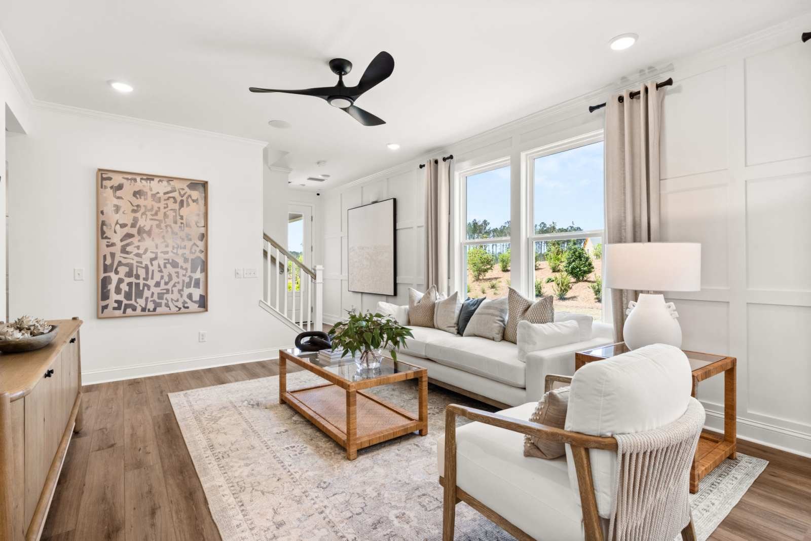
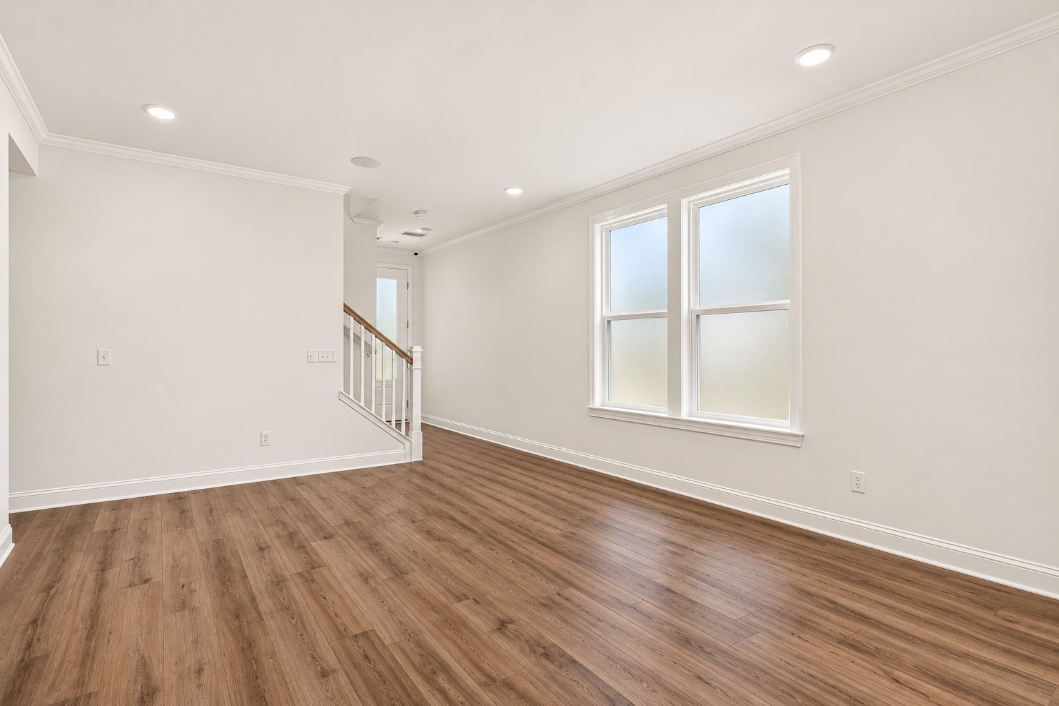
Photograph the room
Stand in a corner and hold the camera level, so two walls and the floor are in view. Daylight works best.
Empty it
Upload the photo with this prompt. It lists what to remove, what to put in its place, and what must not change.
Show the full empty room prompt
Empty room promptEdit the attached photo so the room is completely empty, as if it were ready for a new owner. Remove all furniture, rugs and carpet, curtains, blinds, and other window coverings, wall art, mirrors, shelves, lamps, ceiling fans, light fixtures, plants, and every small object. Where you remove a covering, show a plain surface underneath: smooth white walls, a plain light wood floor, and a flat white ceiling. Keep the room exactly as it was built. Keep the same walls, windows, doors, trim, and ceiling height, and the same camera position, so the room's shape and proportions don't change. Do not add, remove, or move any window, door, or wall. Light the room evenly with soft, neutral daylight, with no harsh shadows or bright spots. Make it look like a real photograph.
Redecorate it
In the same chat, ask for a style. Replace the words in brackets, and try several.
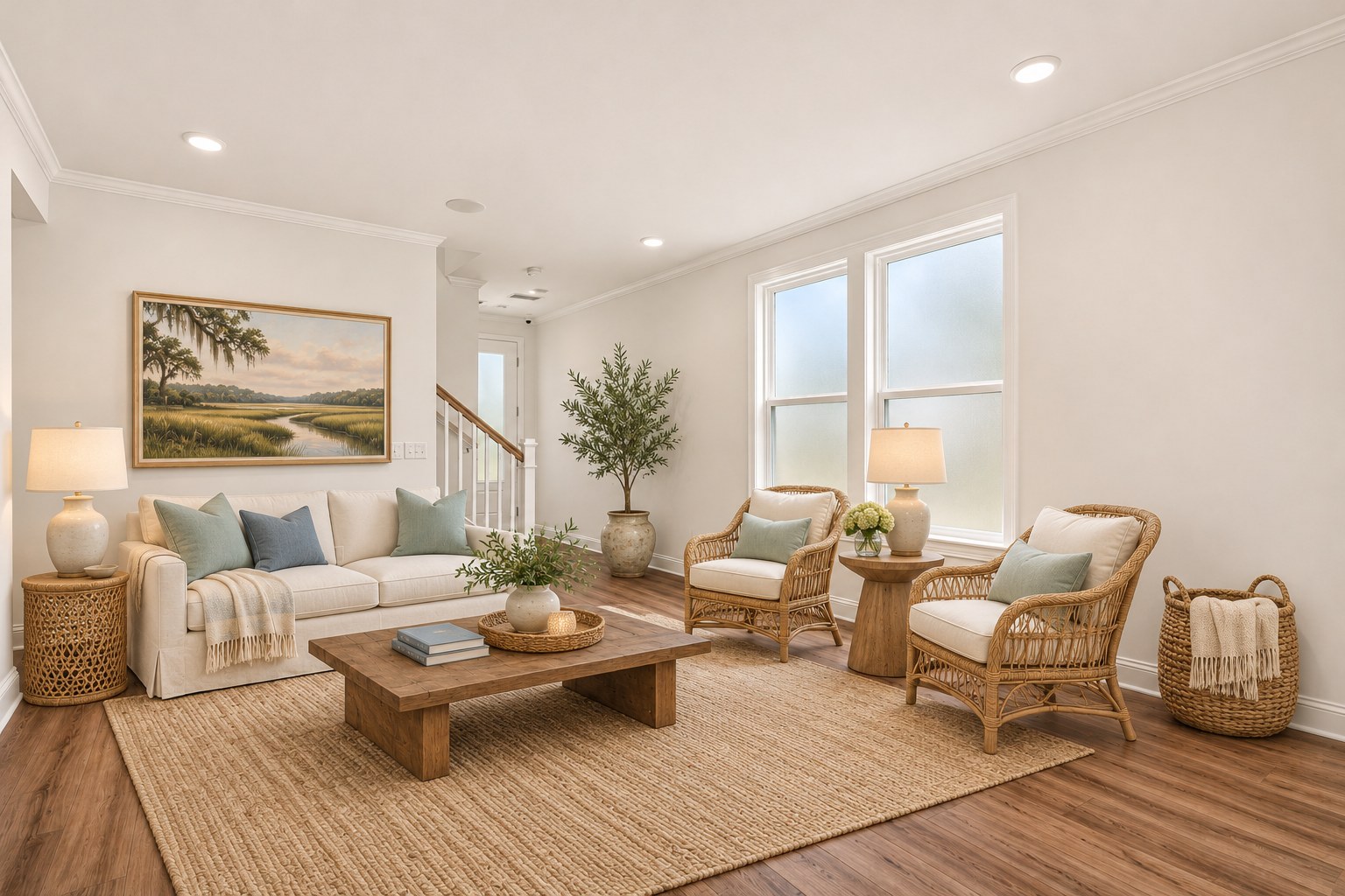
Decorating promptFurnish and decorate this empty room as a [coastal Lowcountry] living room. Keep the walls, windows, doors, floor, ceiling, and camera position exactly the same. Make it look like a real photograph in natural daylight.
Styles to try: coastal Lowcountry, mid-century modern, classic Charleston traditional, Japandi, cozy cottage, farmhouse.
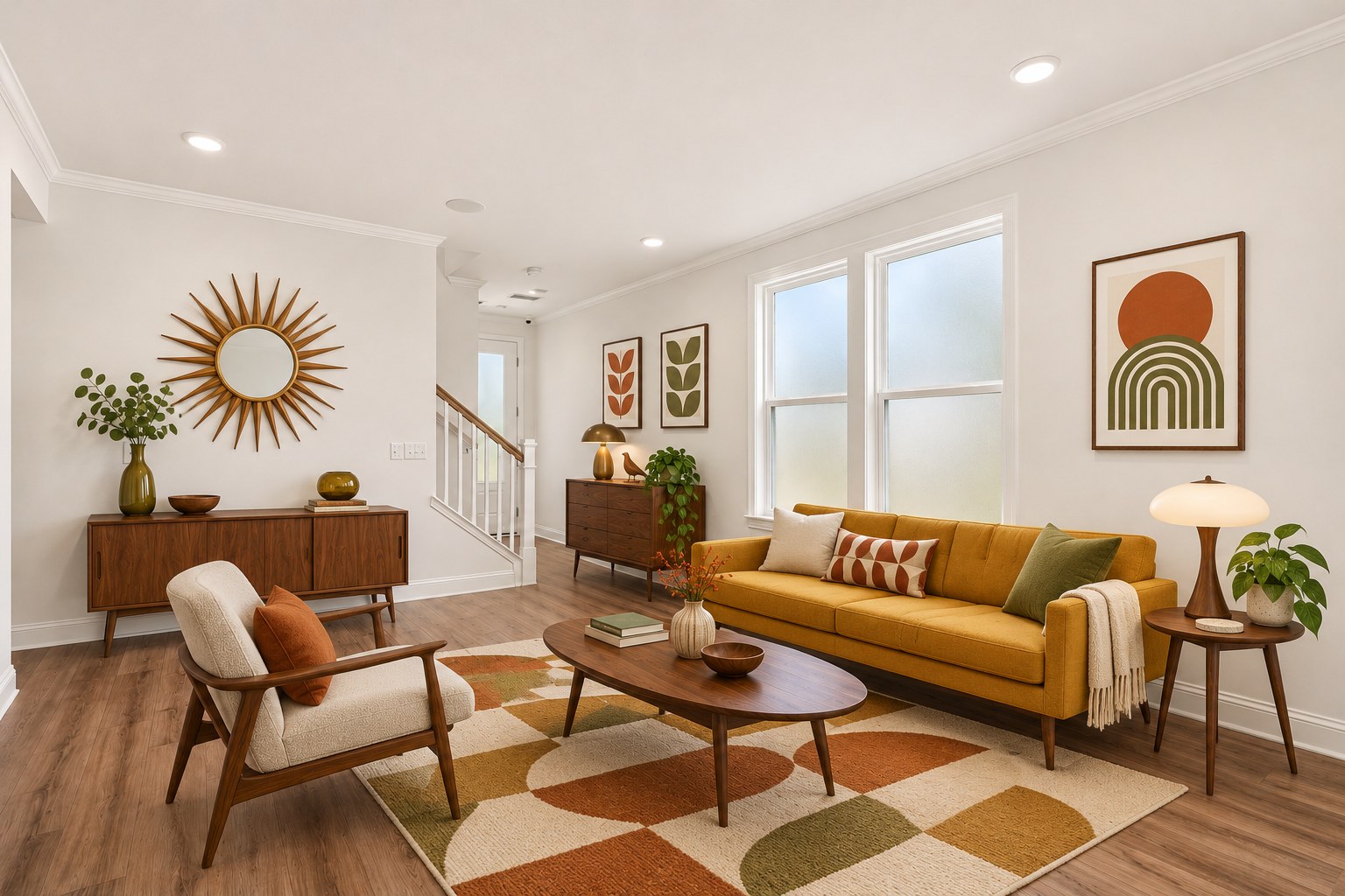
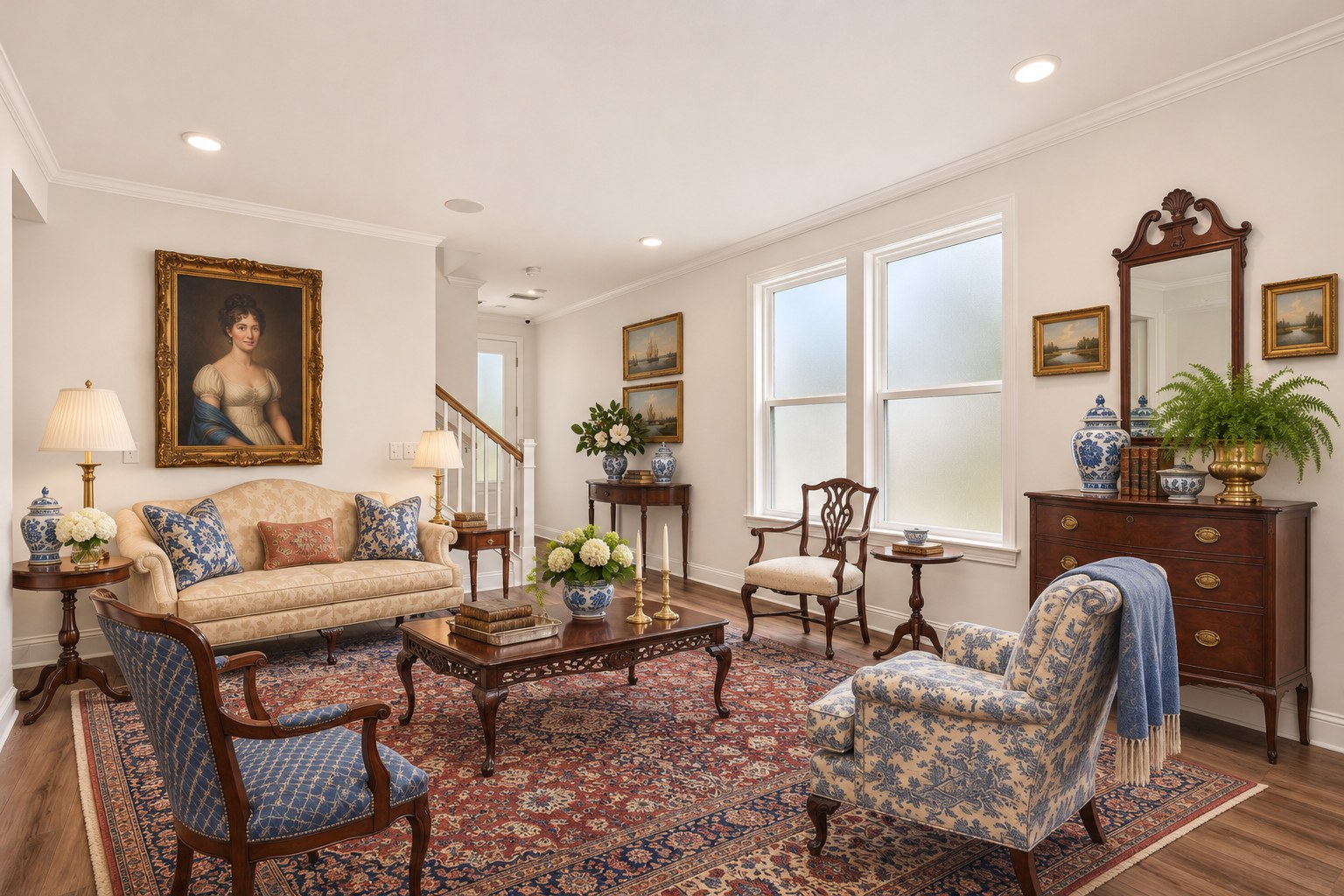
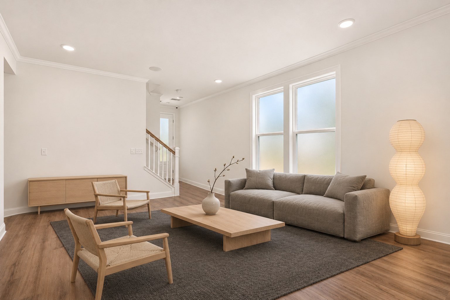
Here is the same empty room in four styles. Each one came from a single decorating prompt, sent in the chat with the emptied room.
Show the prompts for the other three styles
Furnish and decorate this empty room as a mid-century modern living room: walnut furniture with tapered legs, a low sofa in mustard yellow, a sunburst mirror, a few graphic prints, and a geometric rug. Keep the walls, windows, doors, floor, ceiling, and camera position exactly the same. Make it look like a real photograph in natural daylight.
Furnish and decorate this empty room as a classic Charleston traditional living room: antique mahogany furniture, a camelback sofa, a Persian rug, brass lamps, blue-and-white porcelain, and a framed oil portrait. Keep the walls, windows, doors, floor, ceiling, and camera position exactly the same. Make it look like a real photograph in natural daylight.
Furnish and decorate this empty room as a Japandi living room: low, simple furniture in pale oak, a linen sofa in stone gray, a charcoal wool rug, a paper floor lamp, a single branch in a ceramic vase, and very few other objects. Keep the walls, windows, doors, floor, ceiling, and camera position exactly the same. Make it look like a real photograph in natural daylight.
Naming a few specific pieces, as these prompts do, gives you more control than a style name alone. The tool fills in whatever you leave out.
What to look for
- What stayed. The floor, crown molding, recessed lights, staircase, and window positions are the same in all four styles, so each one still reads as the same room.
- The view out the windows. Emptying the room turned the view outside into frosted glass, and every decorated version kept it. If the view matters, say so in the prompt: "Keep the view through the windows exactly as it is."
- The paneled wall. The board-and-batten paneling on the window wall was smoothed flat. The tool treated it as a wall covering. If it's part of the house, name it as something to keep.
Fine-tune one spot with ChatGPT's edit tools
To change one thing in the decorated room, you don't have to describe where it is. You can point to it.
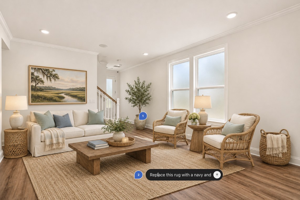
Open the image
Click the picture in the chat (on a phone, tap it) to open it full size with the edit tools.
Point to what you want changed
- Select (web and phone app): brush over the area, such as the rug or a lamp. On a phone, a slider sets the brush size; tap Next when done.
- Comment: click or tap a spot in the picture and type a note about that spot, like leaving a sticky note. A numbered marker shows where it goes.
Say what to change, and what to keep
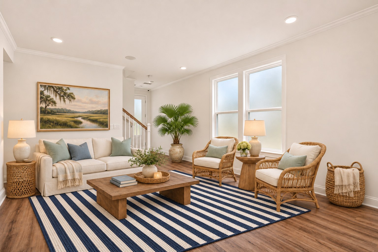
Two comments, sent together1 (on the olive tree): Replace this tree with a potted palmetto.
2 (on the rug): Replace this rug with a navy and white striped rug, the same size and in the same place.You can place several comments before you send. Each gets a number, and ChatGPT makes all the changes in one new picture.
Words like "this" and "here" tie your request to the spot you marked. If anything else in the room changes, follow up with "Keep everything else exactly as it was."
Check the whole picture
A selection isn't a precise boundary, and nearby details can shift. If something outside the area changed, say so, or go back to the earlier version and try again. Undo and Redo are in the editor.
Make it reusable: turn the prompt into a skill
The empty room prompt is long, and you'd need it every time you start with a new room. A skill is a saved set of instructions the AI can follow whenever you ask. After you save it, you only need to upload a photo and say "empty this room."
Ask ChatGPT to make the skill
In the chat where the empty room prompt worked well, send:
Make a skillTurn the instructions I used above for emptying a room into a reusable skill called "Empty room." When I upload a photo of a room and ask you to empty it, follow those instructions exactly and make one realistic image of the bare room.
ChatGPT asks a few questions about how the skill should work, then offers to install it. Your skills are listed under Plugins in the sidebar, on the Skills tab.
Use it on the next room
Start a new chat, upload a different room photo, and type "Empty this room." ChatGPT finds the skill and follows its instructions.
ChatGPT Skills is currently available on Business, Enterprise, and Edu plans. On other plans you can get the same effect two ways: save the prompt in a ChatGPT Project's instructions, or create a Gemini Gem and paste the prompt in as its instructions.
Fix it: restore an old photograph
The prompt decides how far the tool goes. This demo uses three prompts, like rungs on a ladder. Repair fixes the damage and keeps the original look, Enhance adds gentle color, and Reimagine makes it look freshly taken. Comparing each with the original shows what the tool really did.
Not quite the same as "Photoshopping"
Both change an old photo. The difference is what gets changed. Traditional editing in Photoshop and similar programs works on the actual pixels of your scan: you fix a scratch here and lighten a shadow there, and everything you didn't touch stays exactly as it was.
An AI image model doesn't edit your photo. It studies it and draws a new copy. Even when told to fix only the damage, it redraws every face, every button, and every blade of grass, and some of them come out subtly, or not so subtly, different. That can't be avoided with today's tools, and it means this isn't restoration in the true sense of the word.
Still, most of us don't have the software, the skill, or the hours that a careful hand restoration takes. For us, an AI copy is a perfectly reasonable way to breathe life into an old photo, as long as you keep the original and check the result. And the tools are likely to get better, with copies that stay more faithful to the original.
Today's example: one photo, three prompts, six models
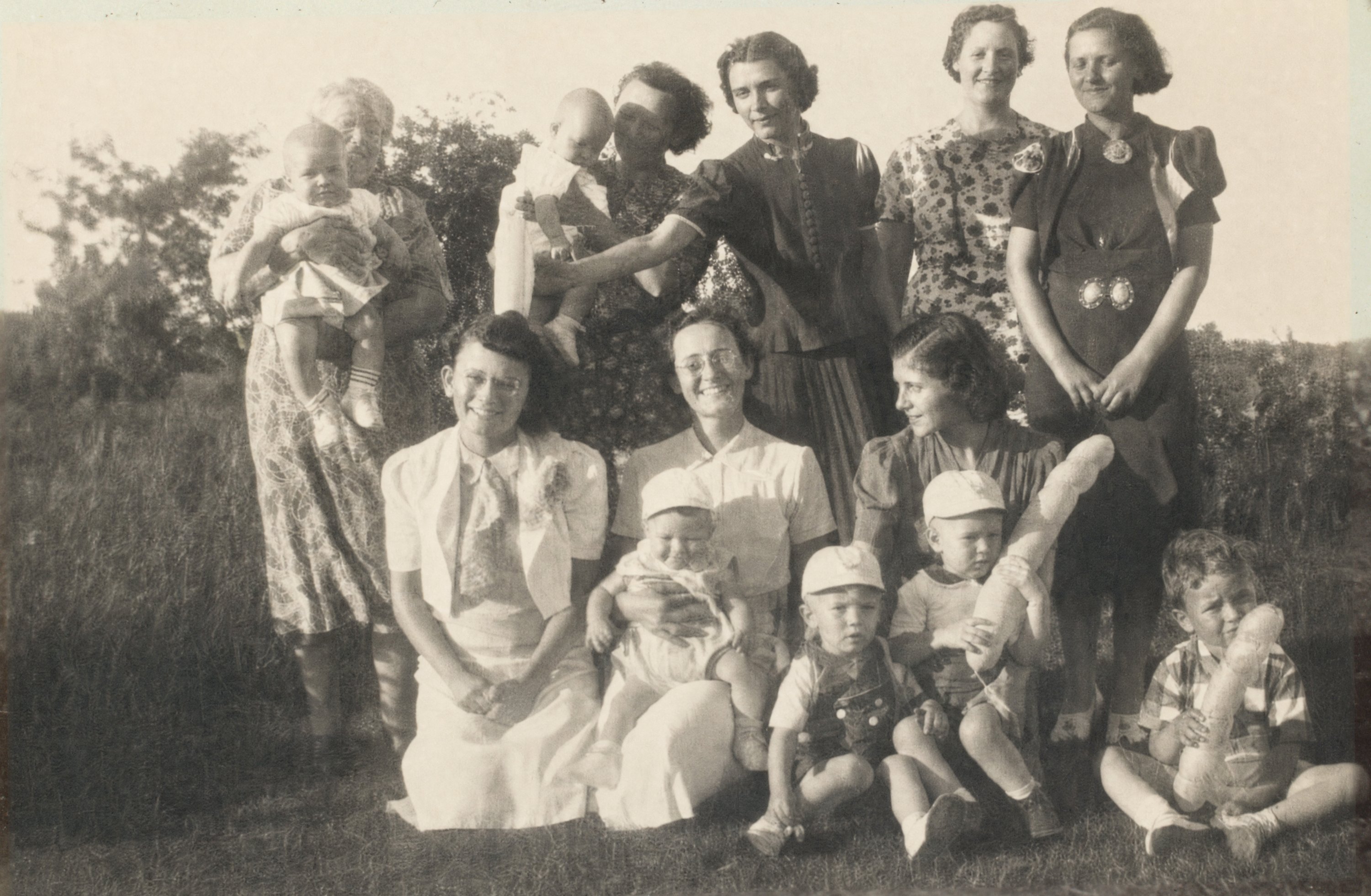
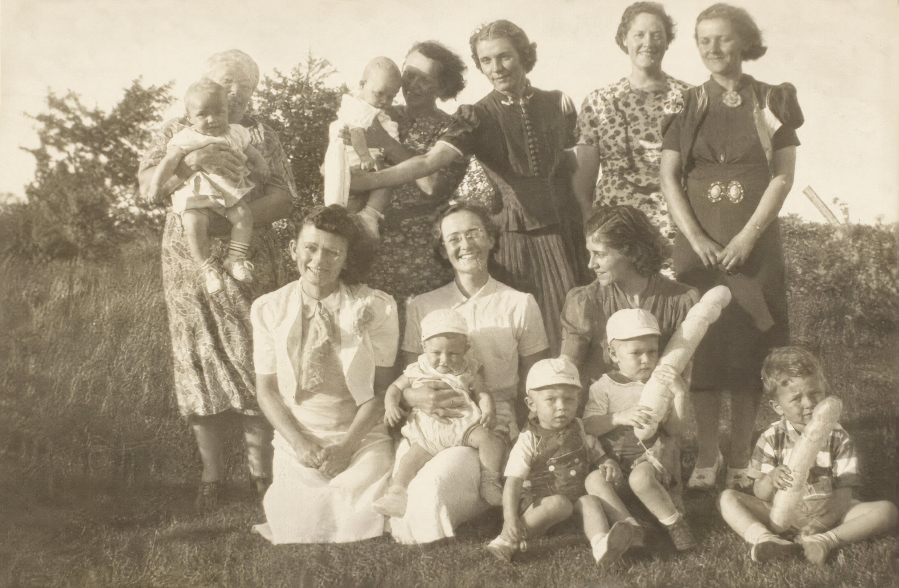
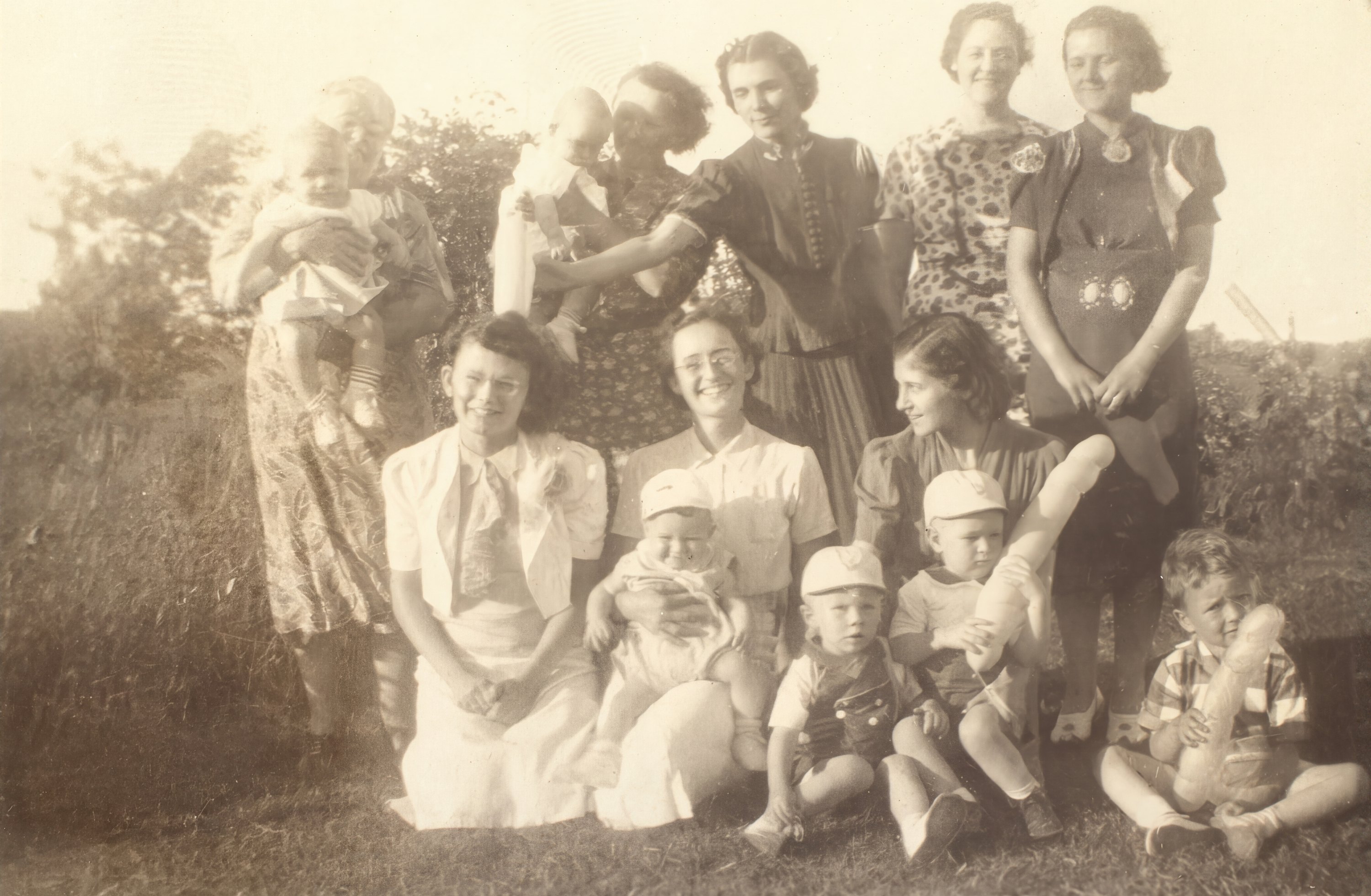
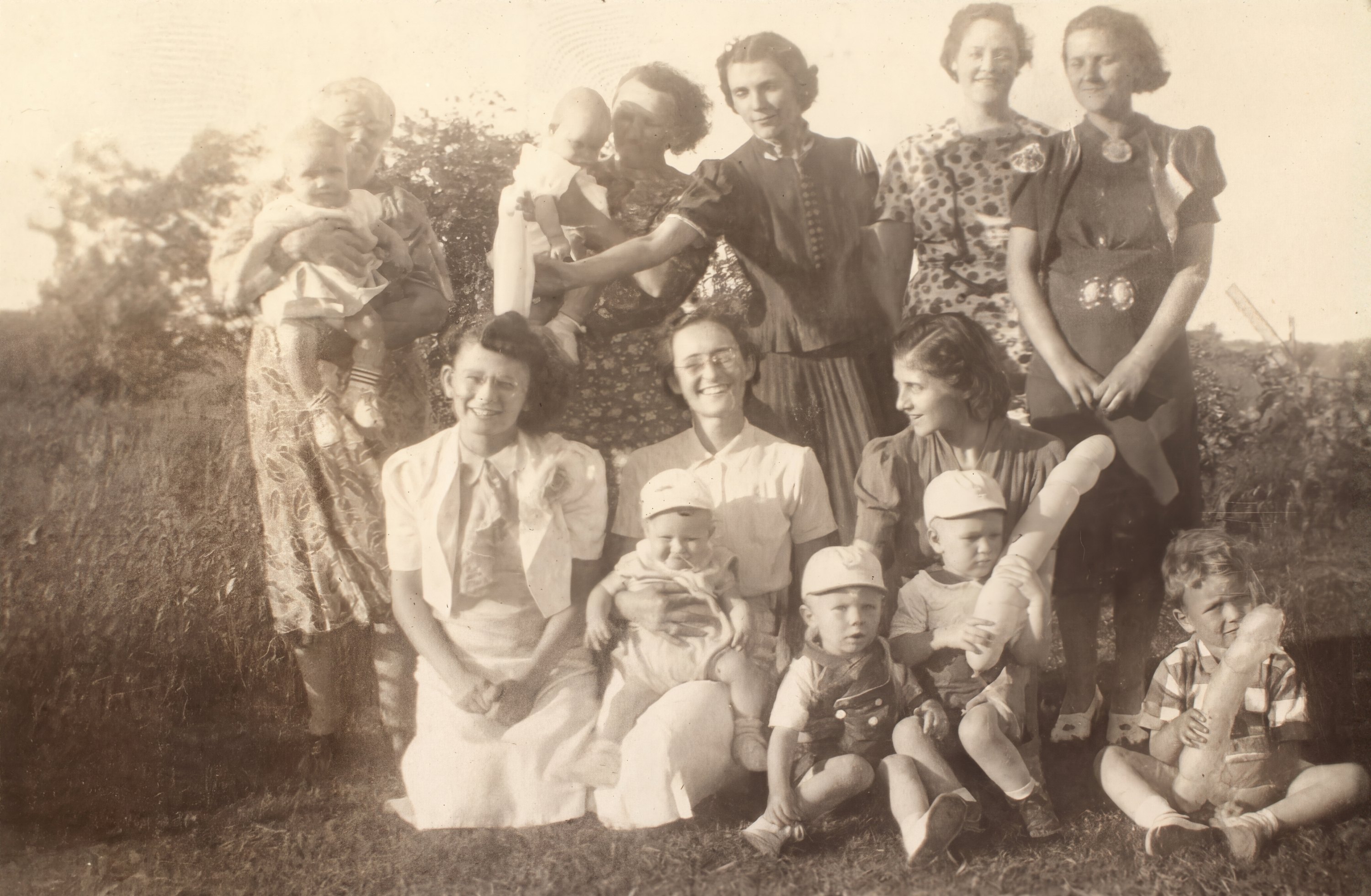
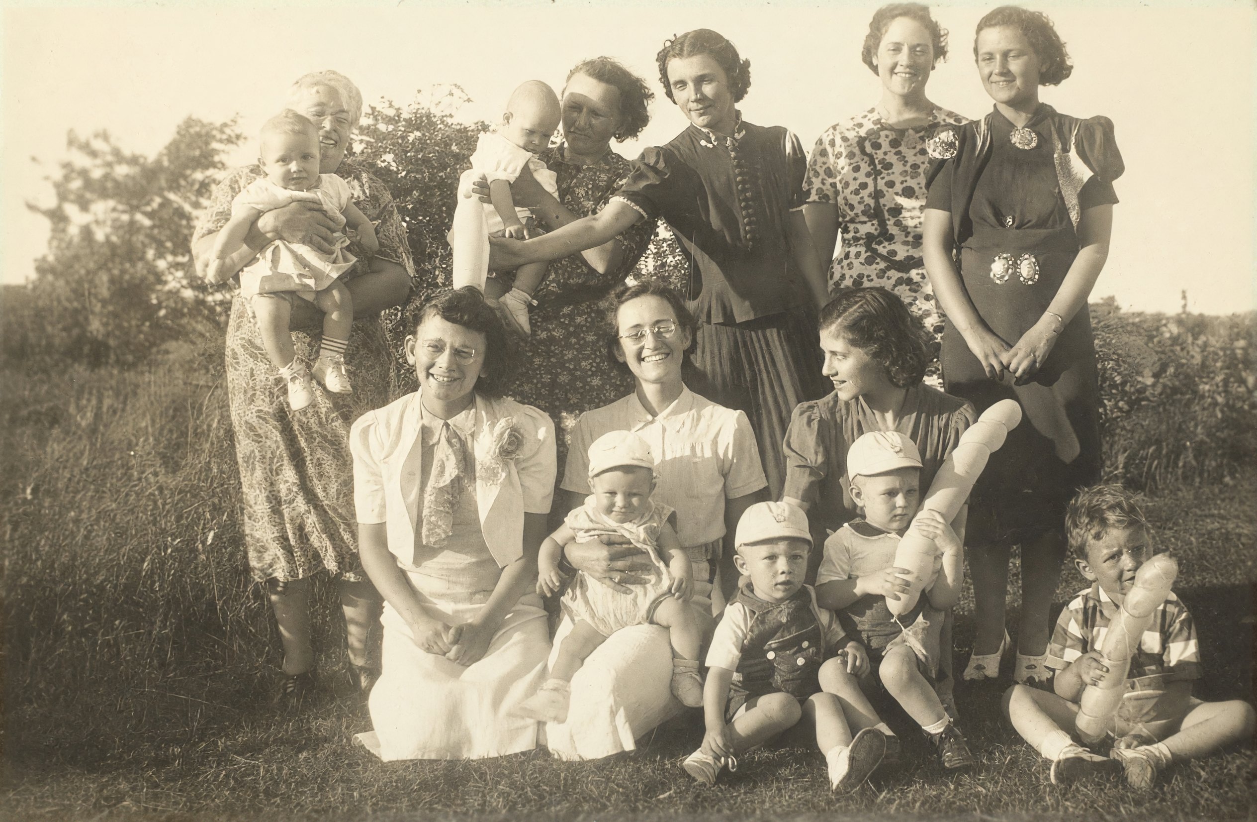
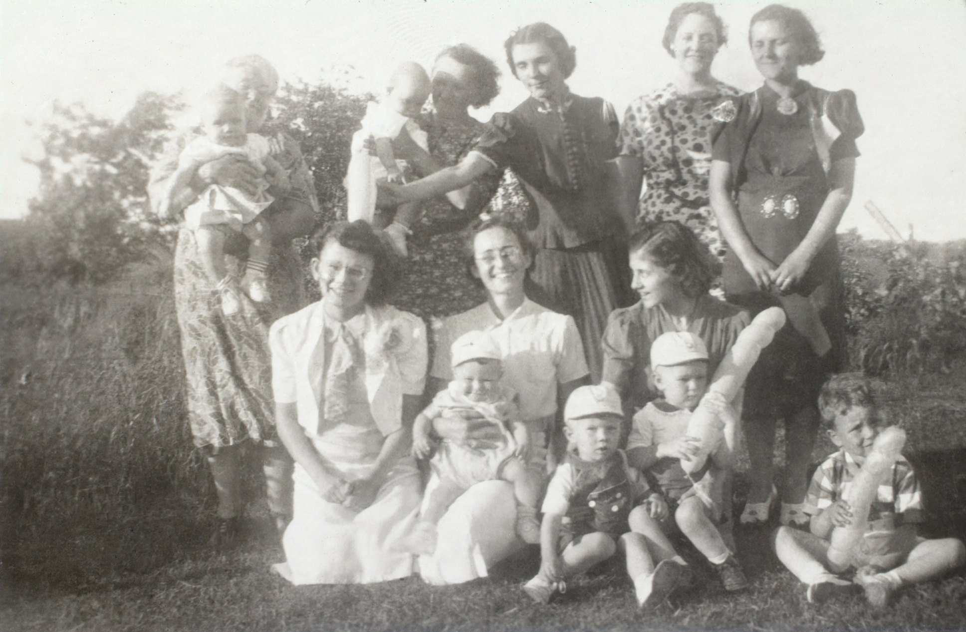
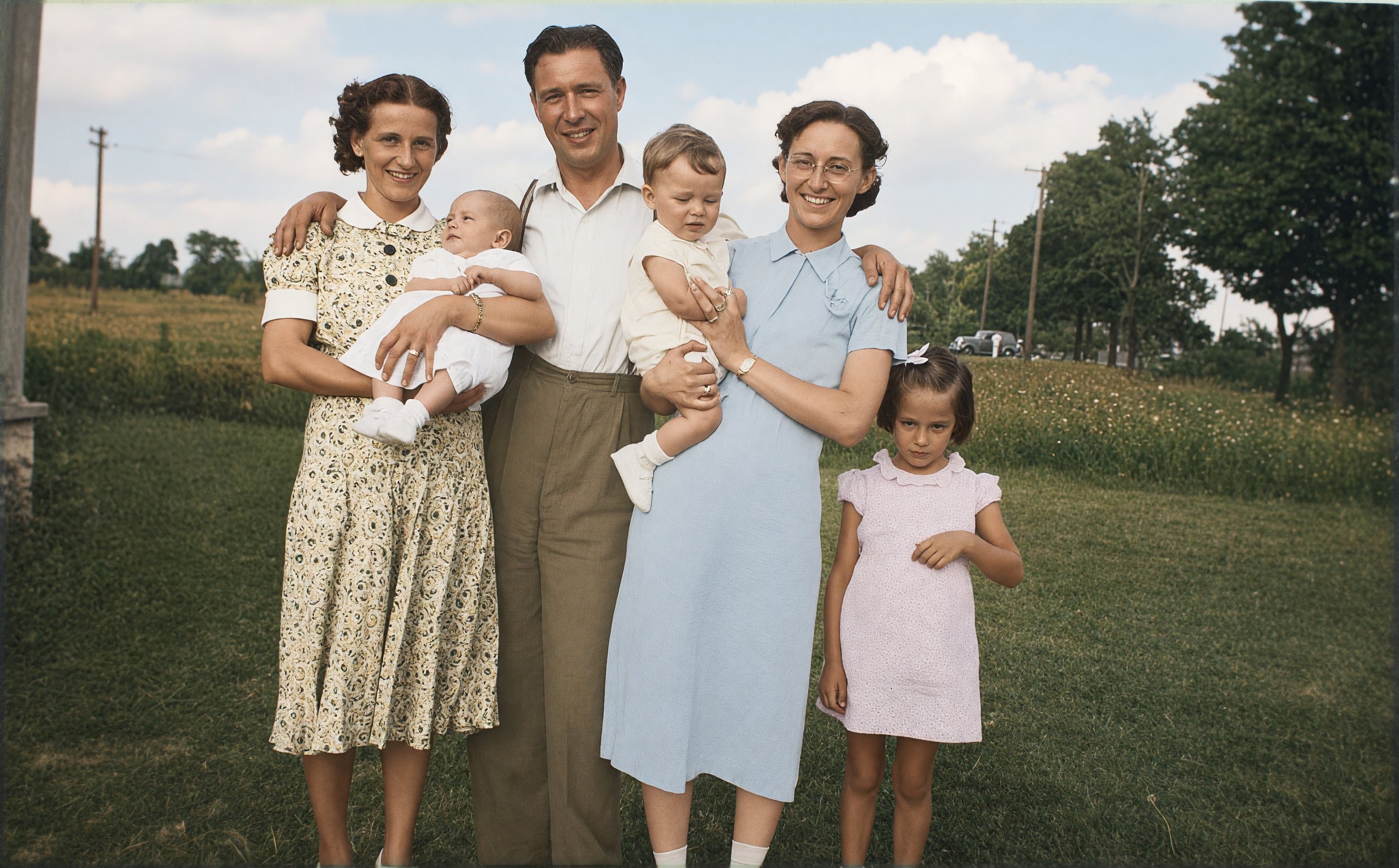
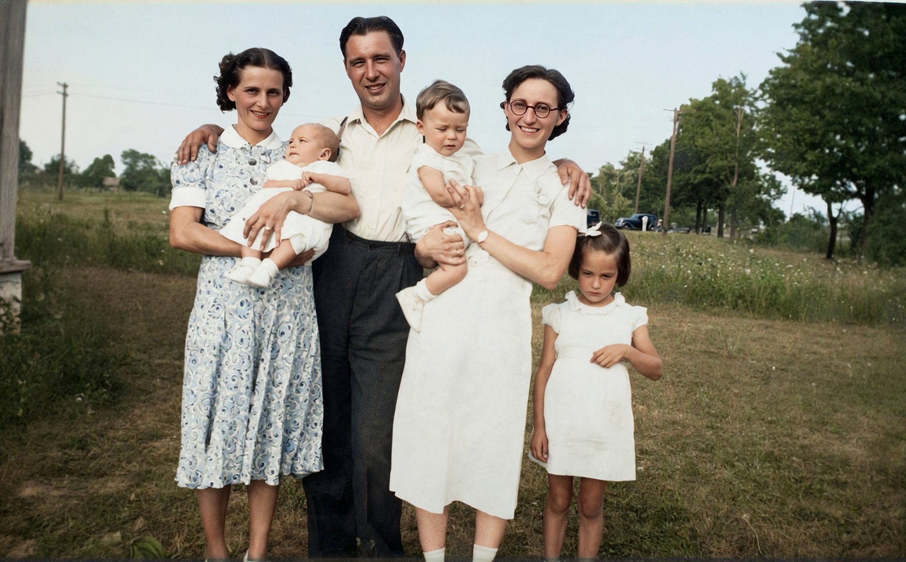
This faded 1930s family group, photographed still mounted in the album, went to six models three times, once with each prompt. With eight faces in it, you can see how differently the models read the same blurry face. Choose a tab to compare.
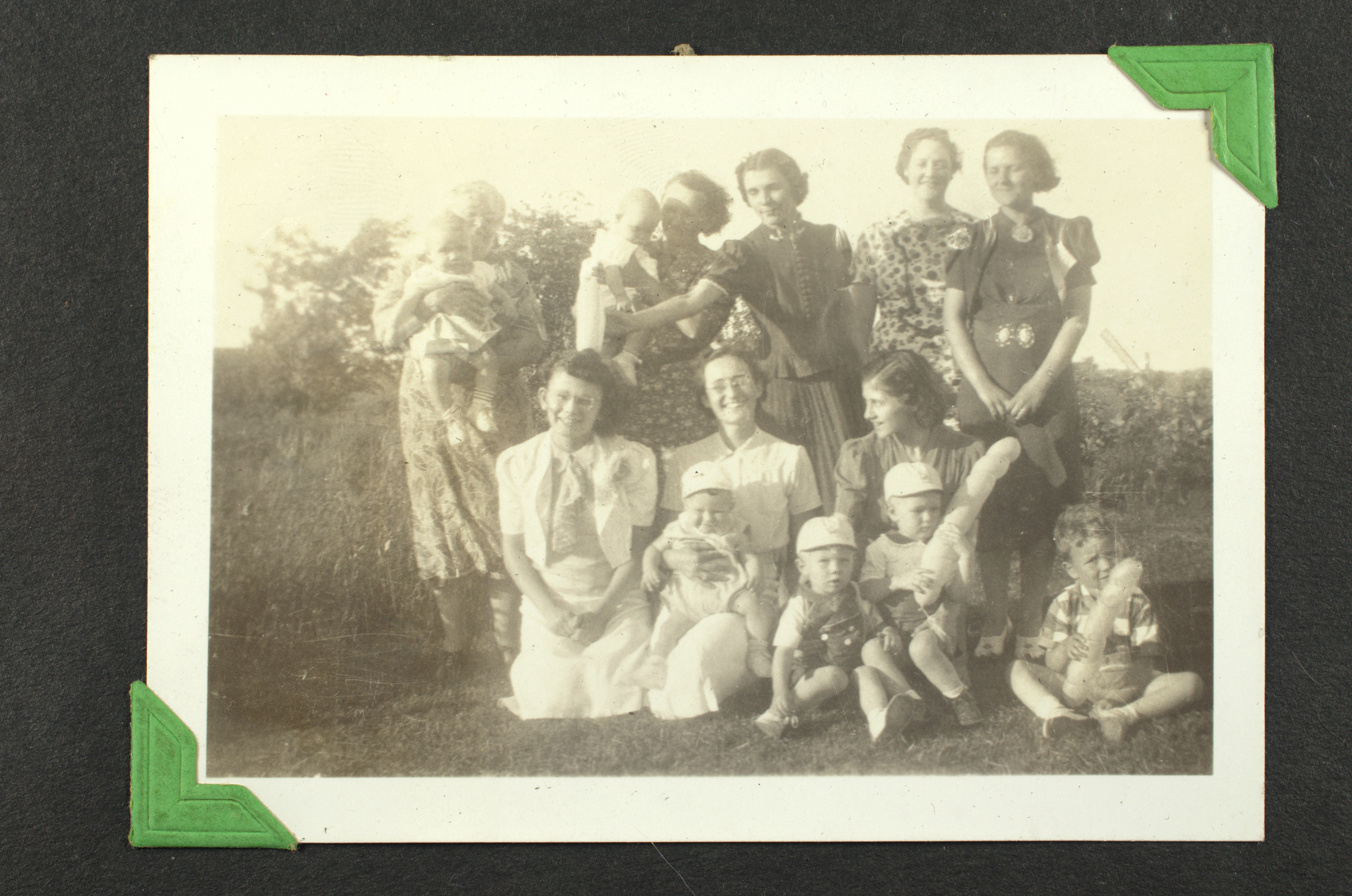
Repair: Fix the damage but keep the original look: no color, no sharpening.
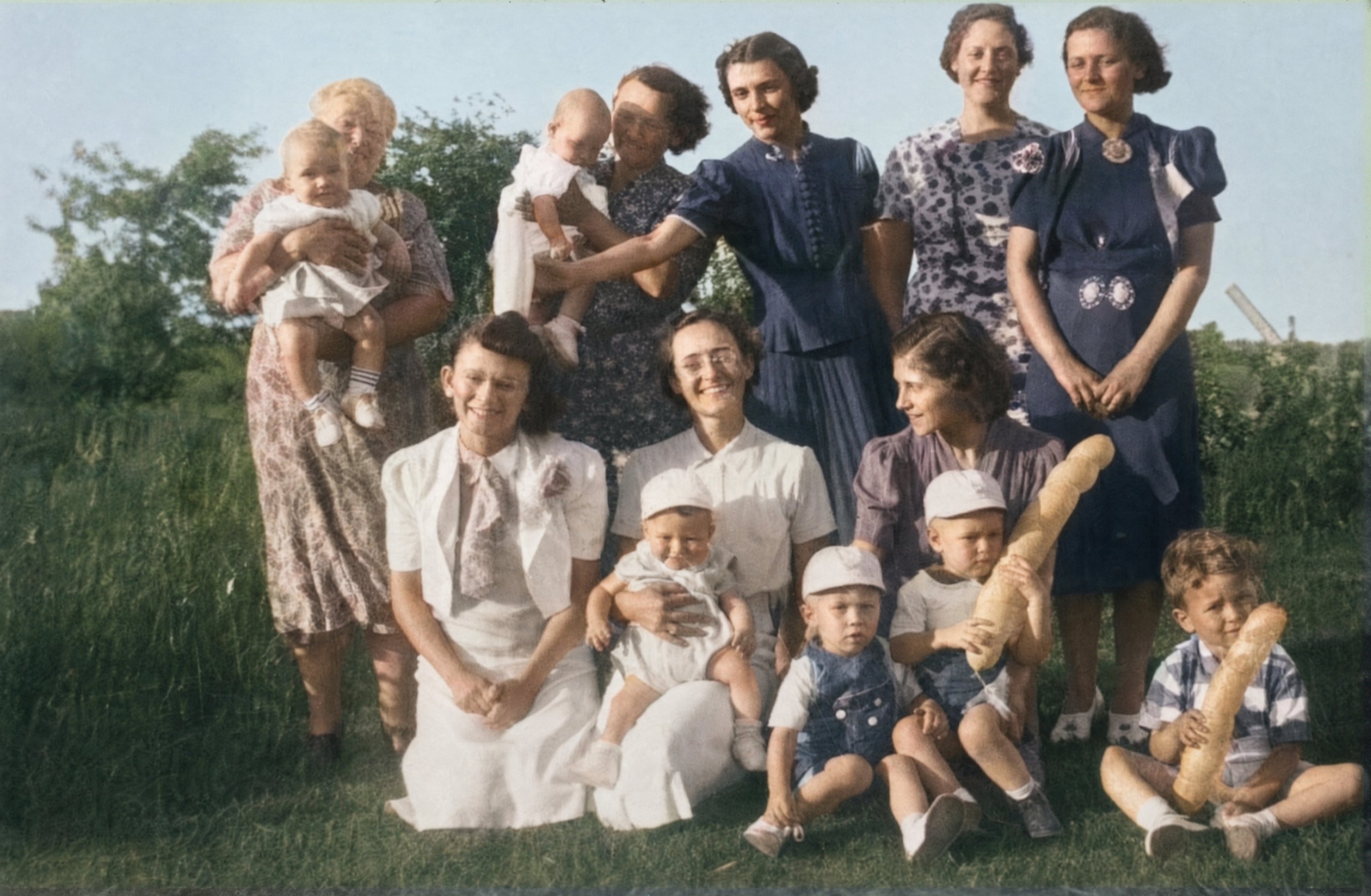
Enhance: Fix the damage and add gentle, believable color.
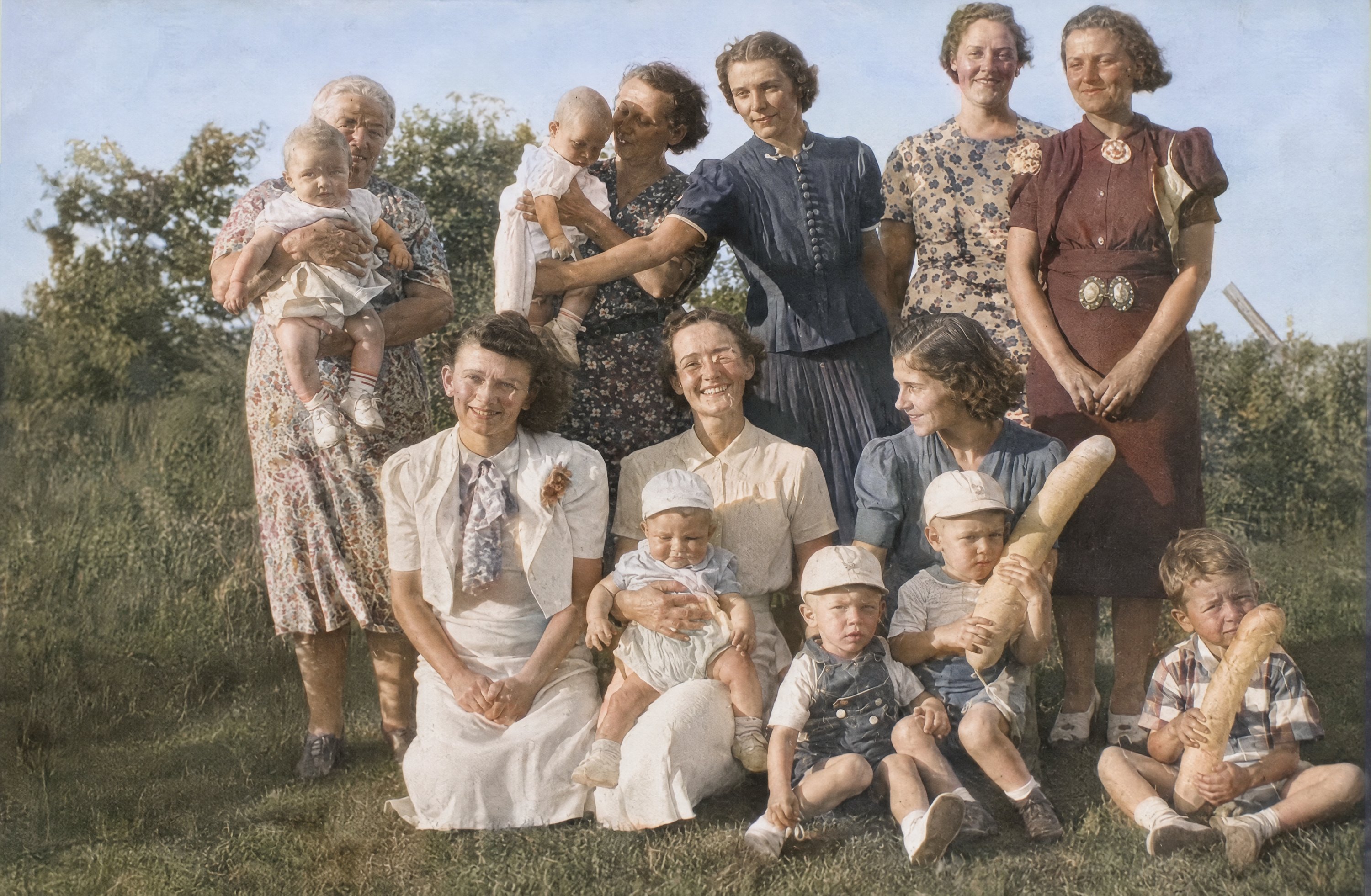
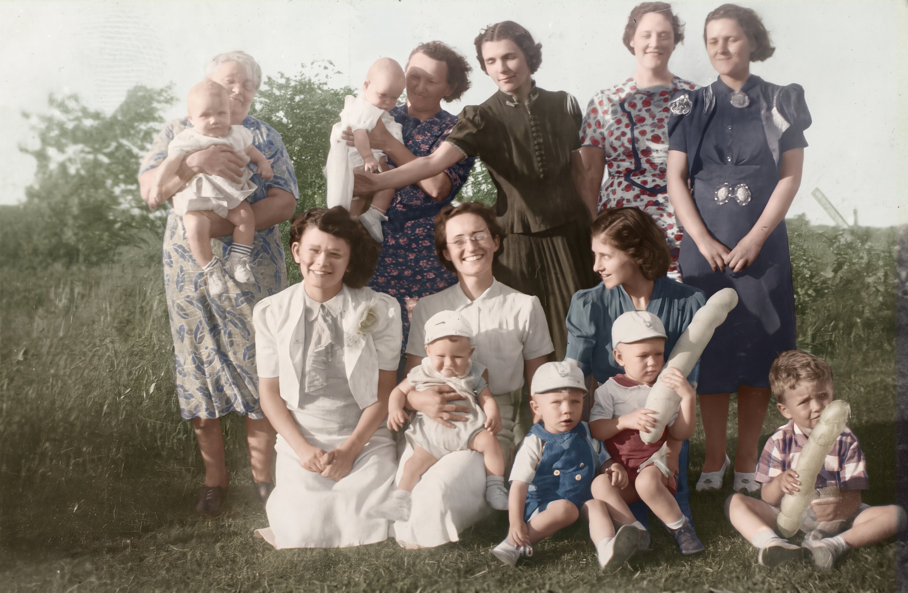
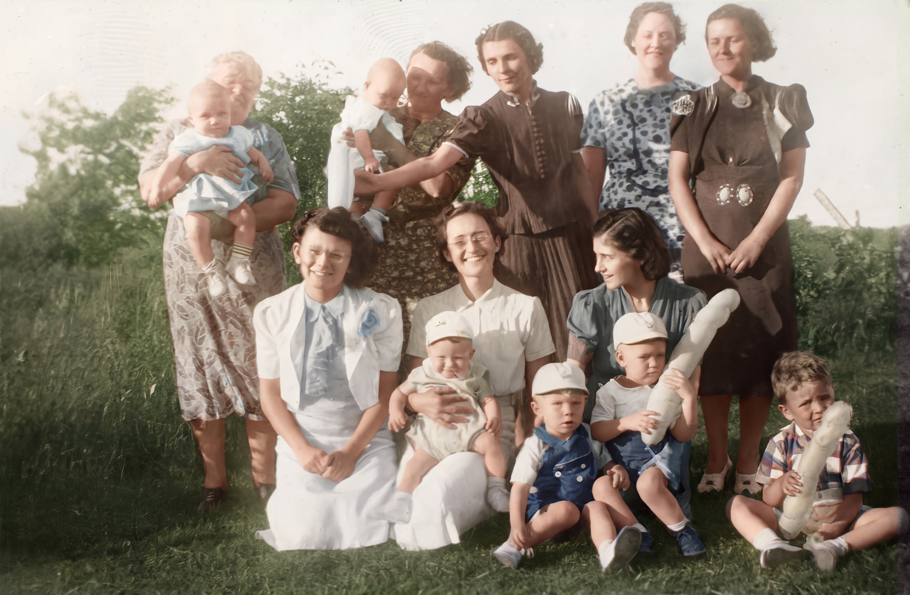
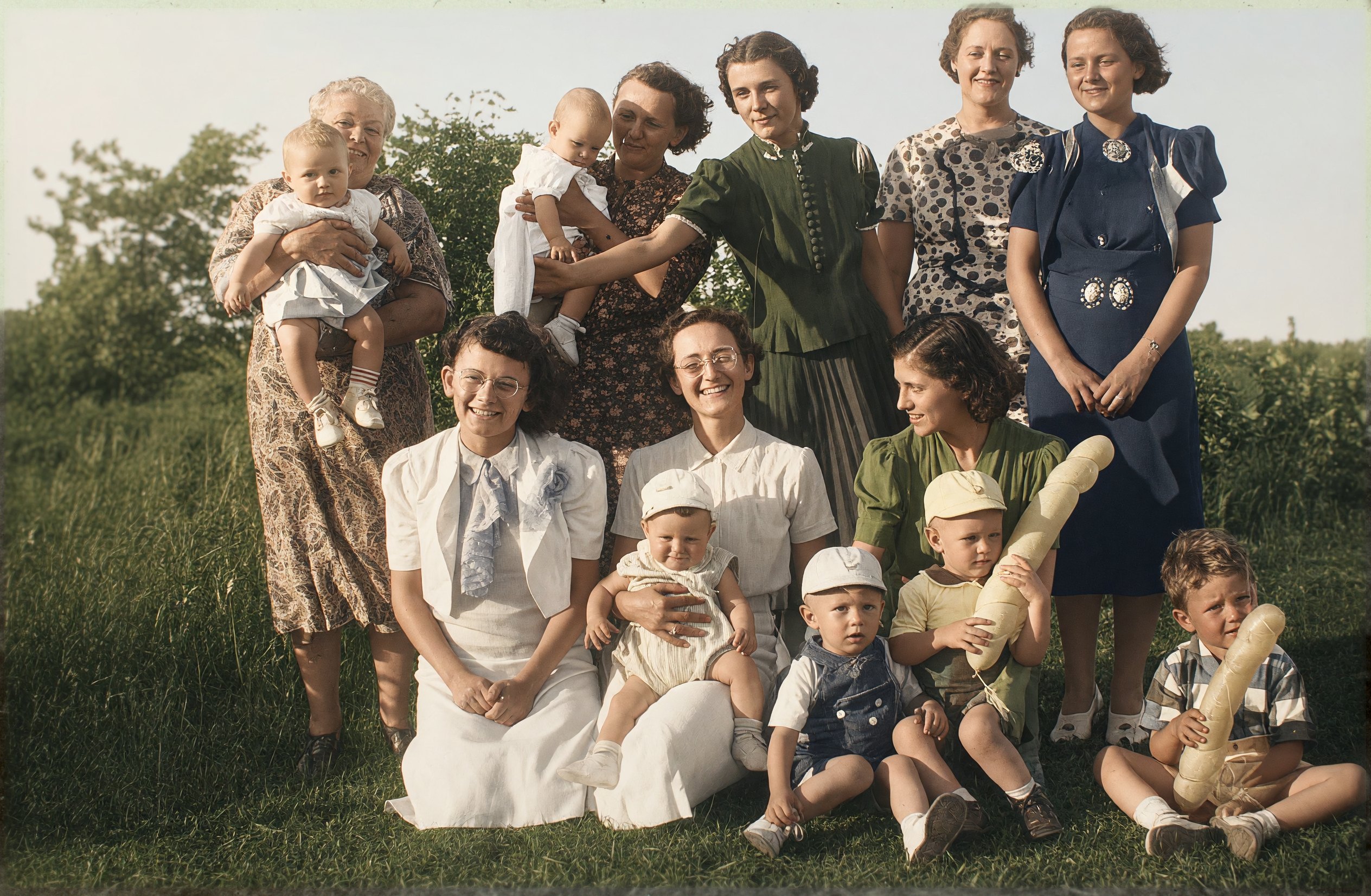
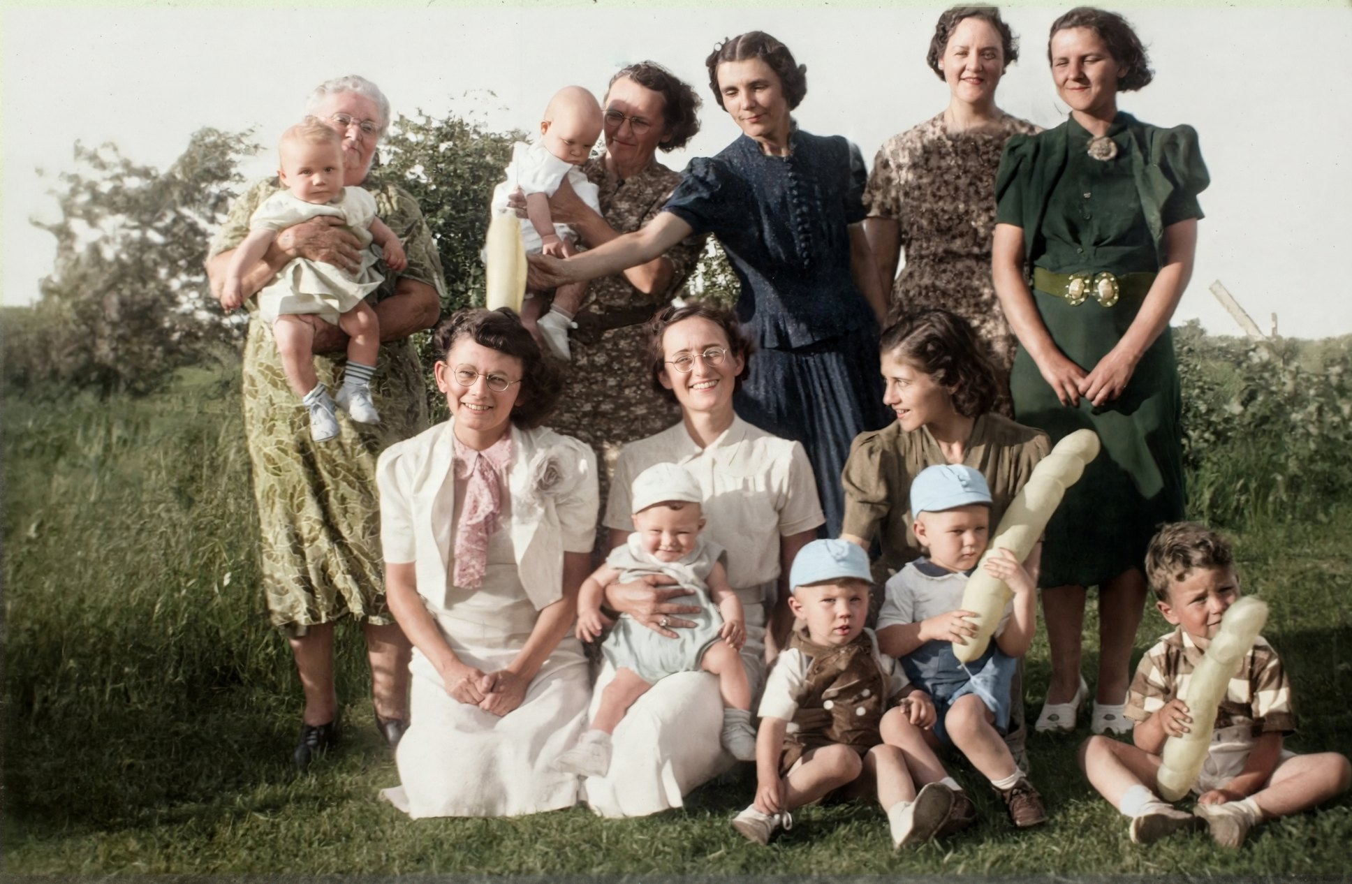
Reimagine: Make it look freshly taken with a modern camera.
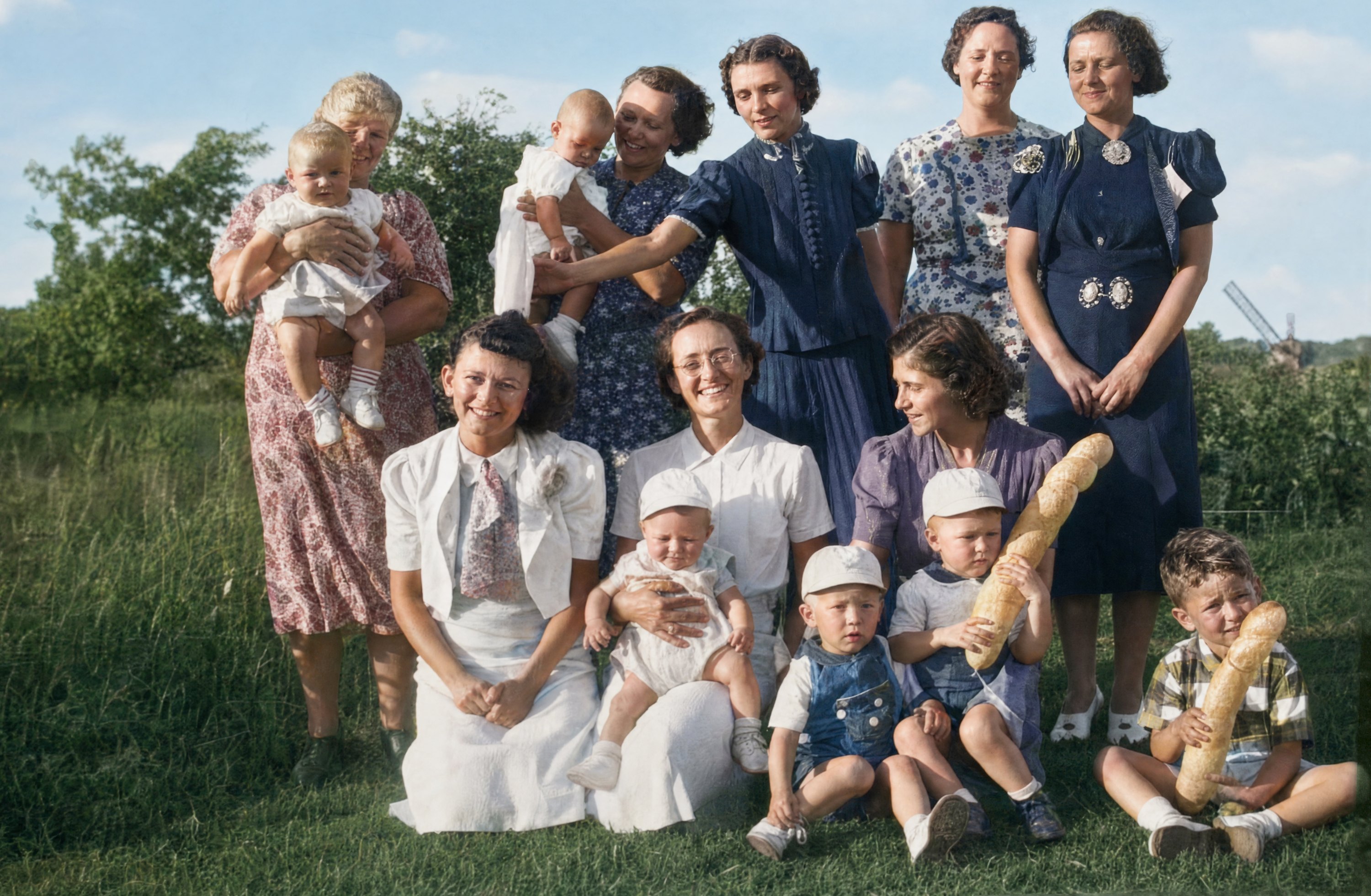
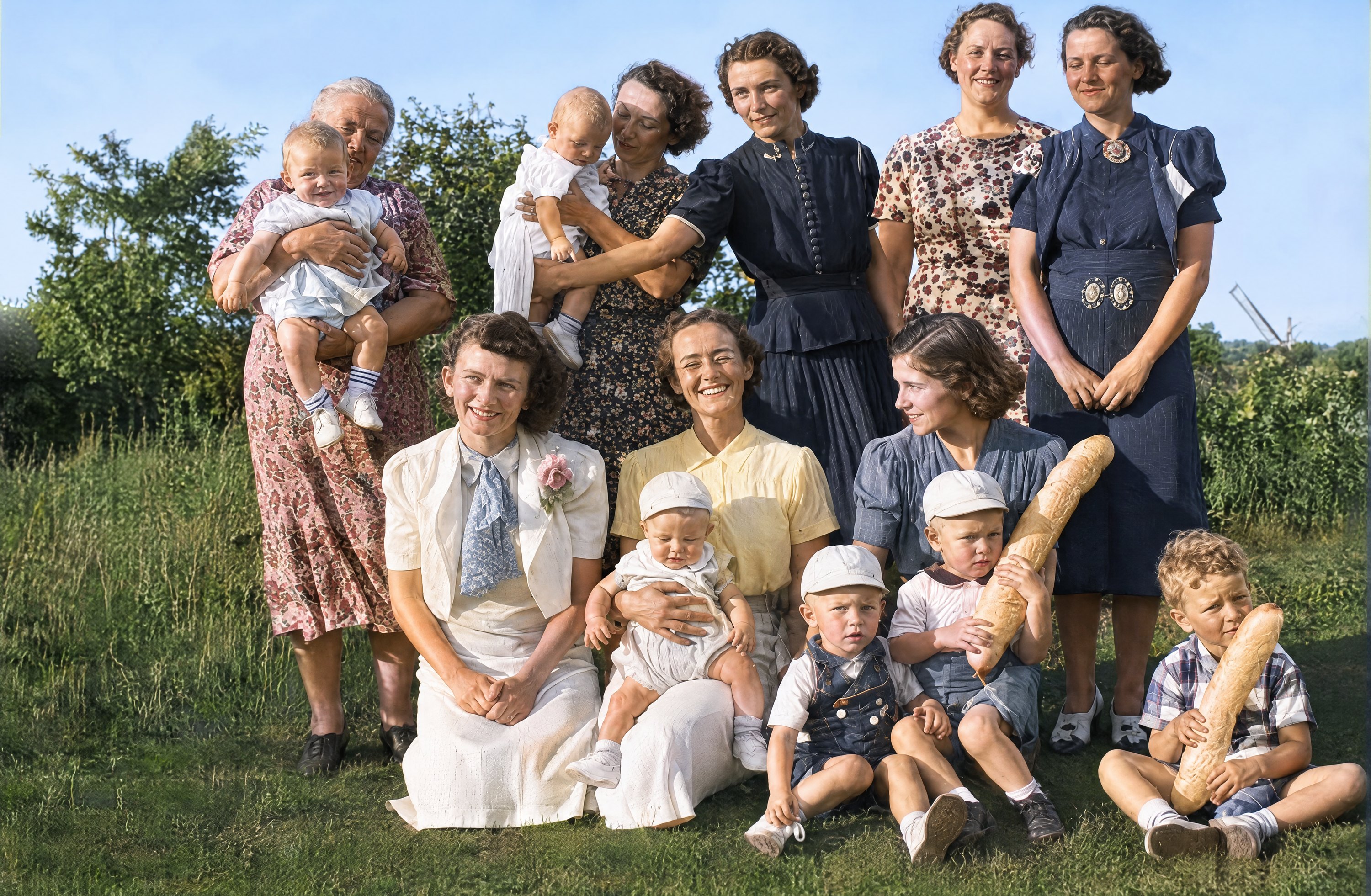
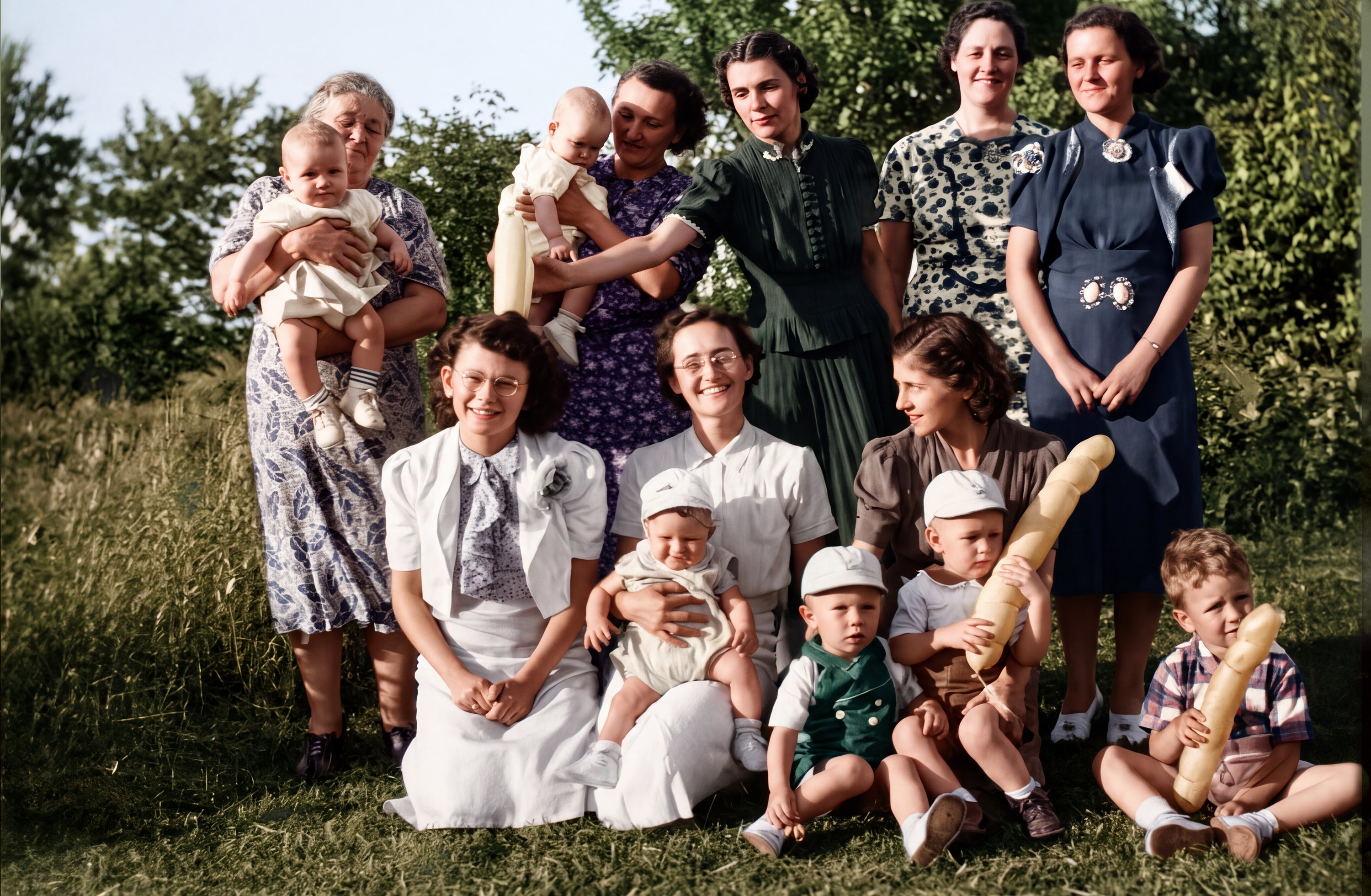
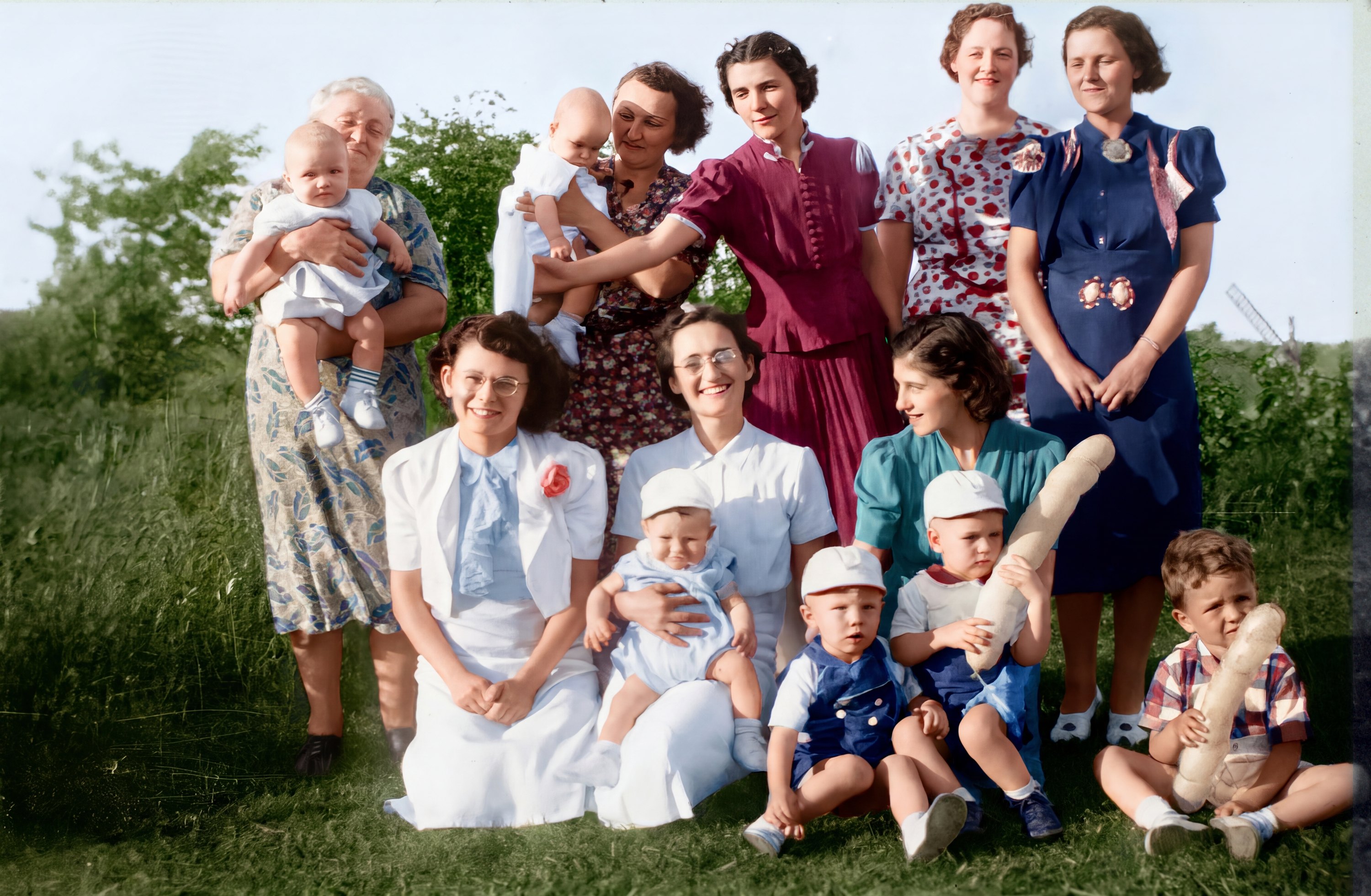
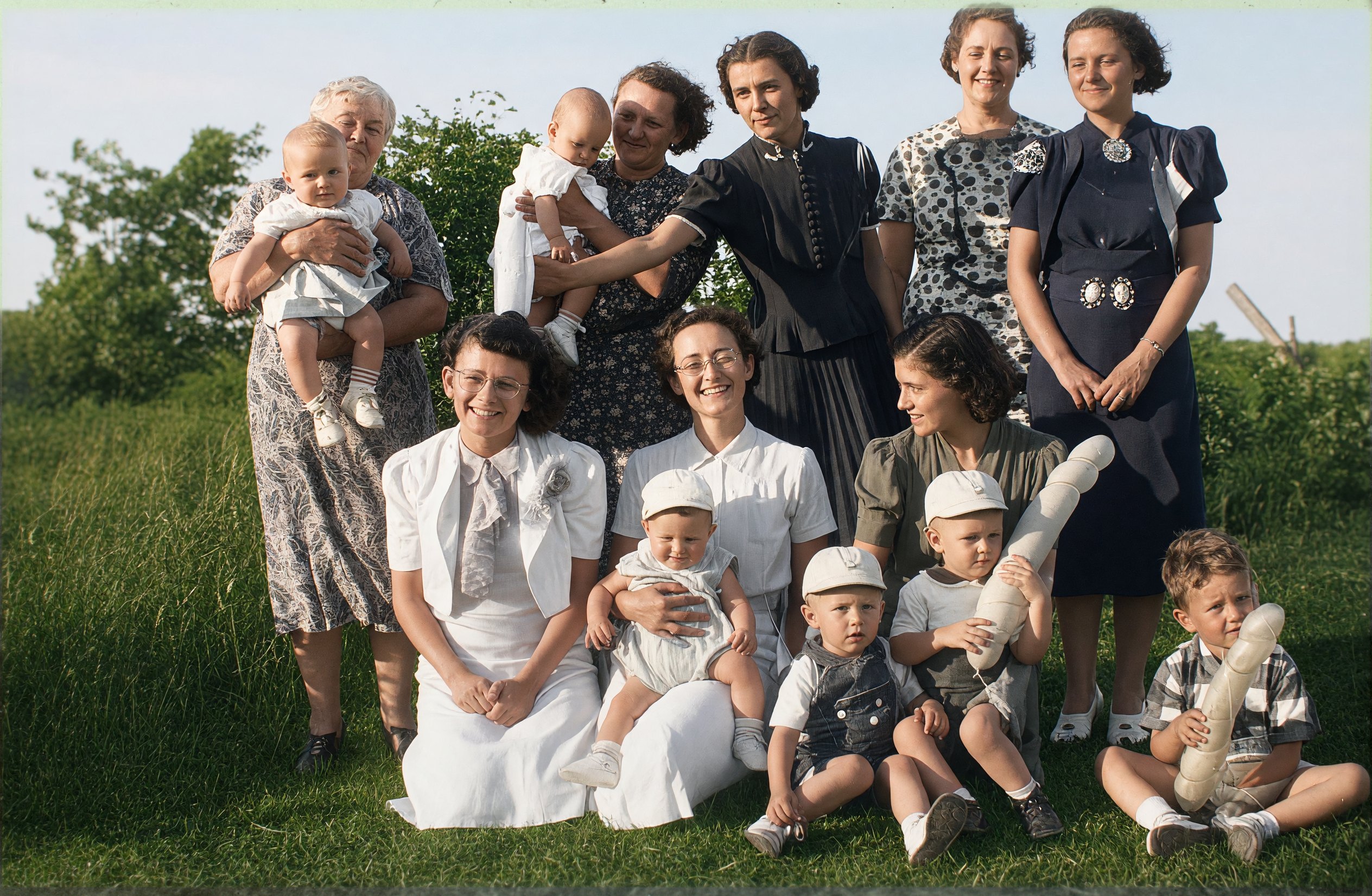
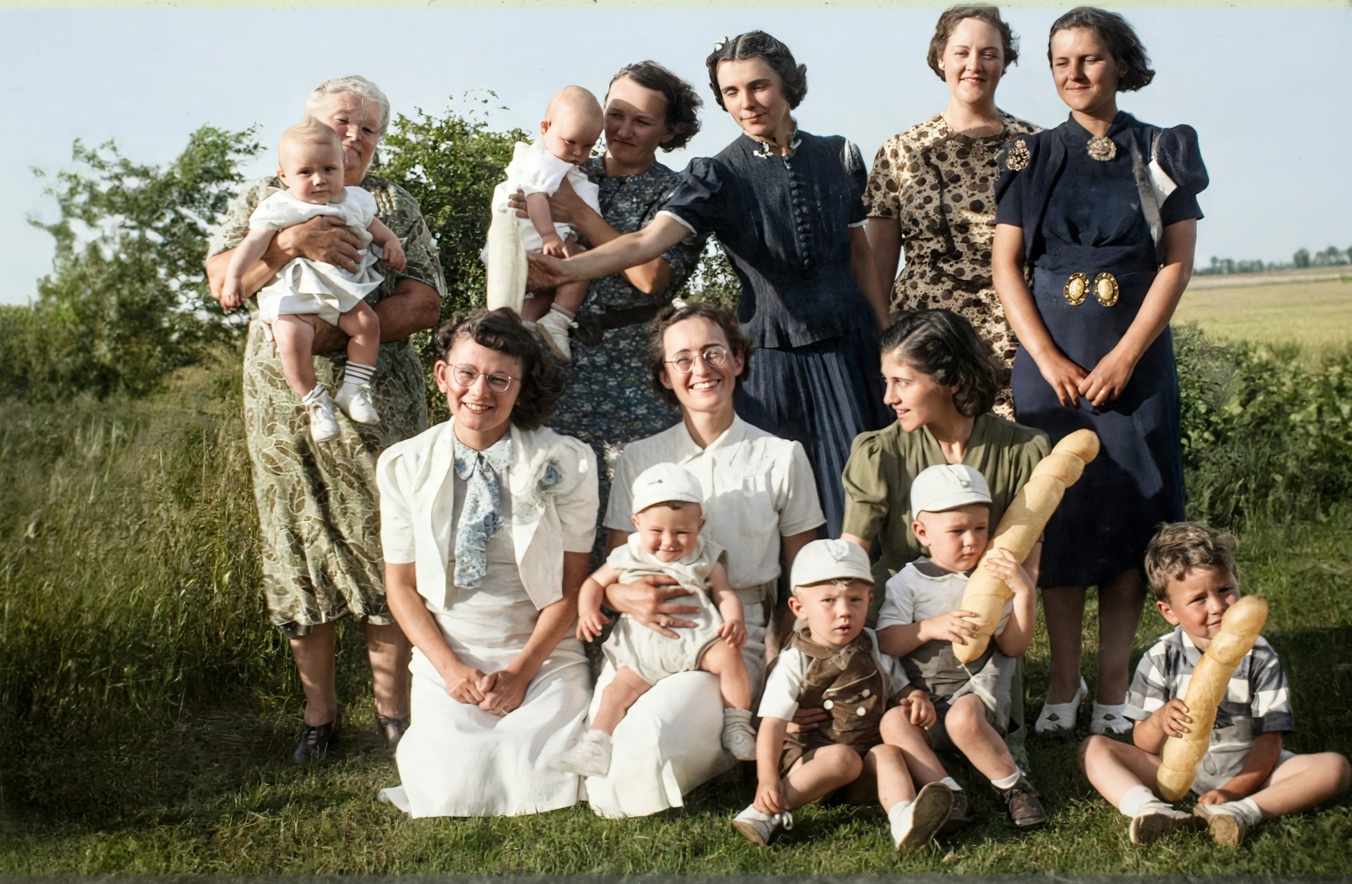
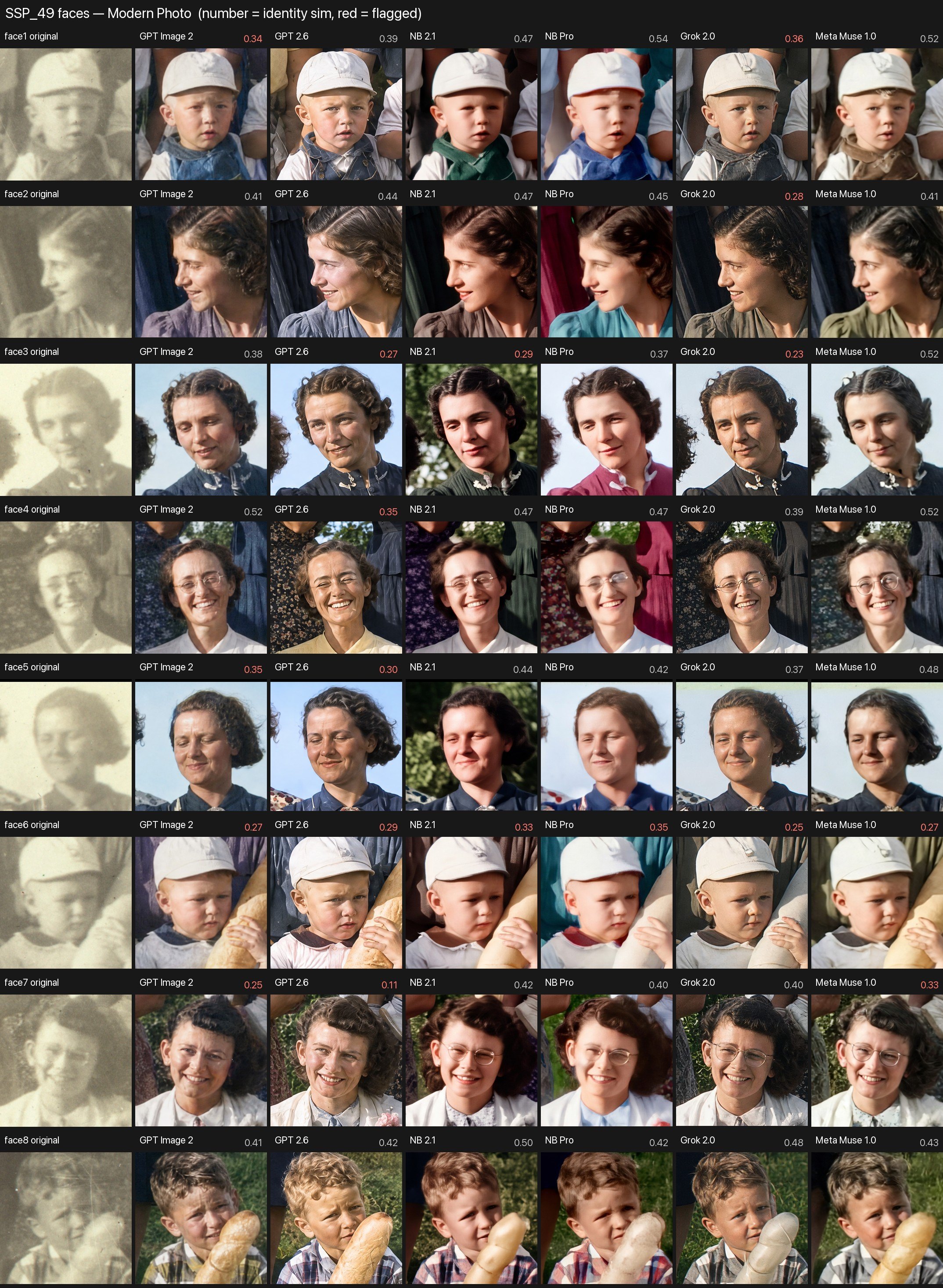
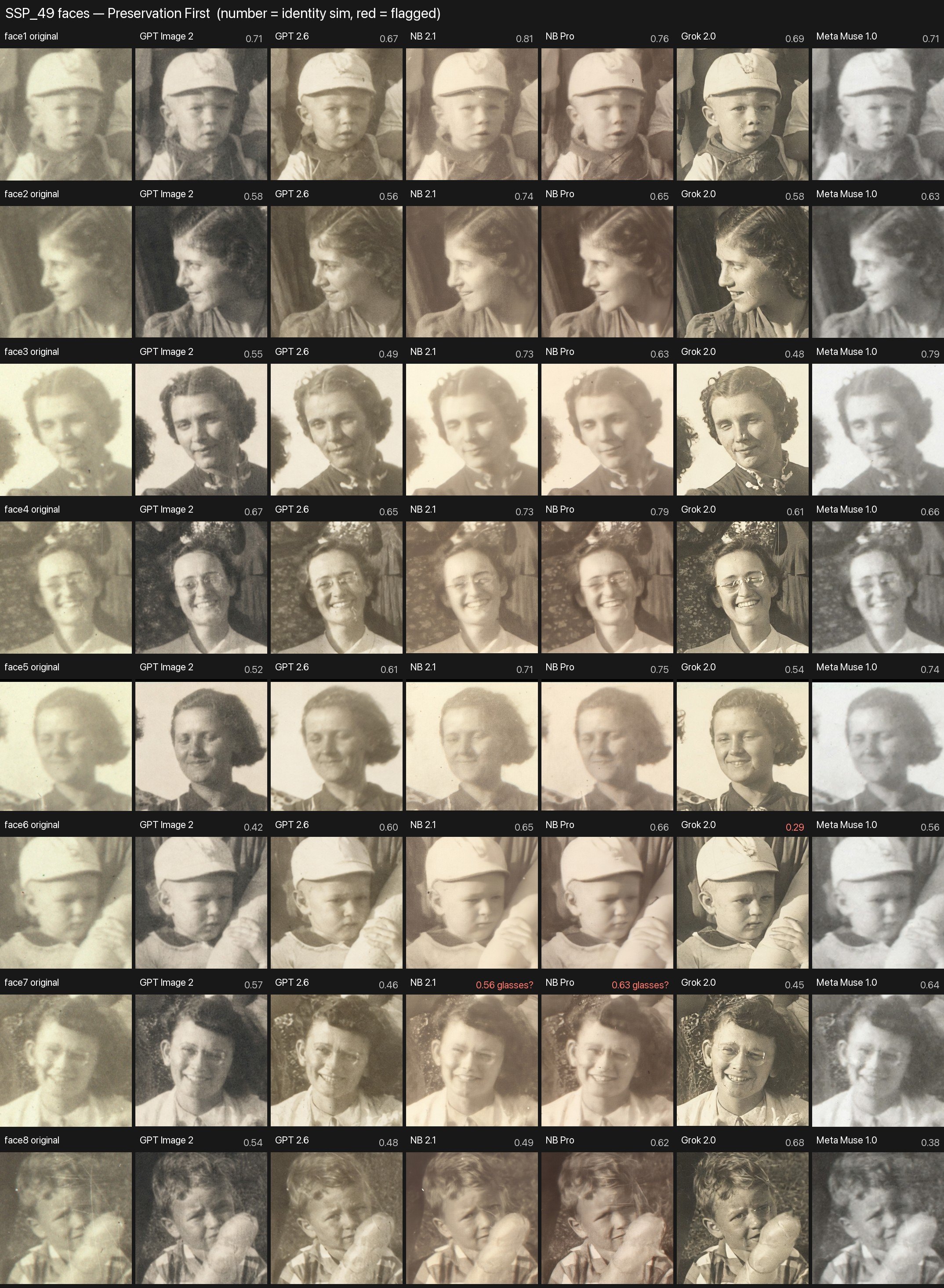
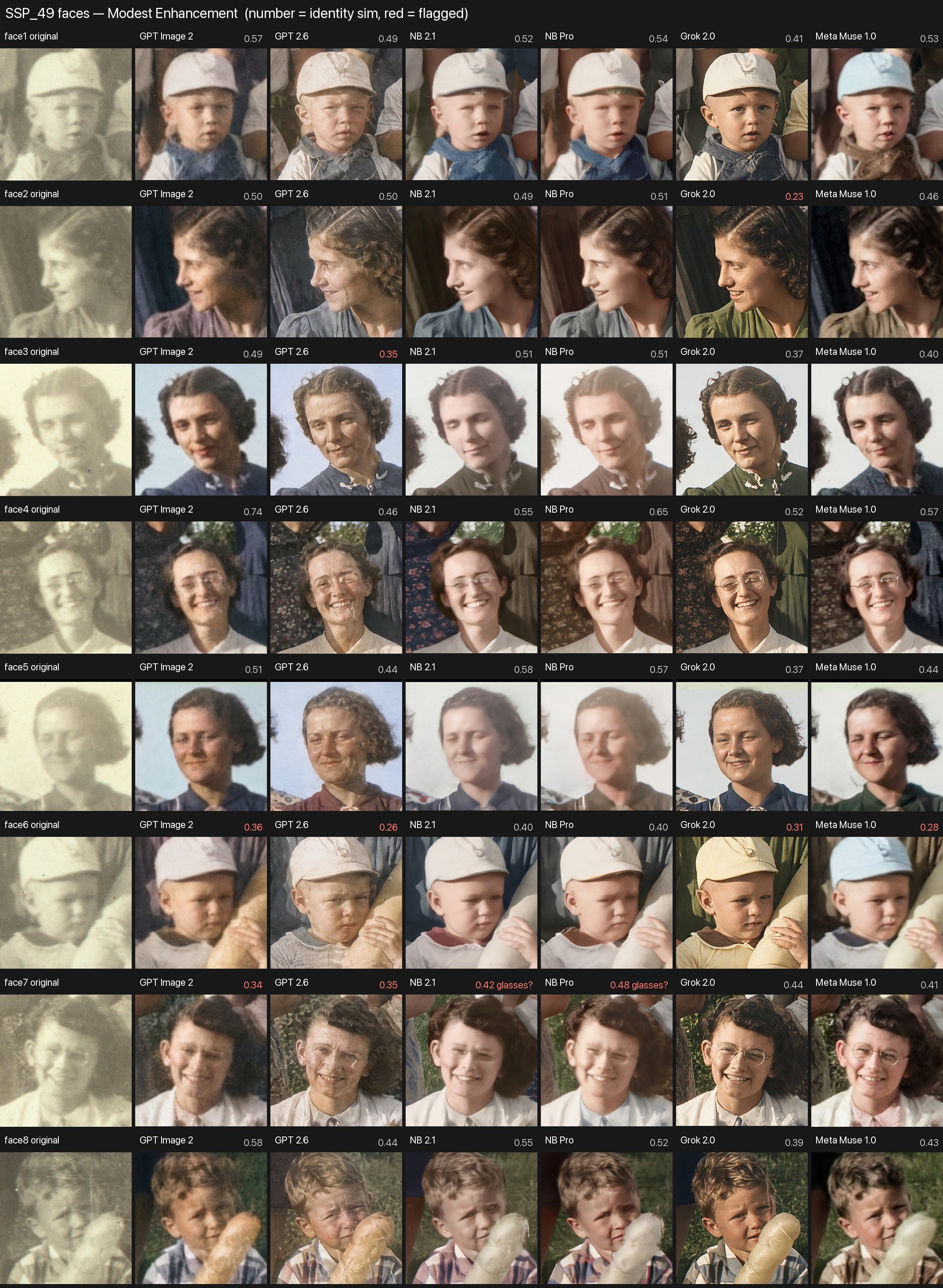
The number above each face is a face-match score. A face-recognition program compared the restored face with the same face in the original and scored how closely they match, from 0 to 1. A perfect match would be 1.0, and higher is closer. A score shown in red falls below 0.36, the point where the program would no longer call them the same person. Faded, blurry originals keep every score modest, so compare the numbers with each other rather than treating them as grades, and always trust your own eyes too. The other face sheets on this page use the same scores.
What to look for in this example
- "Repair" doesn't always stop at repair. GPT Image 2.6 and both Gemini models kept the warm sepia. GPT Image 2 turned it nearly neutral gray, Meta went pale and cool, and Grok sharpened every face, which the prompt forbids.
- The glasses. In the original, the glasses on the seated women are only faint lines. With color allowed, most models drew crisp, round wire frames. The Gemini models lost one person's glasses in the Repair version.
- The colors are guesses. The dark dress on the woman reaching across the back row came out navy, brown, green, or bright magenta, depending on the model. The photo holds no information about the real colors.
- Unclear objects get reinterpreted. In several Reimagine versions, the long, pale objects the boys are holding turned into golden loaves of bread.
- More polish, more drift. The automatic face check flagged at most one face per model for Repair, but up to five of eight faces for Reimagine.
Key points
- The prompt sets the limits. Each step up the ladder, from Repair to Enhance to Reimagine, allows more change, and more of the faces turn into someone new.
- Every face is redrawn, not repaired. With eight small, blurry faces, each model makes its own guesses about eyes, age, and expression. The same person can look like a different relative from one model to the next. Compare every face with the original.
- Small details get lost or invented. Faint glasses became crisp wire frames, or vanished. Pale objects in the boys' hands became loaves of bread.
- Color is a guess. A faded print doesn't record what color anyone's dress was. Treat the colors as plausible, not as fact.
- No model wins every time. If a result looks wrong, try again or try another tool, and compare each version with the original.
- Keep the original, and label every version. A Repair version for the family record, an Enhance version to frame, a Reimagine version for fun.
Try it yourself
Get the photo onto your device
Use a scanner if you have one. Otherwise, lay the print flat in good, even light (no flash, to avoid glare) and photograph it straight on with your phone. A photo still mounted on an album page is fine; the prompt below trims the page away.
Upload it
In any of the tools, click the + button (or paperclip) beside the chat box, then choose your photo file.
Repair: fix the damage
This prompt is long on purpose. It spells out exactly what the tool may and may not do, because without limits it may redraw faces or invent detail. Open it to read it all; the Copy button copies the whole thing.
Show the full Repair prompt
Repair promptPerform a conservative, preservation-first restoration of the attached vintage photograph. Your objective is to repair visible photographic damage and remove extraneous material surrounding the photograph, NOT to enhance, reinterpret, or recreate the image. The restored photograph should look nearly identical to the original, except for the removal of damage, correction of obvious deterioration, and necessary cropping or alignment corrections. PERMITTED CHANGES - Remove clearly identifiable dust, scratches, spots, and physical blemishes. - Correct obvious fading or uneven exposure using gentle, global tonal adjustments. - Make only minimal adjustments to brightness and contrast where necessary. - Preserve the photograph's original grain, softness, texture, and historical appearance. CROPPING AND ALIGNMENT - Identify the boundaries of the original photographic image. Remove unwanted borders, scanner margins, album pages, surrounding surfaces, and other clearly extraneous content outside those boundaries. - Apply minimal rotation to correct a tilted scan or capture. Apply perspective correction only when the physical photograph was clearly photographed at an angle. - Base alignment corrections on the photograph's physical edges, not on assumptions about whether people, buildings, or horizons within the scene should be straight. - Crop only as much as necessary to isolate the core photographic image and remove empty edges introduced by alignment corrections. - Preserve all original scene content, including people, clothing, objects, and background details near the edges. Do not crop for aesthetic improvement or tighter framing. - Preserve the original photographic image's proportions. The overall file dimensions and aspect ratio may change as necessary to remove surrounding material, but do not stretch or compress the image. - Do not use generative fill, content-aware expansion, or invented imagery to replace corners or edges. If an alignment correction would require sacrificing meaningful original content, reduce or omit that correction. - If you cannot confidently distinguish extraneous material from original photographic content, preserve the uncertain area. STRICTLY PROHIBITED CHANGES - NO COLORIZATION. If the original is black and white, the output must remain black and white. If sepia, retain its original sepia appearance. Do not introduce new colors or change the original color palette. - NO SHARPENING OR DETAIL ENHANCEMENT. Do not increase facial definition, edge contrast, texture, or apparent resolution through invented detail. - NO FACIAL MODIFICATIONS. Preserve every person's facial features, proportions, expression, eyes, nose, mouth, wrinkles, hairline, and apparent age exactly as they appear in the source photograph. Do not reconstruct, beautify, smooth, or regenerate faces. - Do not change clothing, hairstyles, poses, backgrounds, objects, or lighting. - Do not alter the scene's composition except for the limited cropping and alignment corrections explicitly permitted above. - Do not invent or replace missing visual information. RESTORATION PRIORITIES 1. Exact preservation of people's faces and identities. 2. Preservation of all original scene content and the original photographic appearance. 3. Careful removal of extraneous surrounding material and correction of capture misalignment. 4. Removal of obvious physical damage. 5. Gentle tonal correction only where necessary. If an improvement risks altering any original visual detail, leave that area unchanged. Generate one restored image, preserving the source image's resolution and visual character as closely as possible, with dimensions adjusted only as needed for the permitted cropping and alignment corrections. The desired result is a carefully cleaned and properly aligned historical photograph, NOT a newly generated version of the original.
Shorter version: "Repair the scratches and fading in this old photo and trim away the album page around it. Don't change anyone's face, don't add color, and don't cut off anything inside the picture."
Enhance: add gentle color
Upload the same original again (in a new chat is best), and allow a little more freedom.
Show the full Enhance prompt
Enhance promptCreate a conservative, historically faithful enhanced restoration of the attached vintage photograph. Your objective is to repair visible damage, make modest improvements in clarity, and introduce subtle, period-appropriate colorization while preserving the original photograph's content and character. This is a restoration of an existing photograph, NOT a recreation or reinterpretation of the scene. PERMITTED CHANGES - Remove visible dust, scratches, stains, spots, and other physical damage. - Correct fading, uneven exposure, and tonal imbalance using restrained adjustments. - Apply subtle sharpening only where it improves the clarity of existing details. Do not generate or invent new details. - If the photograph is black and white or sepia, apply gentle, realistic colorization using muted, historically plausible colors. - Maintain natural skin tones, lighting, shadows, and photographic textures. - Preserve the photograph's original grain and softness wherever possible. CROPPING AND ALIGNMENT - Identify the boundaries of the original photographic image. Remove unwanted borders, scanner margins, album pages, surrounding surfaces, and other clearly extraneous content outside those boundaries. - Apply minimal rotation to correct a tilted scan or capture. Apply perspective correction only when the physical photograph was clearly photographed at an angle. - Base alignment corrections on the photograph's physical edges, not on assumptions about whether people, buildings, or horizons within the scene should be straight. - Crop only as much as necessary to isolate the core photographic image and remove empty edges introduced by alignment corrections. - Preserve all original scene content, including people, clothing, objects, and background details near the edges. Do not crop for aesthetic improvement or tighter framing. - Preserve the original photographic image's proportions. The overall file dimensions and aspect ratio may change as necessary to remove surrounding material, but do not stretch or compress the image. - Do not use generative fill, content-aware expansion, or invented imagery to replace corners or edges. If an alignment correction would require sacrificing meaningful original content, reduce or omit that correction. - If you cannot confidently distinguish extraneous material from original photographic content, preserve the uncertain area. STRICTLY PROHIBITED CHANGES - NO FACIAL MODIFICATIONS. Preserve every person's facial features, proportions, expression, eyes, nose, mouth, wrinkles, hairline, and apparent age exactly as depicted. Do not reconstruct, beautify, smooth, or regenerate faces. - Do not change hairstyles, clothing styles, poses, body proportions, or expressions. - Do not add, remove, reposition, or replace any people, objects, or background details. - Do not invent missing visual information or introduce artificial textures. - Do not apply excessive sharpening, smoothing, HDR effects, or modern photographic styling. - Do not crop, reframe, or change the original aspect ratio. COLORIZATION GUIDELINES - Use restrained, natural-looking colors appropriate to the apparent historical period. - Avoid overly saturated colors, dramatic contrast, or modern cinematic effects. - Where original colors are unknown, use muted, plausible colors. These choices are speculative interpretations, not recovered historical facts. - Colorization must change only the color appearance, not the underlying shapes, textures, or details. RESTORATION PRIORITIES 1. Exact preservation of facial features and identities. 2. Preservation of all original scene details and composition. 3. Conservative removal of visible damage. 4. Subtle, historically plausible colorization. 5. Modest sharpening and tonal improvement. If any enhancement risks changing a person's face or another original visual detail, leave that detail unchanged. Generate one high-quality restored image that looks like the original historical photograph, carefully cleaned and naturally colorized—not a newly generated photograph.
Optional: Reimagine it as a modern photo
For a version that looks as if it were taken recently, use this prompt in a new chat. It allows stronger sharpening and full color, and accepts small changes to faces, so keep it for enjoyment, not the family record.
Show the full Reimagine prompt
Reimagine promptProduce one restored photograph that looks as though the original people and scene were photographed recently with a good modern camera. Modernize image quality while preserving historical content, clothing, setting, and composition. Colorize monochrome or sepia sources by default unless the user requests monochrome. APPLY PRIORITIES IN THIS ORDER 1. Preserve recognizable identities, expressions, apparent ages, and original scene content. 2. Preserve composition, poses, clothing, objects, and period details. 3. Repair photographic damage and deterioration. 4. Produce full natural color, clean tones, and modern photographic clarity. 5. Accept minor facial drift and cautious inferred fine texture where needed for that finish. Treat minor drift as an allowed tradeoff, not a goal. Honor stricter preservation instructions when supplied. Do not promise exact facial fidelity or factual recovery of details missing from the source. INSPECT THE ORIGINAL - Obtain the actual source photograph. If none is attached or accessible, ask for it; do not substitute another photo or generate a sample restoration. - Inspect the full image, physical photograph boundaries, faces, and edge content before editing. Use the source as the authoritative reference throughout; preserve the original file. - Distinguish dust, scratches, stains, spots, fading, and physical damage from genuine scene details. Preserve uncertain marks, textures, objects, and areas. - Use any supplied date, location, or known colors as evidence. Treat an inferred period as approximate; do not invent historical certainty or require a date to proceed. PRESERVE FACES AND SCENE CONTENT - Keep each person readily recognizable. Retain facial structure, distinctive features, expression, gaze, apparent age, hairstyle, and hairline. - Allow stronger facial sharpening and restrained reconstruction of poorly resolved texture, accepting small incidental changes in facial detail. Keep highly ambiguous anatomy softer instead of confidently inventing eyes, teeth, or other prominent features. - Do not replace faces, beautify, de-age, change expressions, correct symmetry, add makeup, or smooth skin into a synthetic appearance. Retain natural wrinkles and age cues. - Preserve people, animals, poses, body proportions, clothing, objects, lettering, backgrounds, and spatial relationships. Do not add, remove, reposition, or replace scene elements. - Preserve original lighting direction, scene mood, and focus relationships. Do not invent dramatic lighting, replace backgrounds, or add artificial portrait blur. CROP AND ALIGN CONSERVATIVELY - Identify the physical boundaries of the original photographic image. Remove only clearly extraneous borders, scanner margins, album pages, and surrounding surfaces. - Apply minimal rotation for a tilted scan or capture. Apply perspective correction only when the physical photograph was clearly captured at an angle. Use its physical edges as evidence, not assumptions that people, buildings, or horizons should be straight. - Preserve all meaningful original scene content, including content near the edges. Crop only enough to isolate the photographic image and remove empty edges introduced by alignment. Never crop for aesthetic improvement or tighter framing. - Preserve the photograph's proportions without stretching or compressing it. Allow the overall file dimensions and aspect ratio to change only as needed to remove surrounding material or perform justified alignment; do not deliberately reframe the scene into a new aspect ratio. - Do not use generative fill, content-aware expansion, or invented imagery to replace corners or edges. Reduce or omit alignment corrections that would sacrifice meaningful scene content. - Preserve any area whose status as surrounding material is uncertain. REPAIR AND SHARPEN FOR MODERN CLARITY - Remove visible dust, scratches, stains, spots, and physical damage. Permit cautious local reconstruction supported by surrounding evidence; preserve ambiguous scene details. - Correct fading, yellowing, color casts, uneven exposure, and tonal imbalance decisively. Aim for clean whites, rich but open shadows, and natural contrast with retained highlight detail. - Apply substantially stronger sharpening, local contrast, and deblurring than Restore Photo Faithfully permits. Aim for convincing detail consistent with a good modern lens and sensor. - Reduce distracting grain, scan noise, haze, and deterioration while retaining natural skin, hair, fabric, and photographic texture. - Permit cautious inferred fine detail during enhancement or upscaling, without presenting that detail as recovered fact. Avoid inventing prominent anatomy, lettering, or objects. - Avoid halos, ringing, crunchy edges, exaggerated pores, plastic skin, aggressive HDR, and artificial microtexture. Preserve depth of field instead of making every plane equally sharp. COLORIZE FULLY AND NATURALLY - Colorize monochrome and sepia sources with confident, lifelike color rather than a muted vintage wash, unless monochrome is requested. - Use natural skin tones, believable greens and skies, and richer clothing and environmental colors plausible for the apparent period. Allow stronger saturation while keeping the result photographic. - Correct deteriorated existing color more decisively while preserving evidenced colors. Prioritize supplied references and known colors over guesses. - Preserve lighting, shadows, material textures, and color continuity. Avoid tint bleeding, uniformly tinted faces, cinematic grading, and neon saturation. - Do not infer ethnicity from monochrome tonal values. Treat unknown colors as plausible interpretations rather than historically verified facts.
Compare them all
Put the original next to each version. Check:
- Faces, especially small ones in the back row. They may come out clearer than the original, which means the tool redrew them.
- Patterns and small objects, such as dress prints or things people are holding.
- Colors. Skies, clothing, and ties are guesses. Added color is not history.
If something is wrong, say so: "The woman on the right looks different. Keep her face exactly as it was in the original."
These tools regenerate the photo rather than retouch it, and instructions are not guarantees. Always keep the unedited original, keep the Repair version as your record, and label any colorized print so family members know the color is an interpretation.
More restoration examples: my father on horseback, and a six-model test that puts faces first
My father on horseback: one photo, three prompts, six models
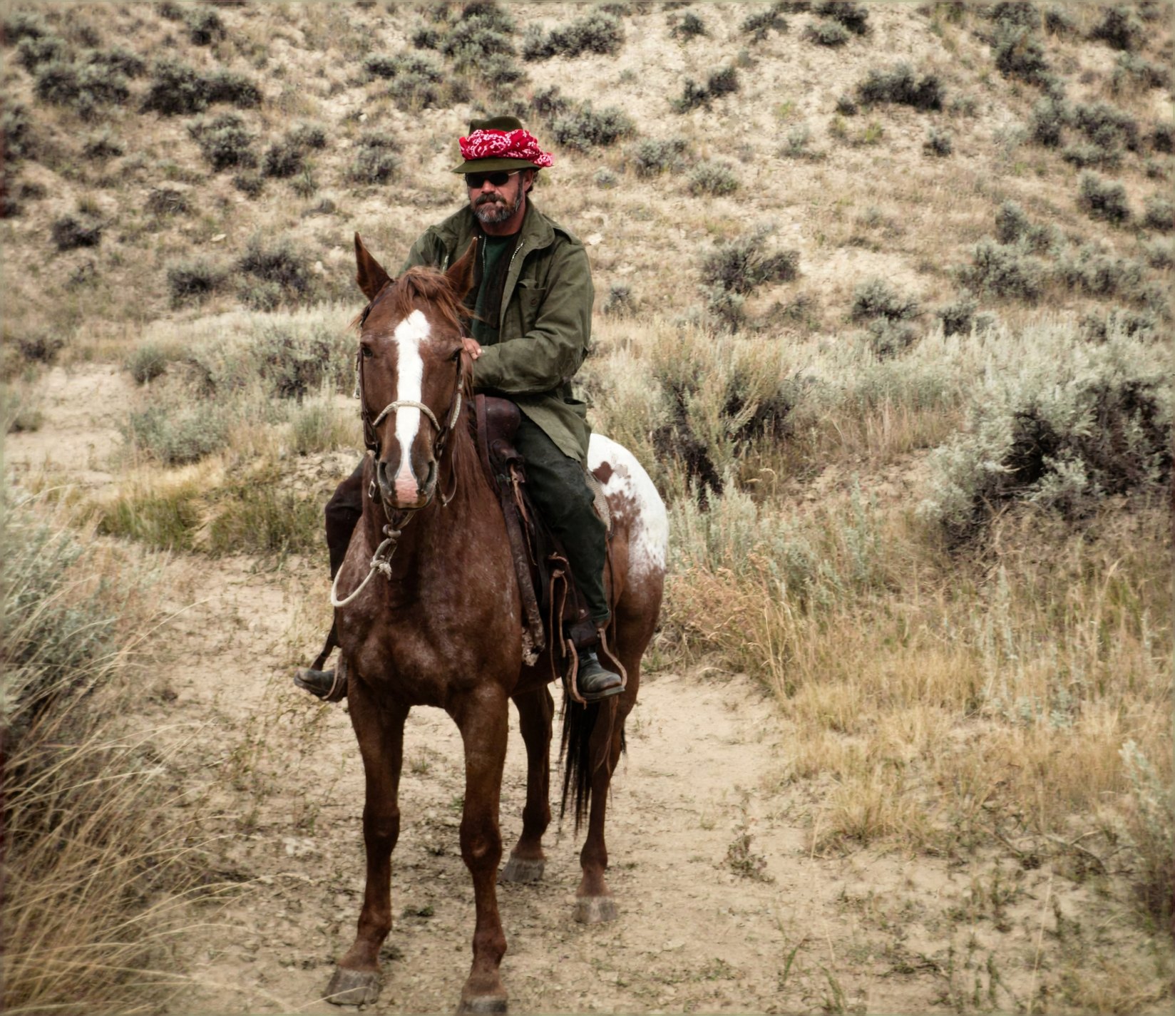
This faded snapshot of my father went to the same six models with each of the three prompts. With one large figure, it's easier to see what happens to small details, like the cigar.
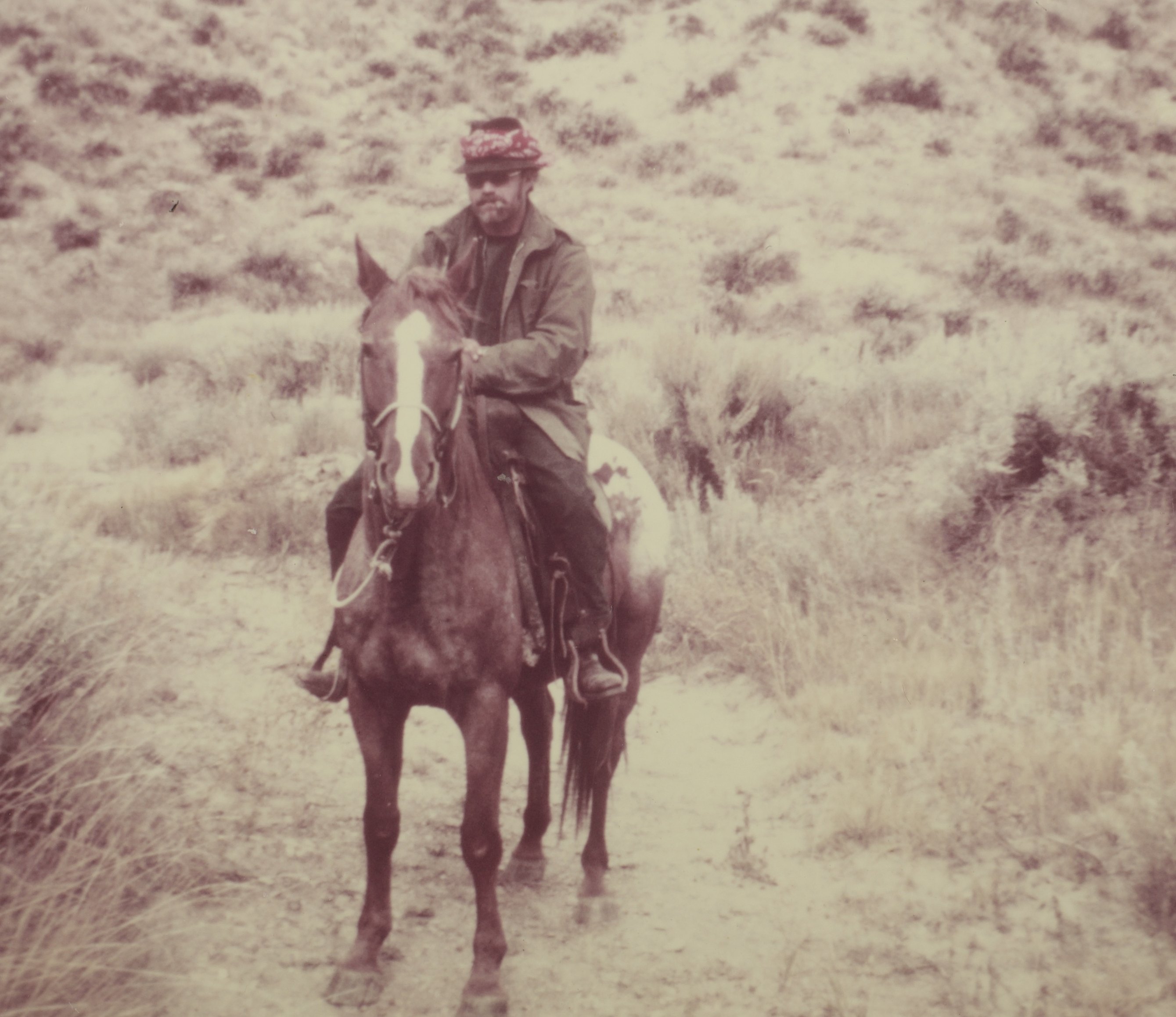
Repair: Keep it looking like the original print: fix the damage, but no color and no sharpening.
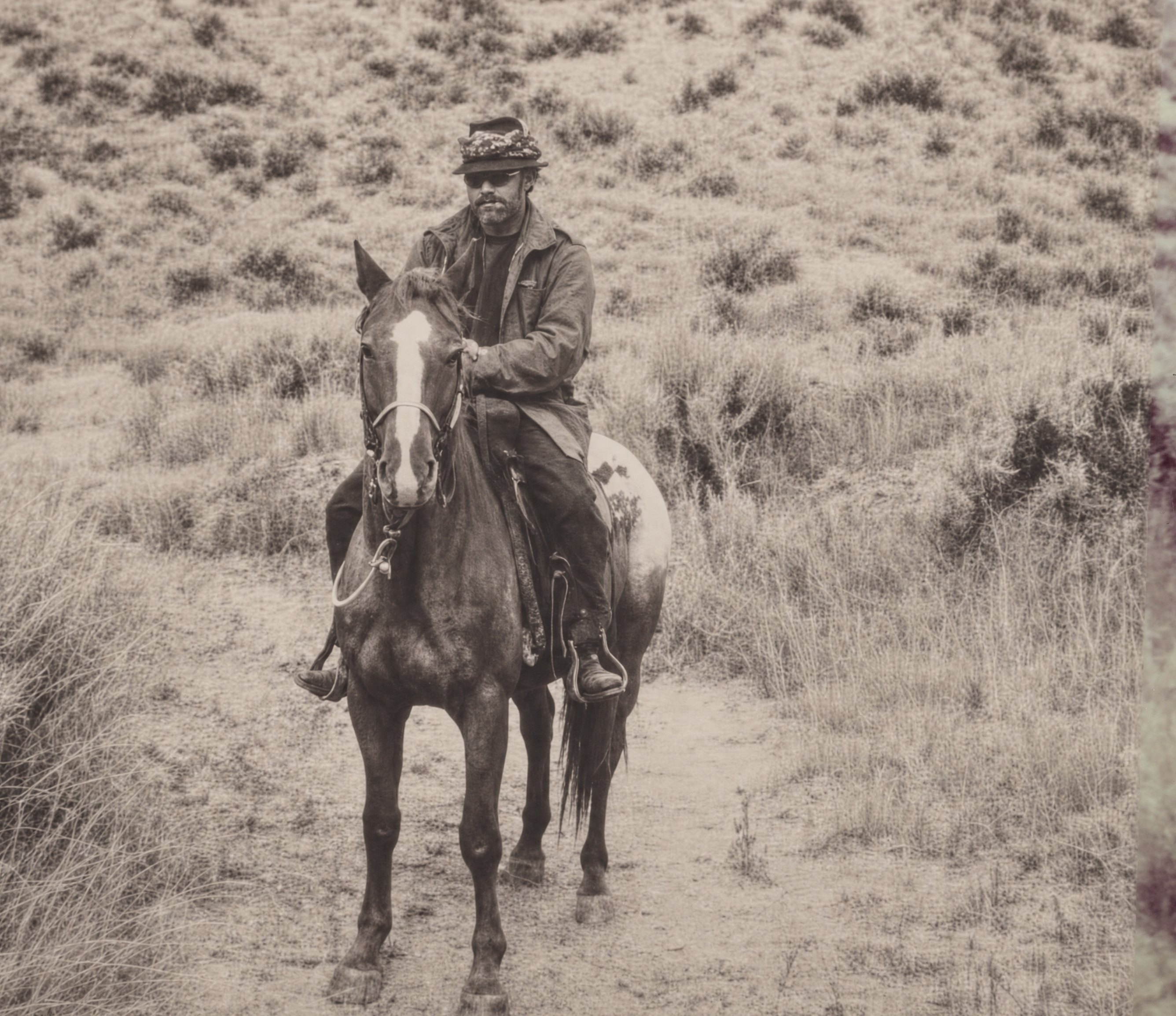
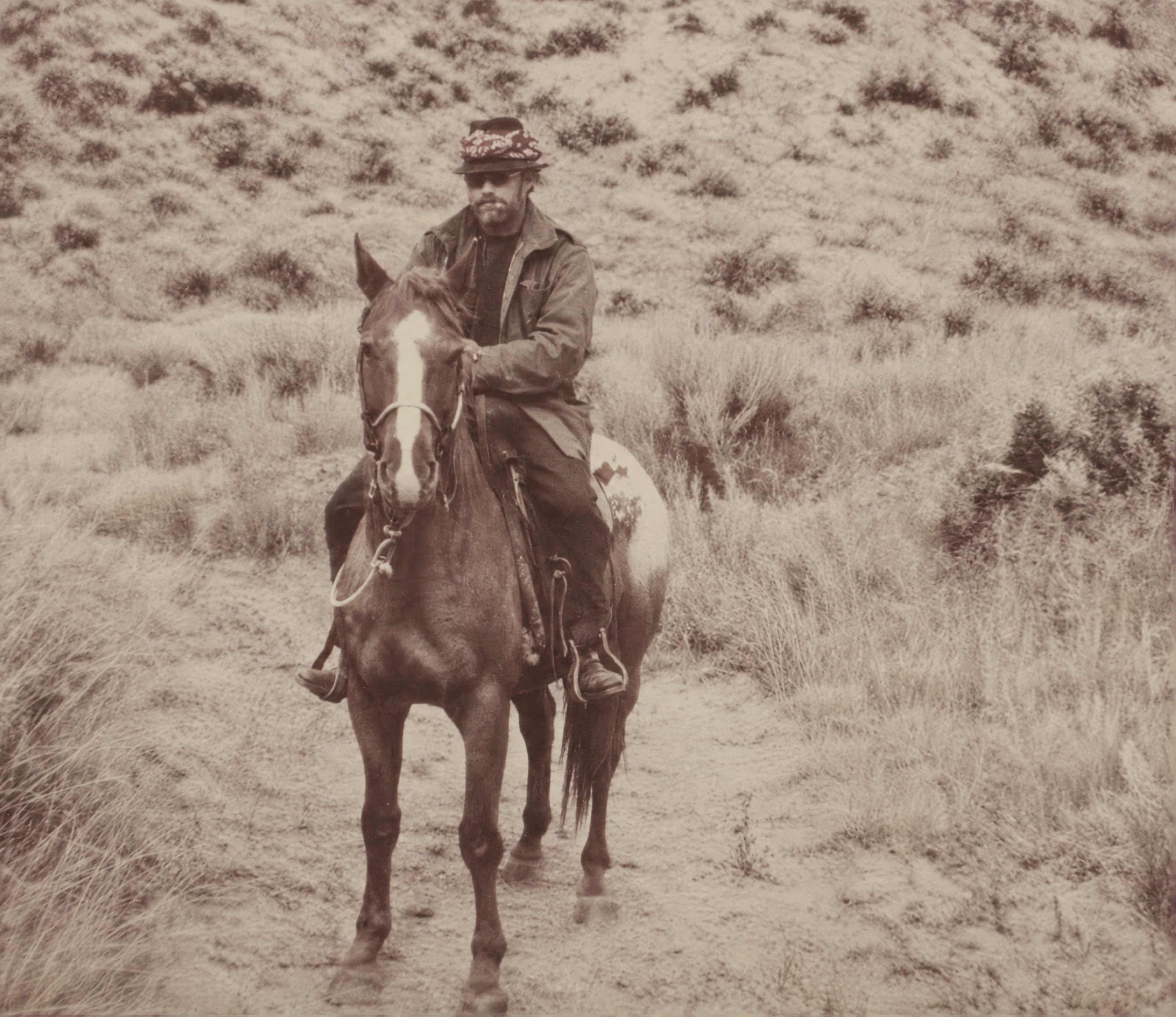
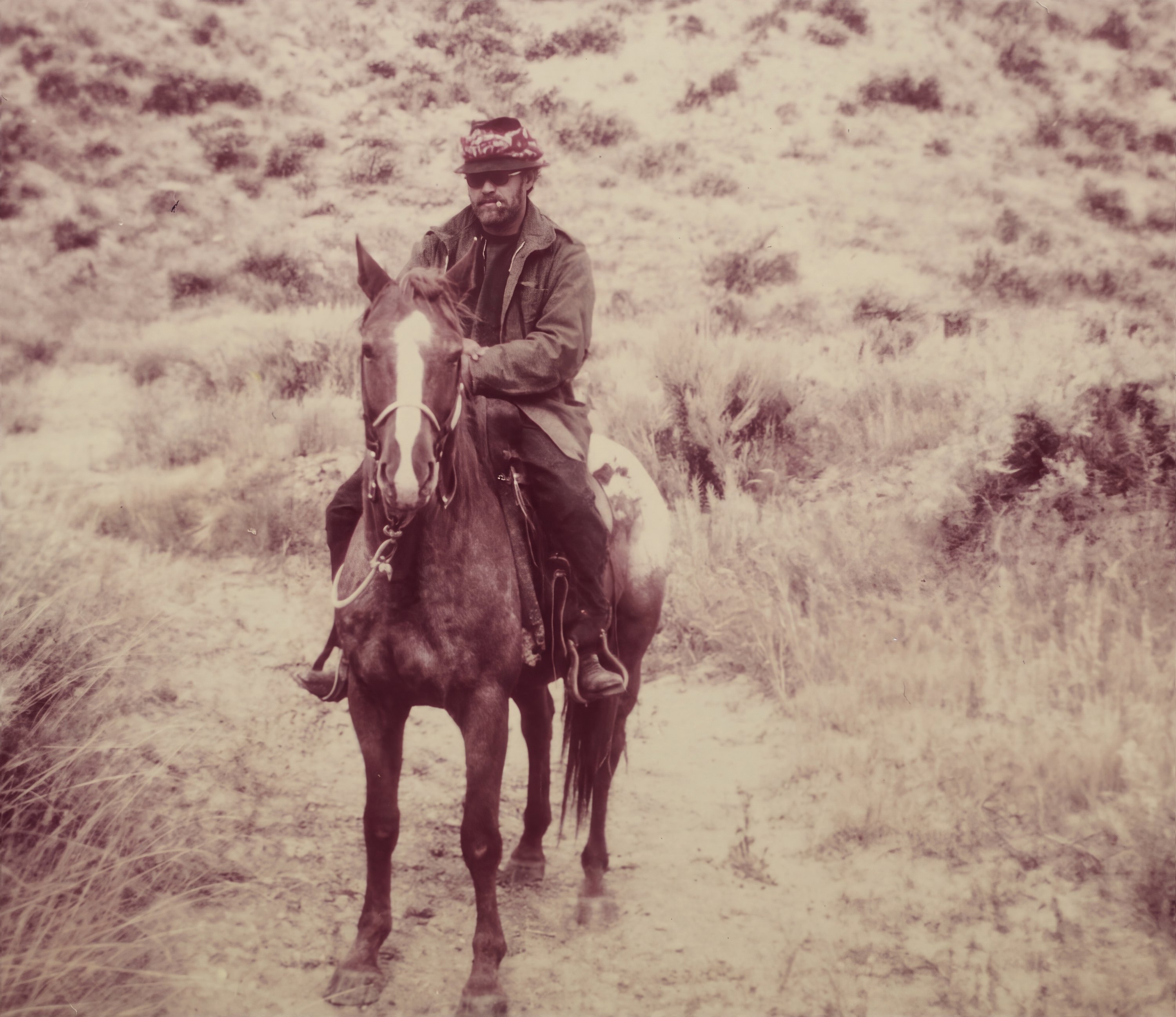
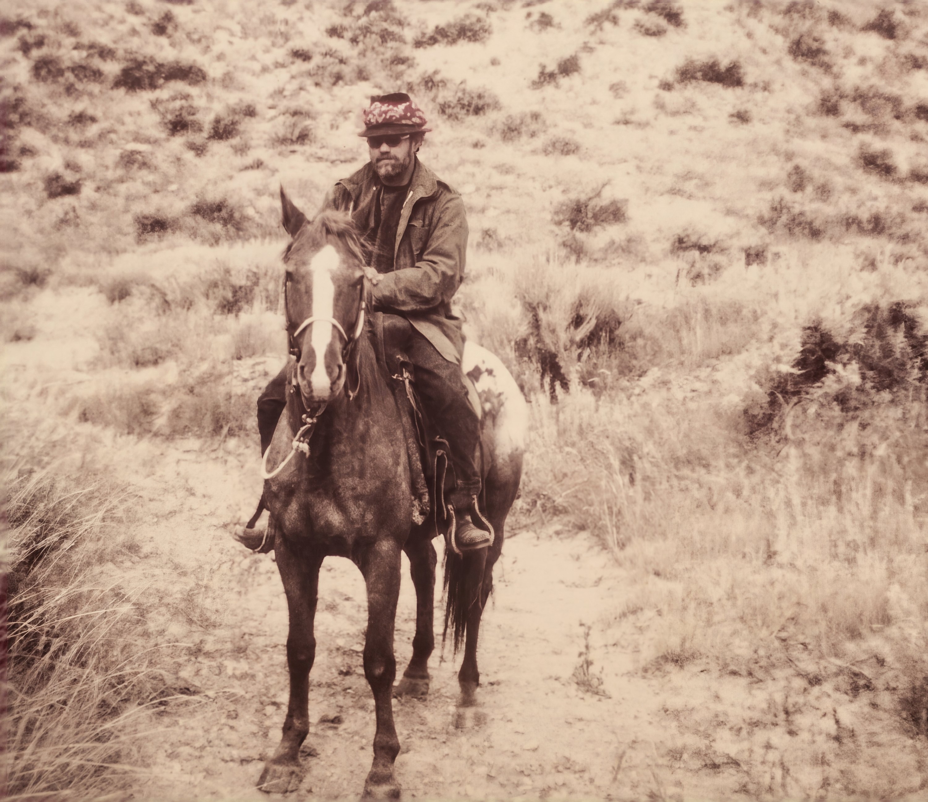
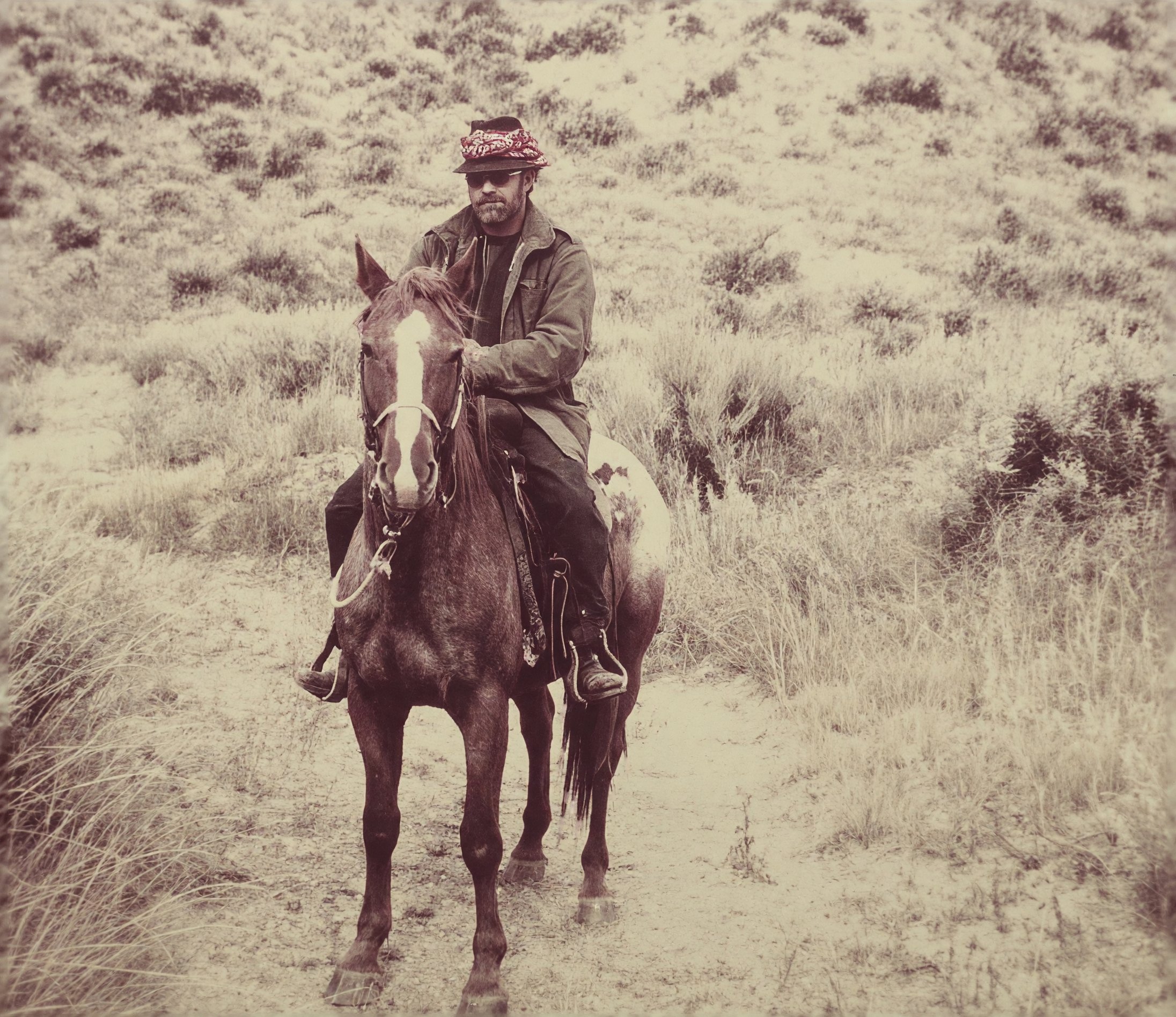
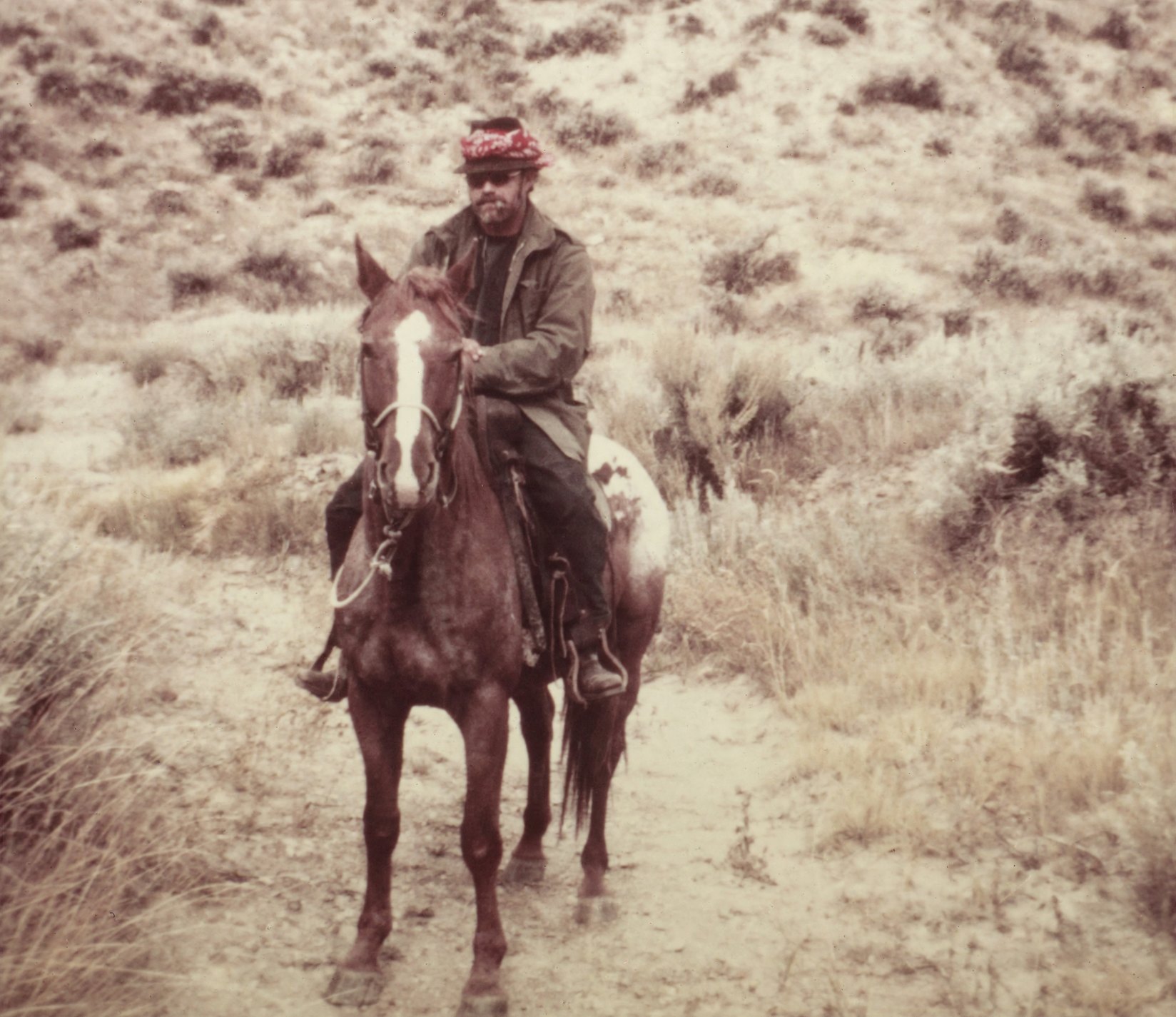
Prompt: the Repair prompt in the steps above.
Enhance: Fix the damage and add gentle, believable color, without making it look new.
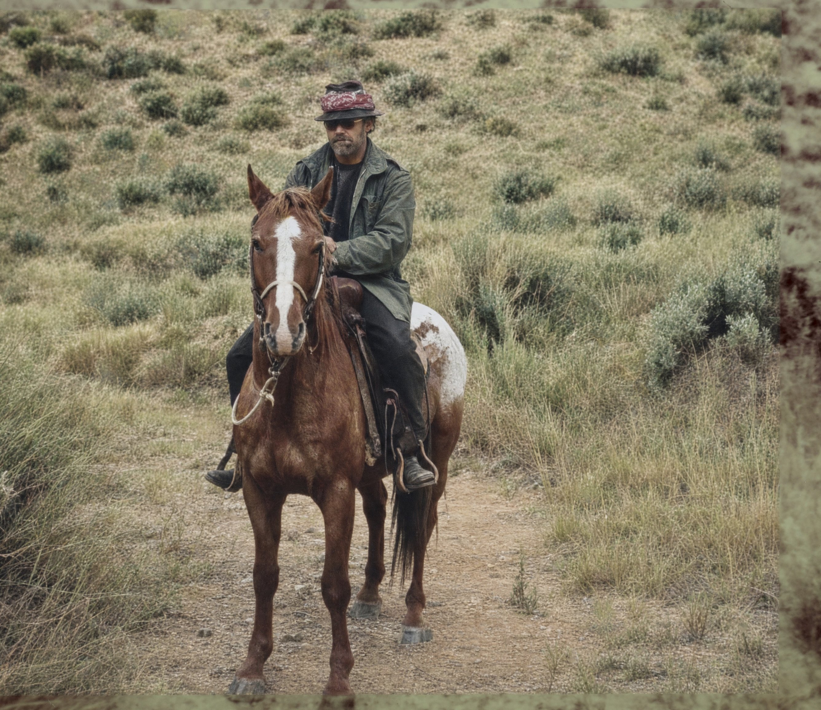
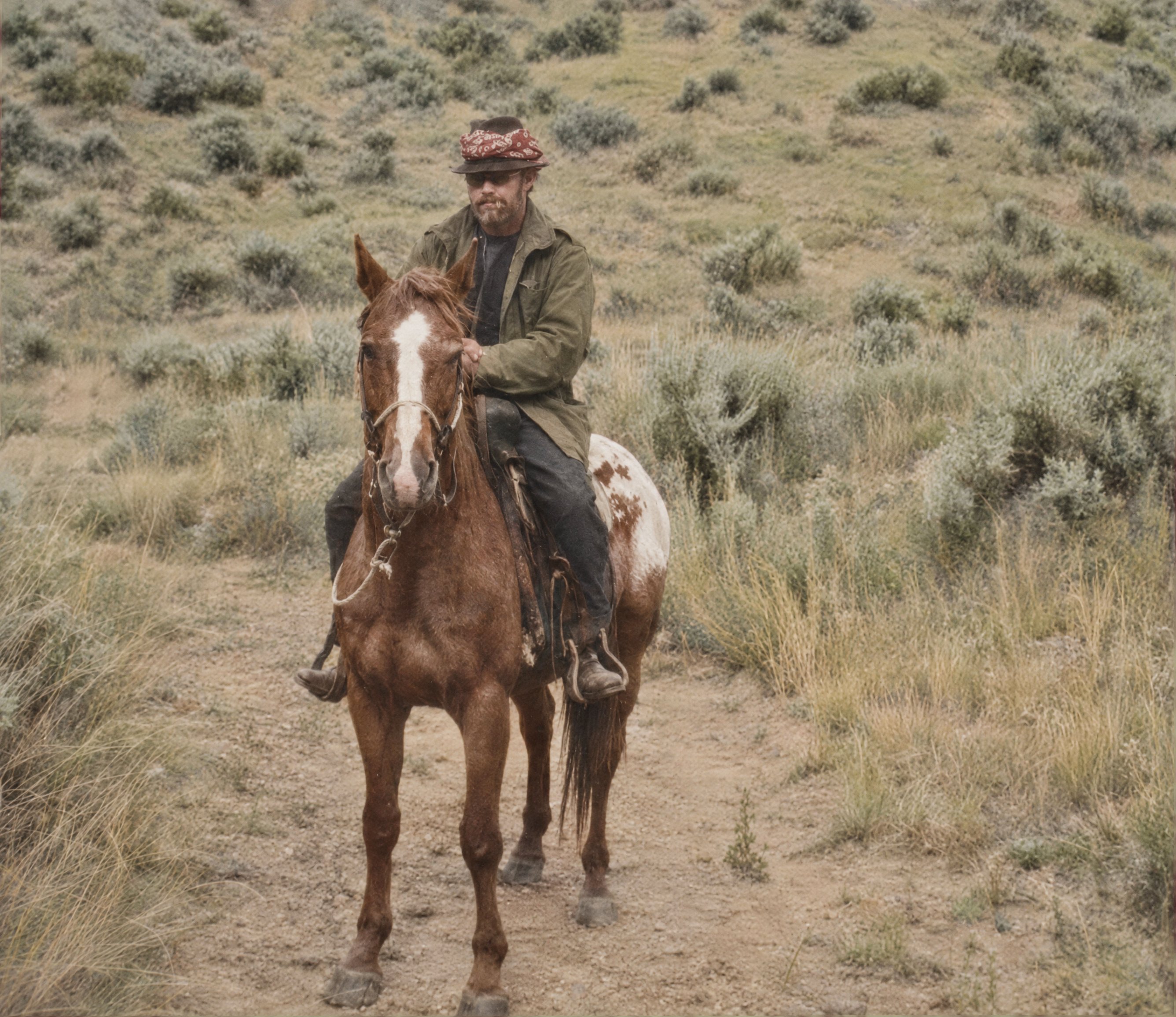
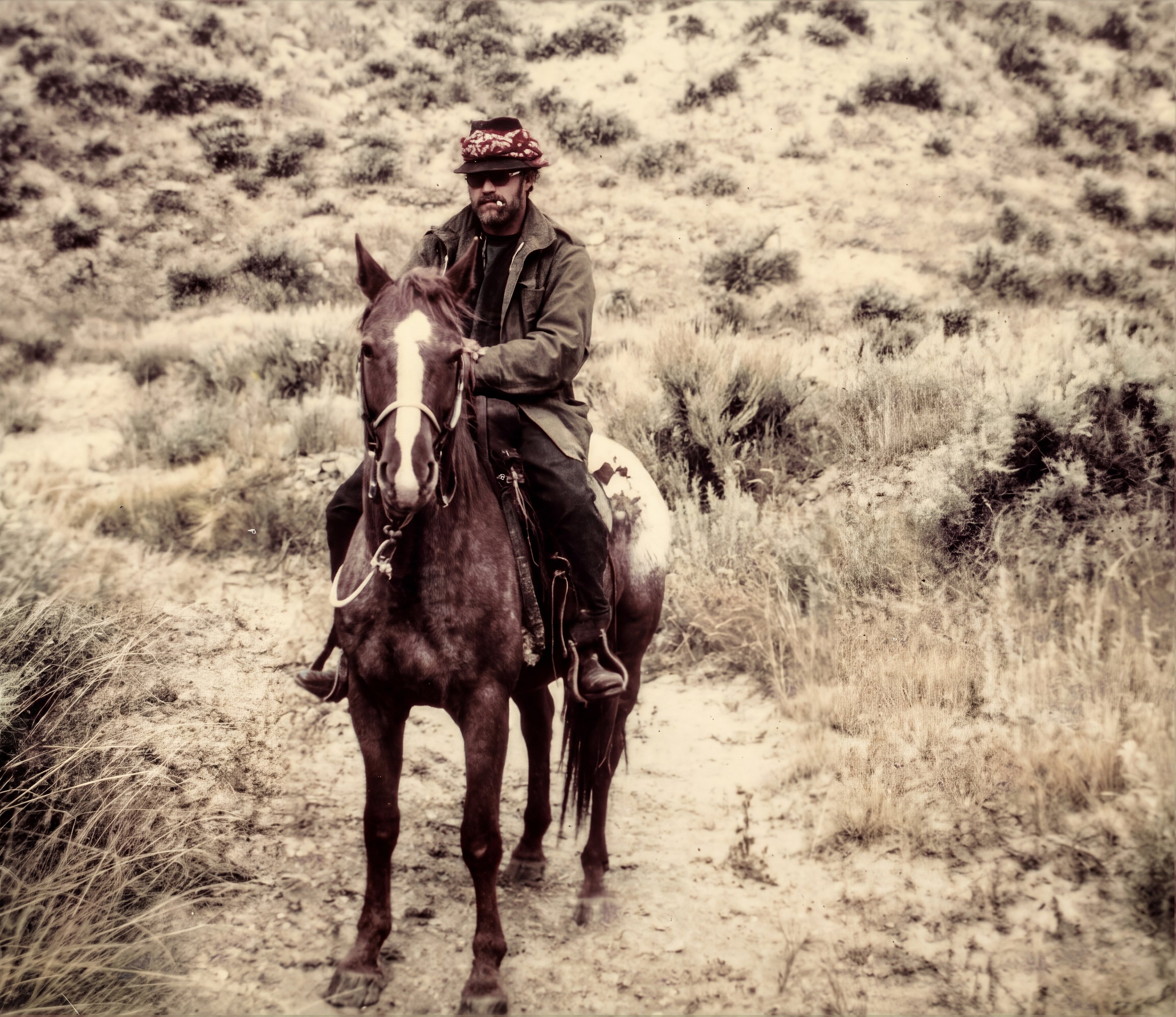
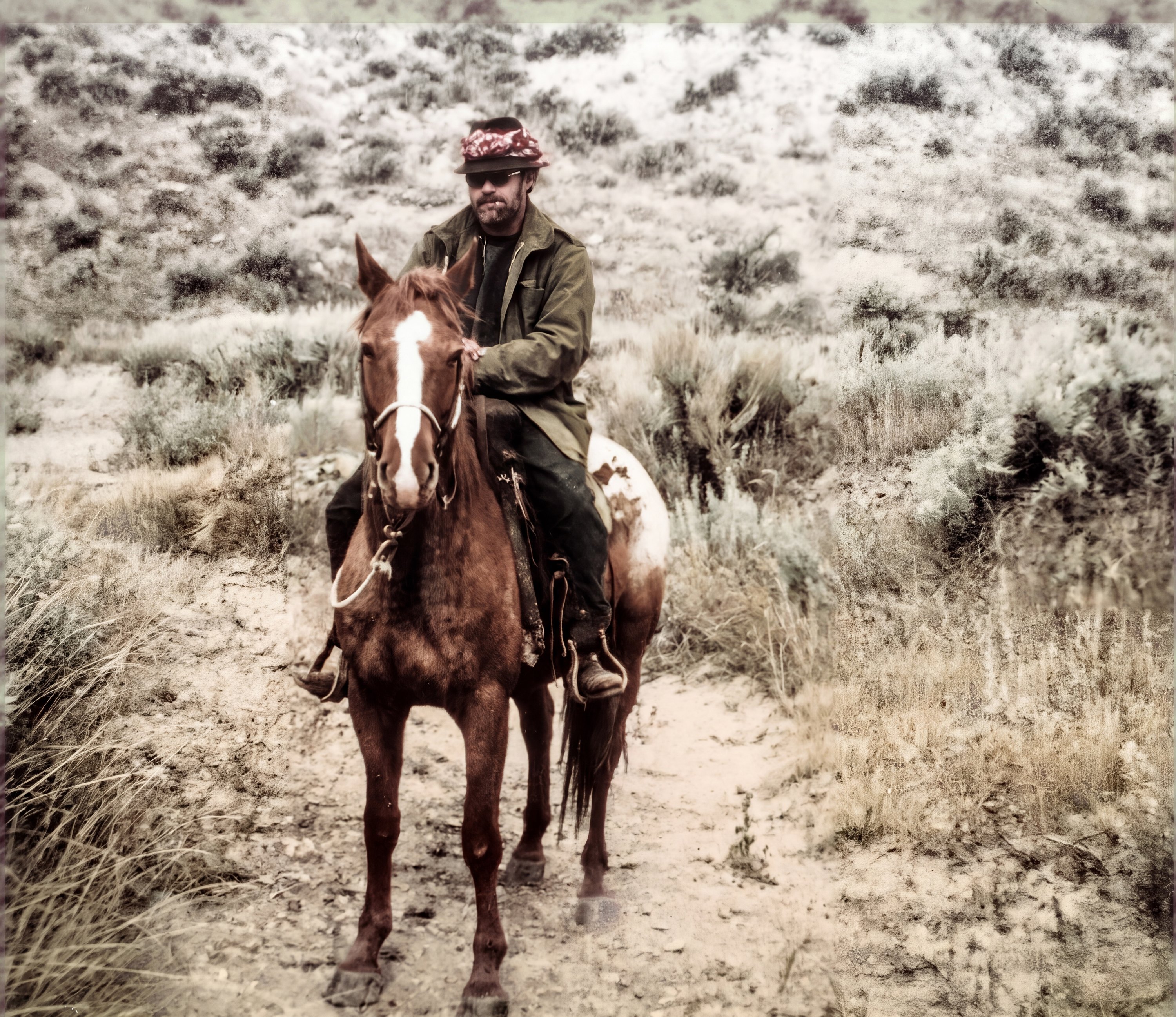
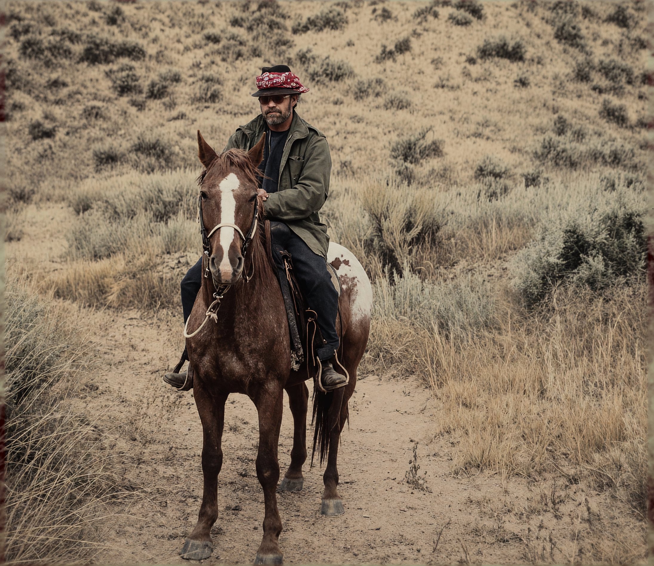
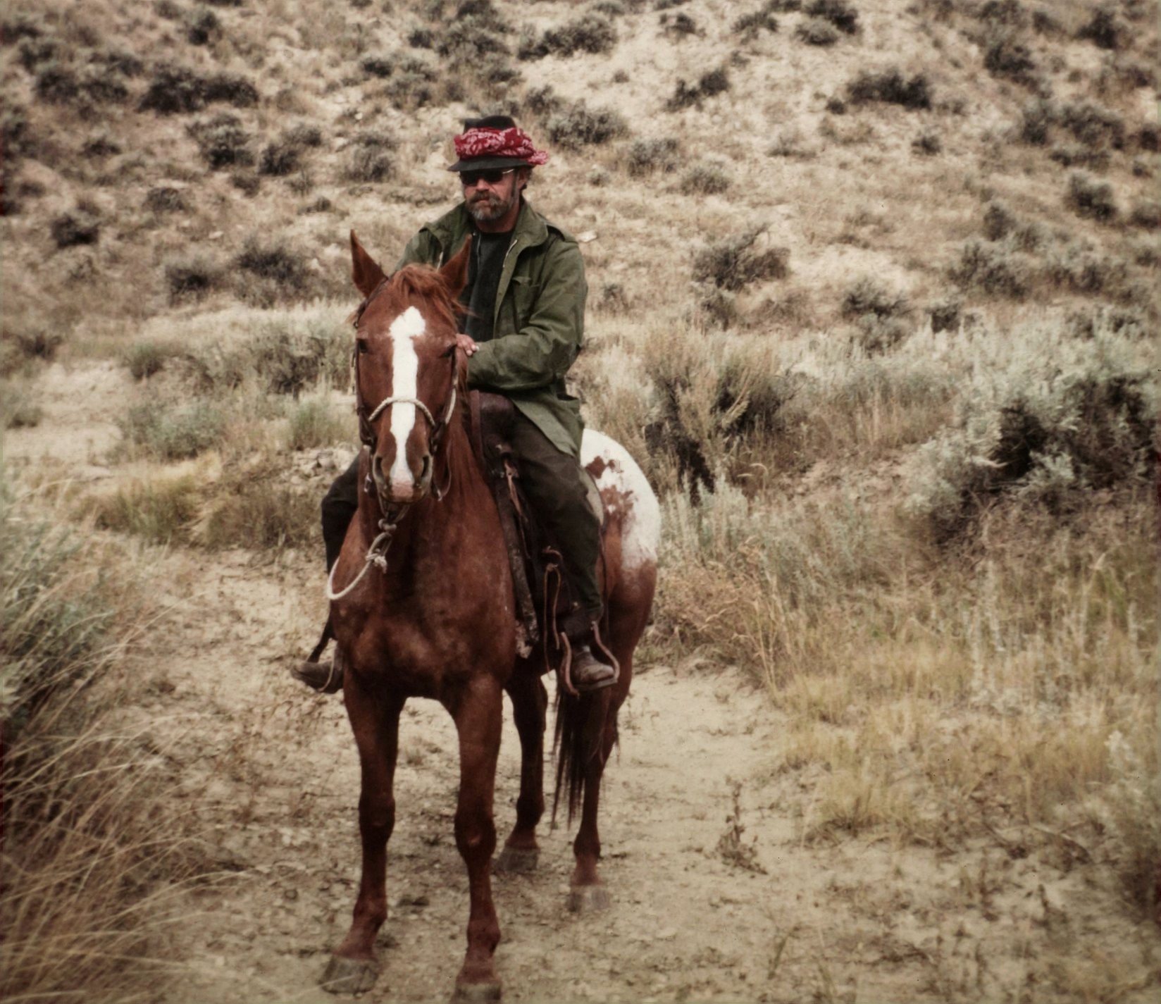
Prompt: the Enhance prompt in the steps above.
Reimagine: Make it look as if it were taken recently with a good modern camera, accepting small changes to faces.
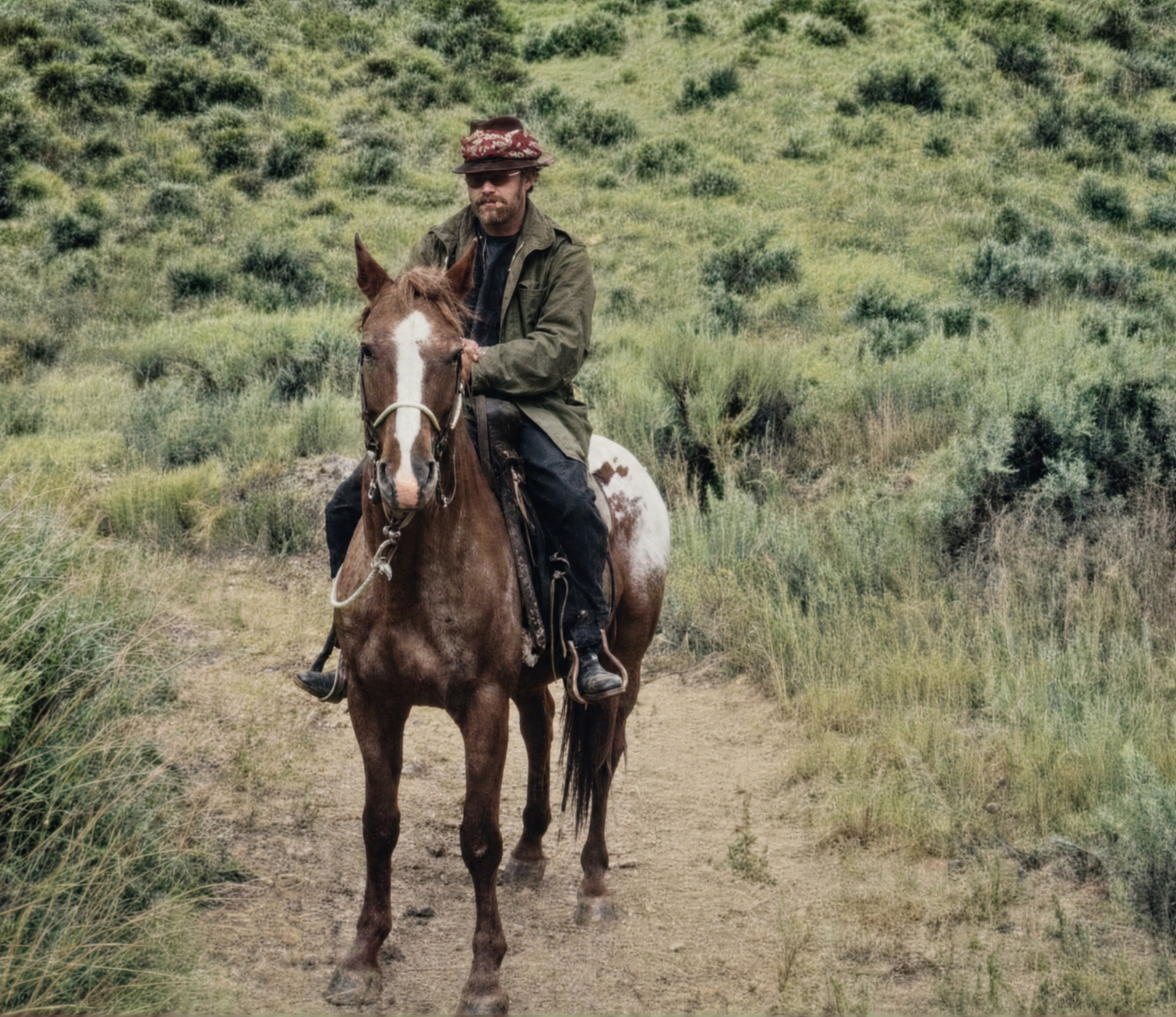
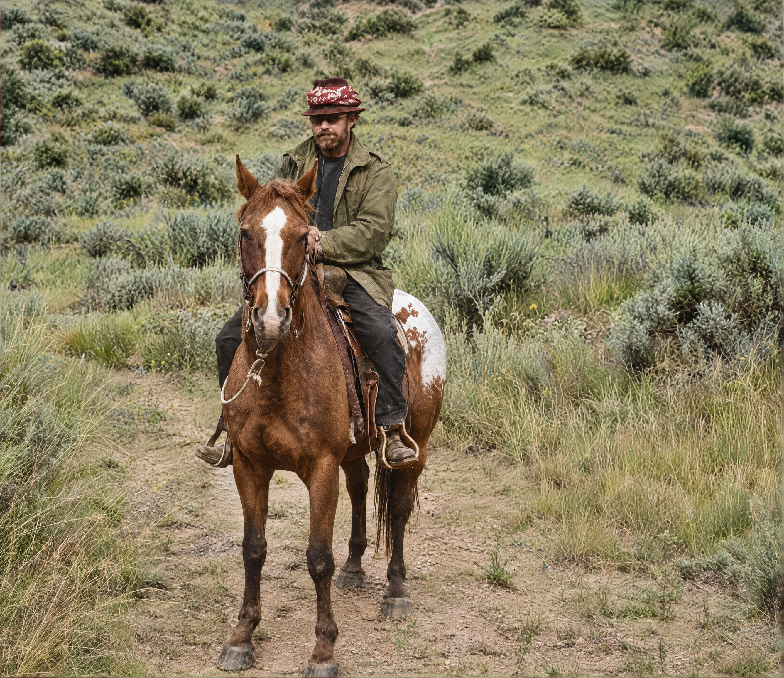
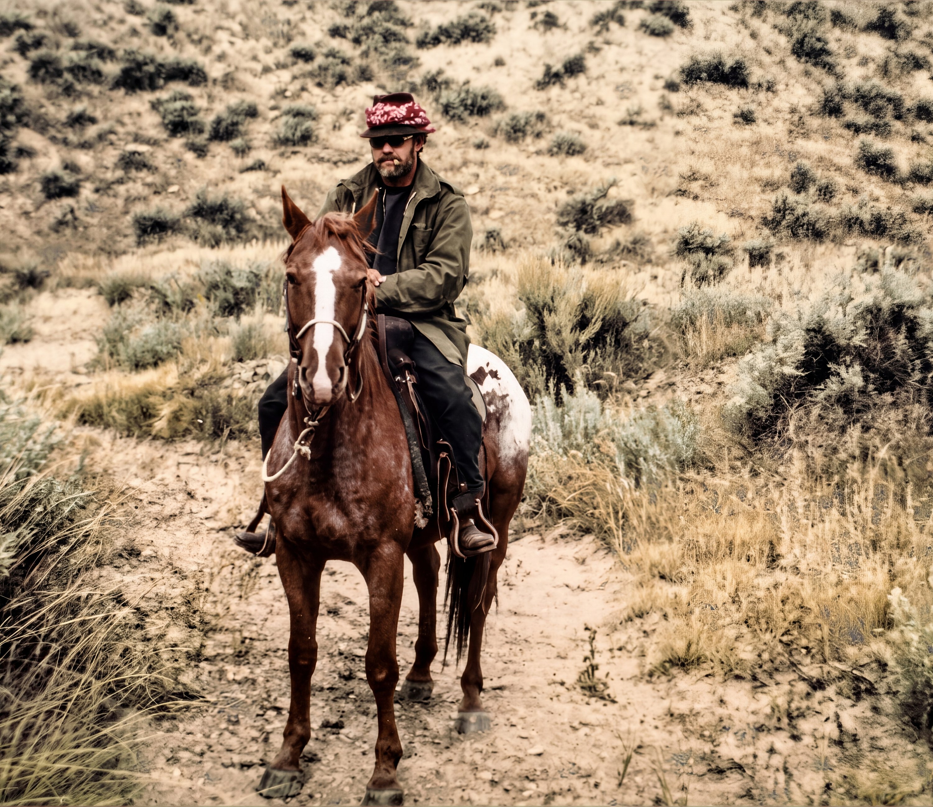
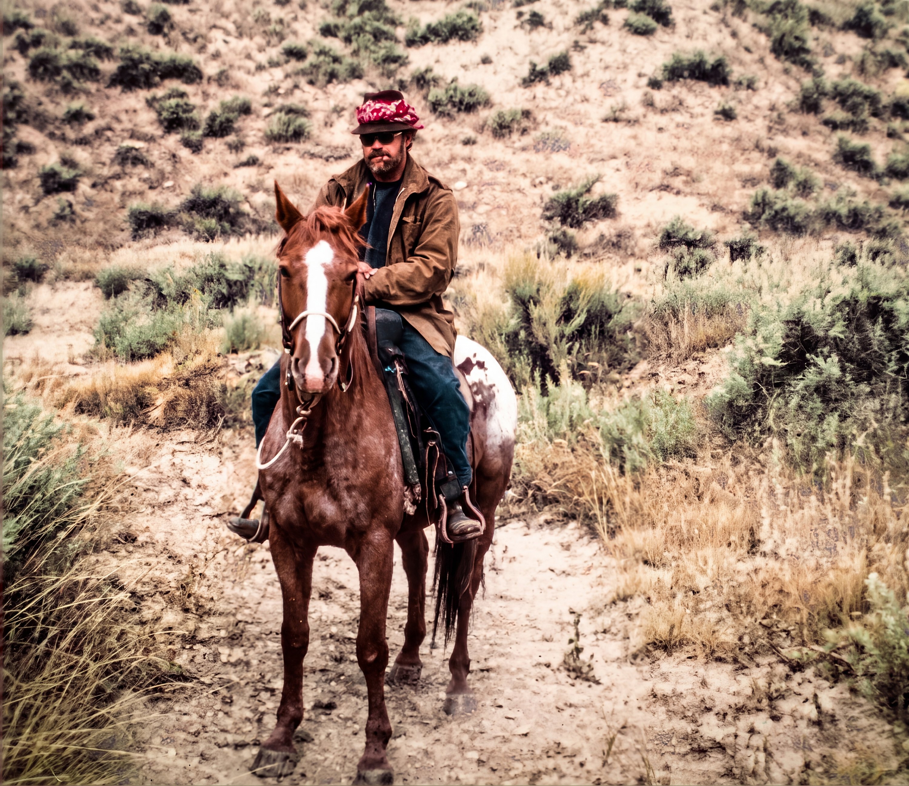
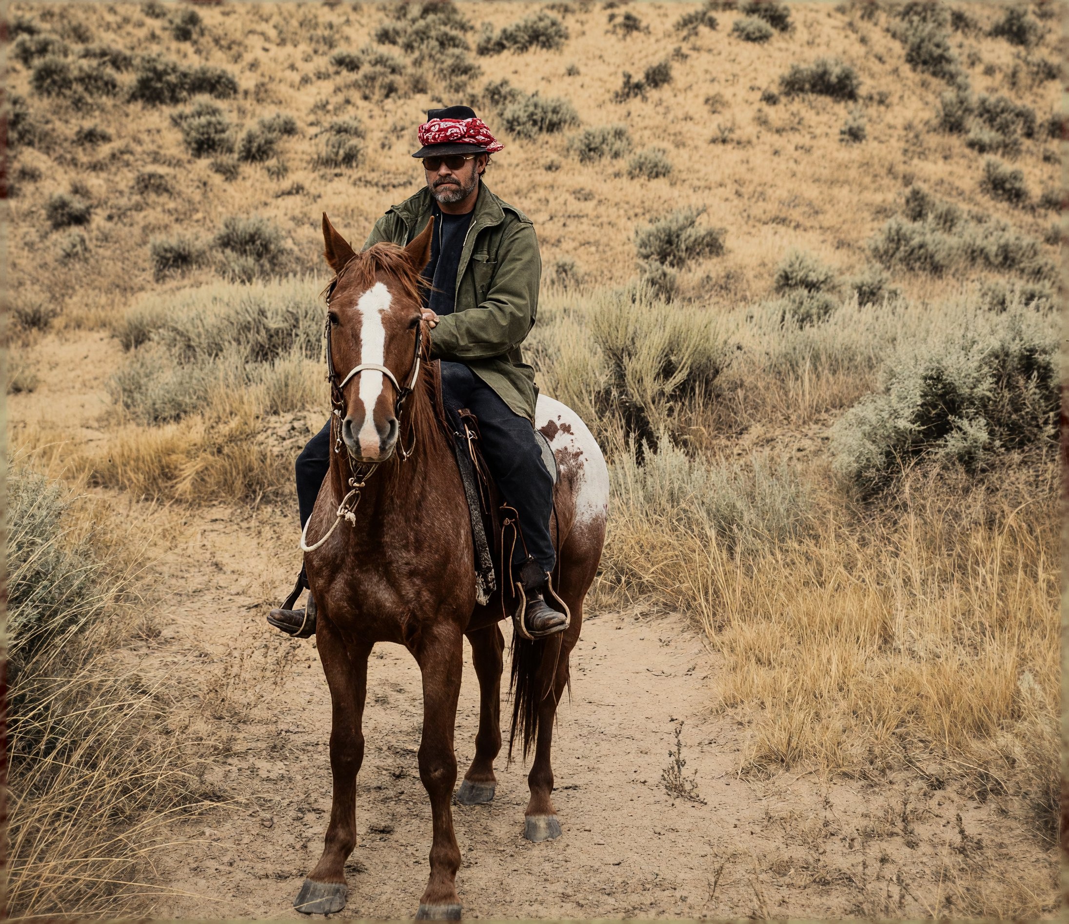
Prompt: the Reimagine prompt in the steps above.
What changed from prompt to prompt
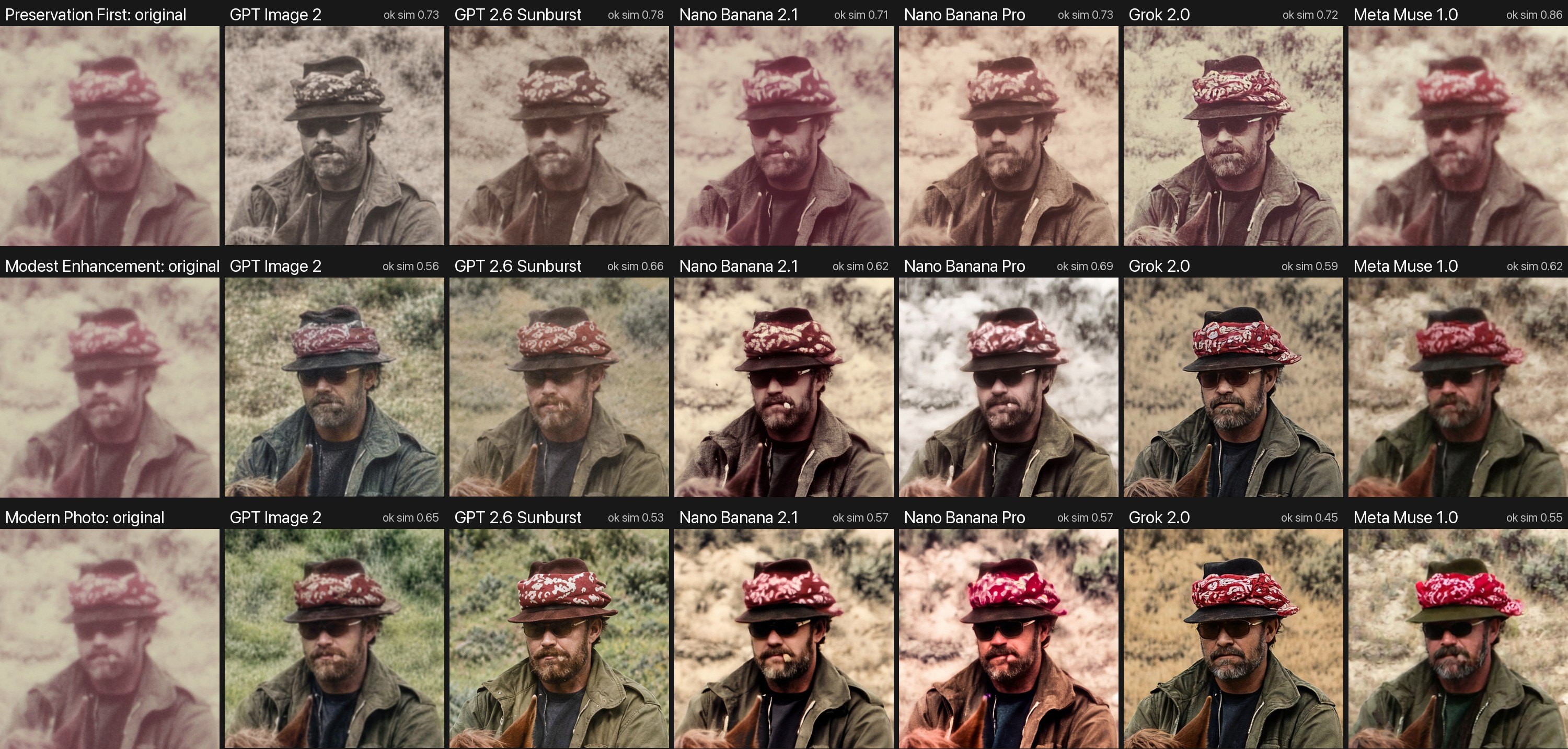
- Repair kept the look, mostly. Meta and Nano Banana 2.1 stayed closest to the faded print. GPT Image 2 went further than asked and turned the sepia into a nearly neutral gray.
- Color is a guess. With color allowed, the OpenAI models painted lush green hills; Grok, Meta, and Nano Banana 2.1 chose dry, tan sagebrush. Nano Banana Pro turned the green coat brown. Nothing in the photo says which is right.
- More polish, more drift. The face-match scores fall as the prompts allow more change: about 0.7 to 0.86 for Repair, and as low as 0.45 for Reimagine.
The case of the disappearing cigar
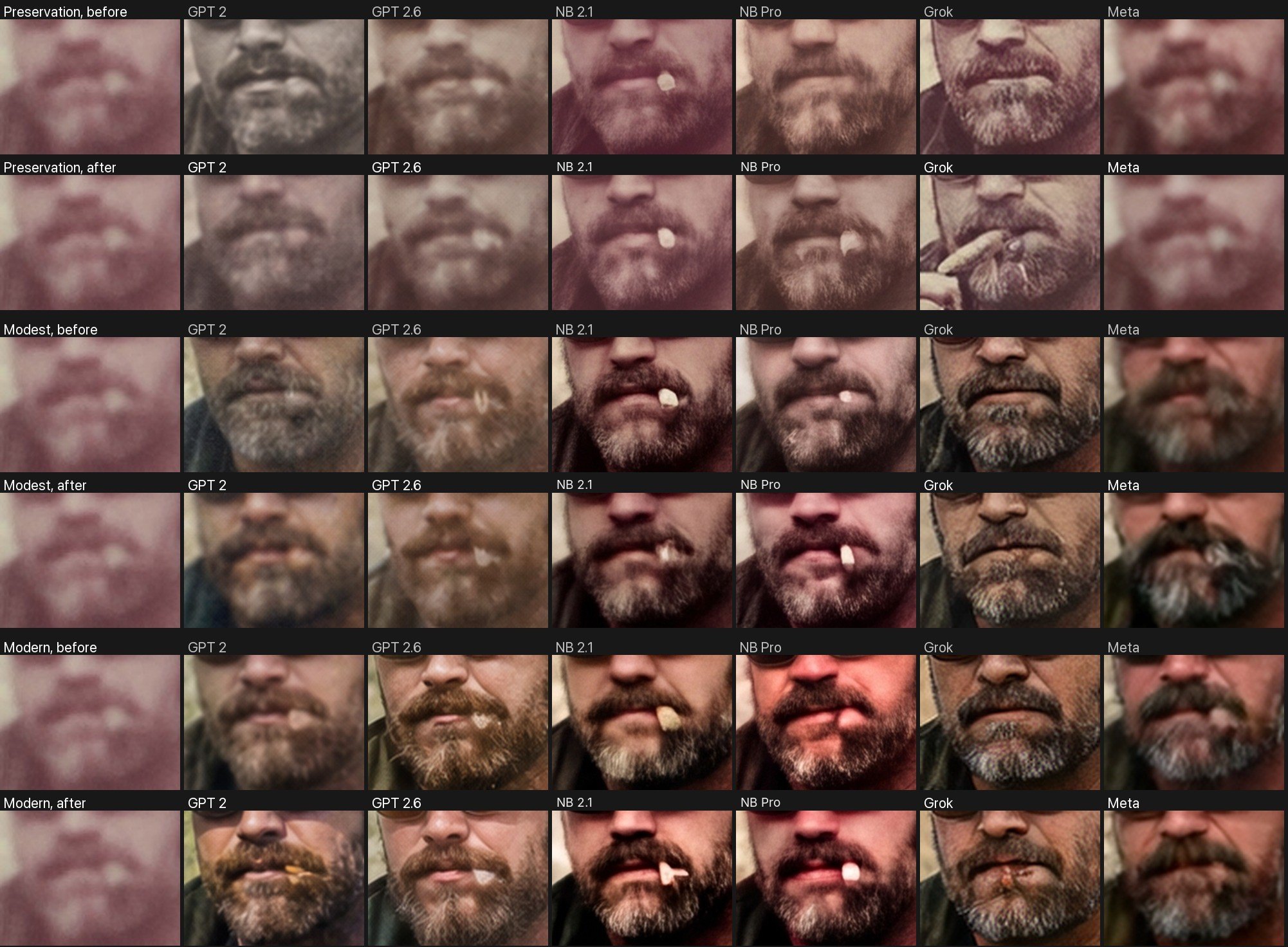
In the original, a small pale mark at the corner of his mouth is a cigar. Some models kept it: the two Gemini models drew it in most versions, and GPT Image 2.6 kept a pale mark. Others, including GPT Image 2 and Grok, cleaned it away as a speck of damage. A second run added one sentence to each prompt telling the models to keep small objects in people's mouths. The results were mixed. Both Gemini models then kept the cigar in all three versions, including the Repair version where Nano Banana Pro had lost it. But GPT Image 2 still left it out of the Repair version, and Grok invented a hand holding it.
Which model restores best?
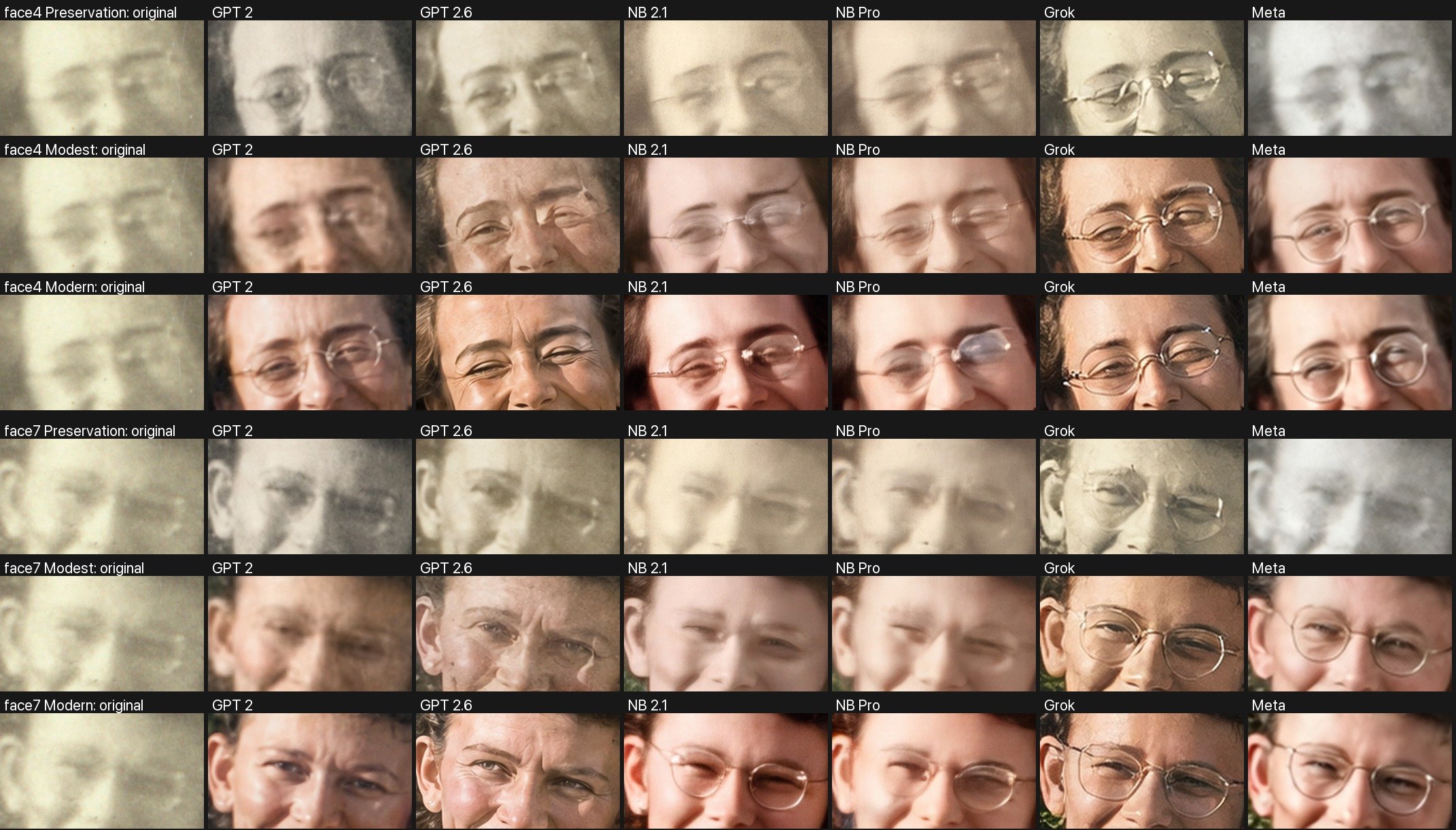
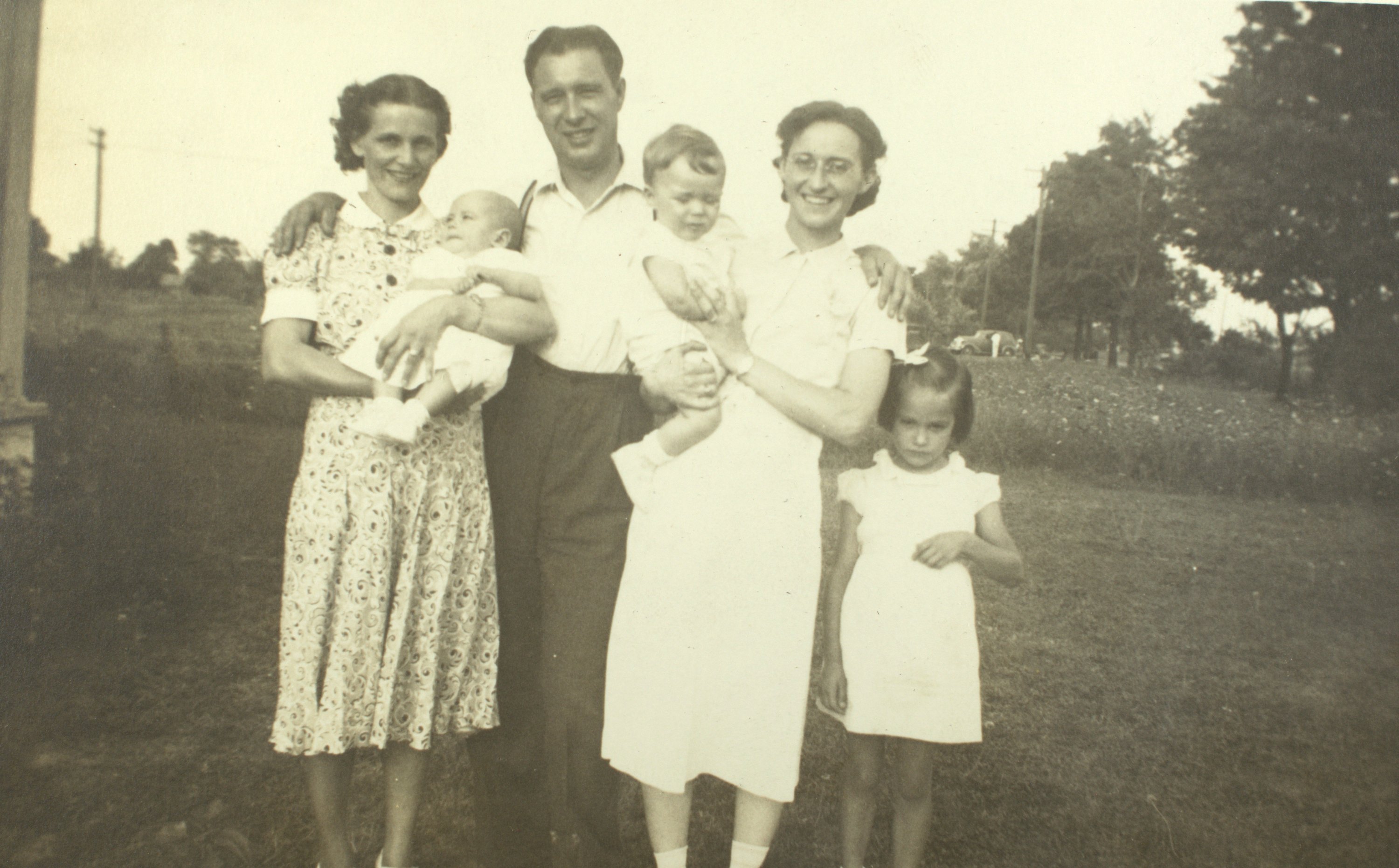
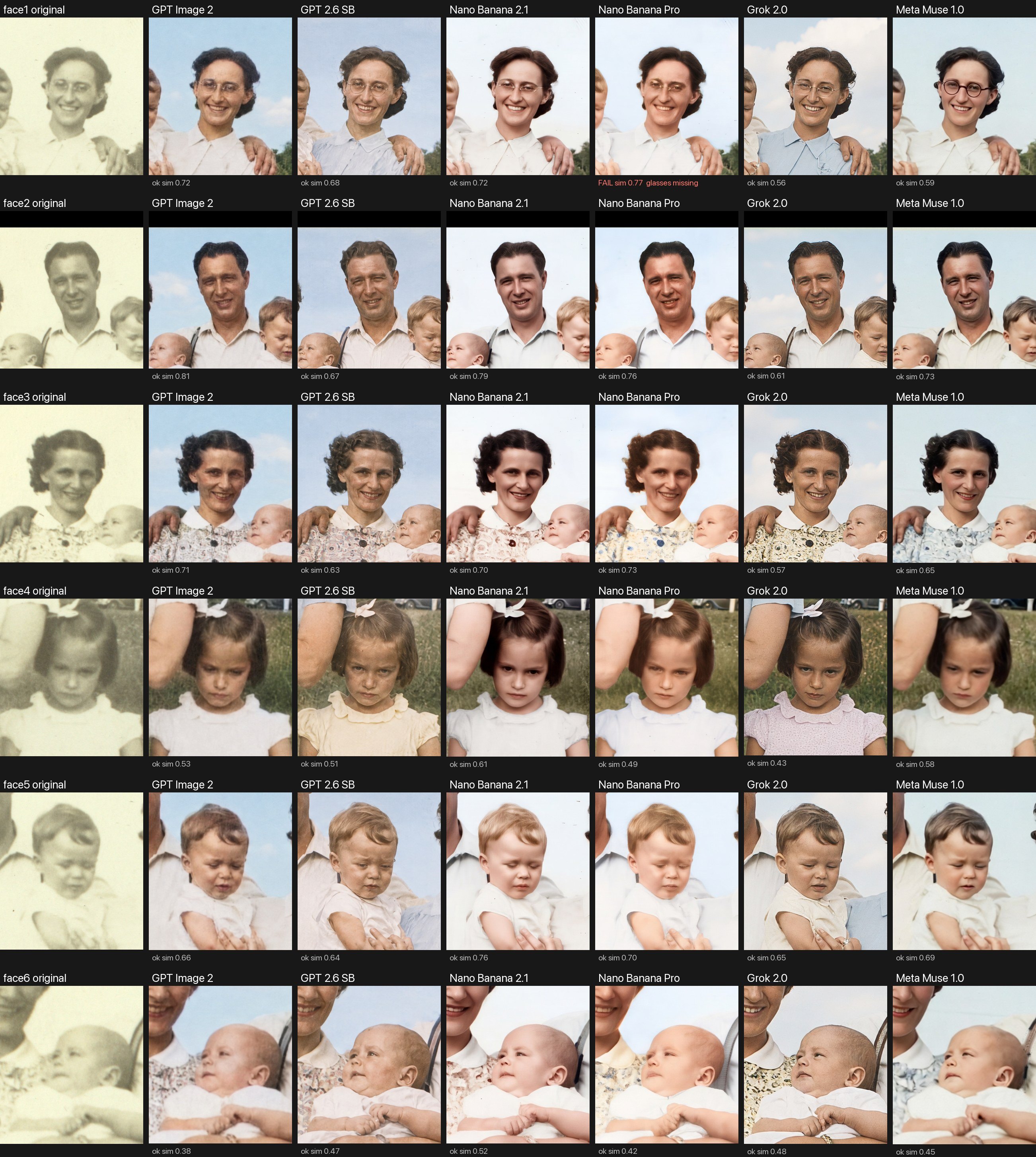
We gave one faded 1930s family snapshot to six image models from four companies, with a strict prompt that puts faces first. It says to repair and color the photo but never redraw a face, and to add nothing new: no clouds, no dirt patches, no new paths, and no changes to glasses or clothing. Every model repaired the damage. Every model also broke at least one of those rules.
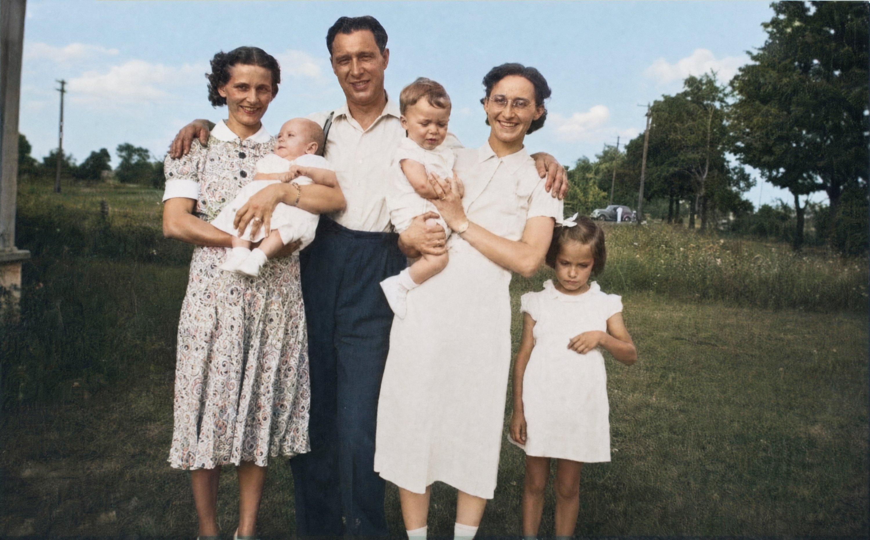
Developer API only
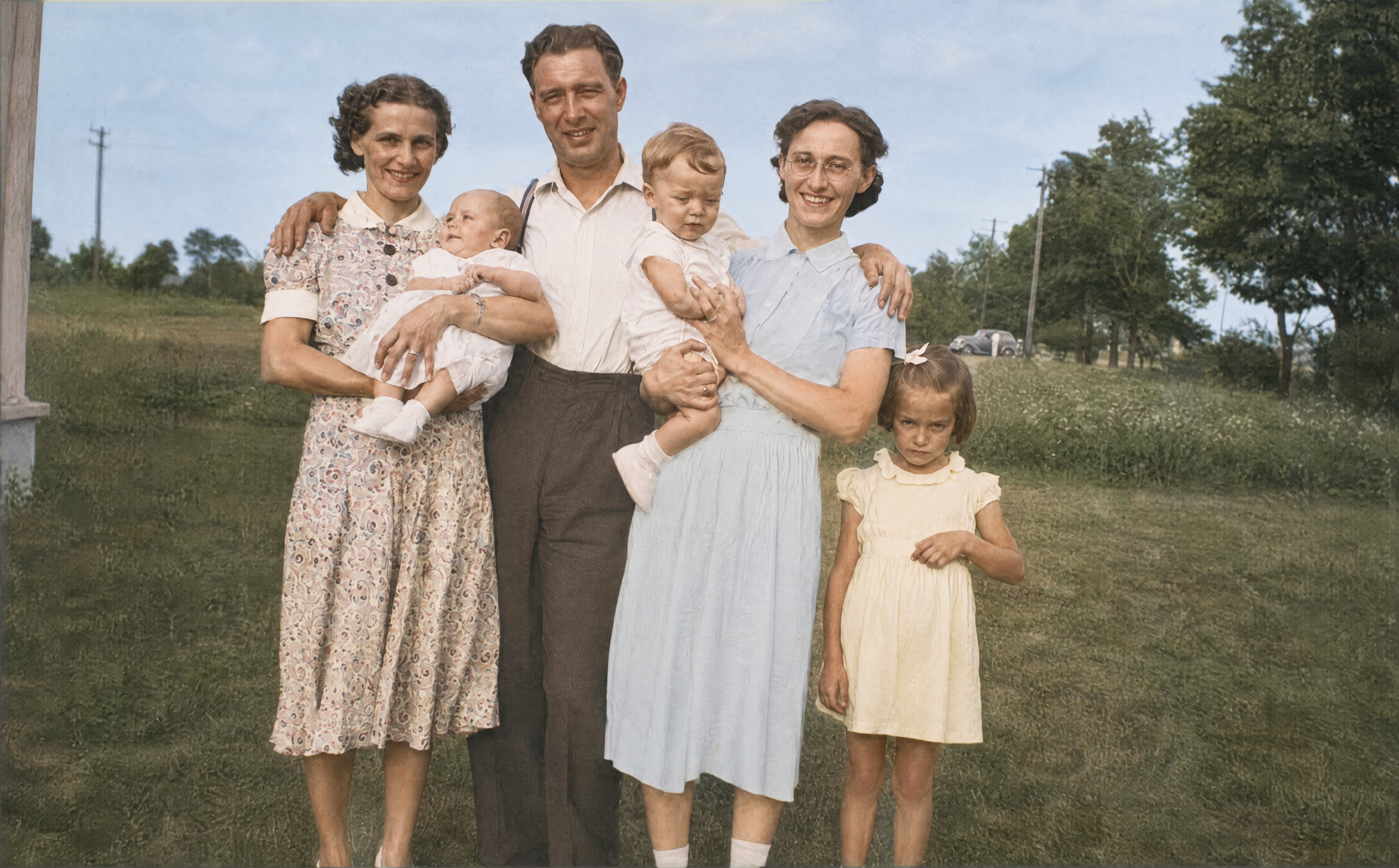
ChatGPT, every plan
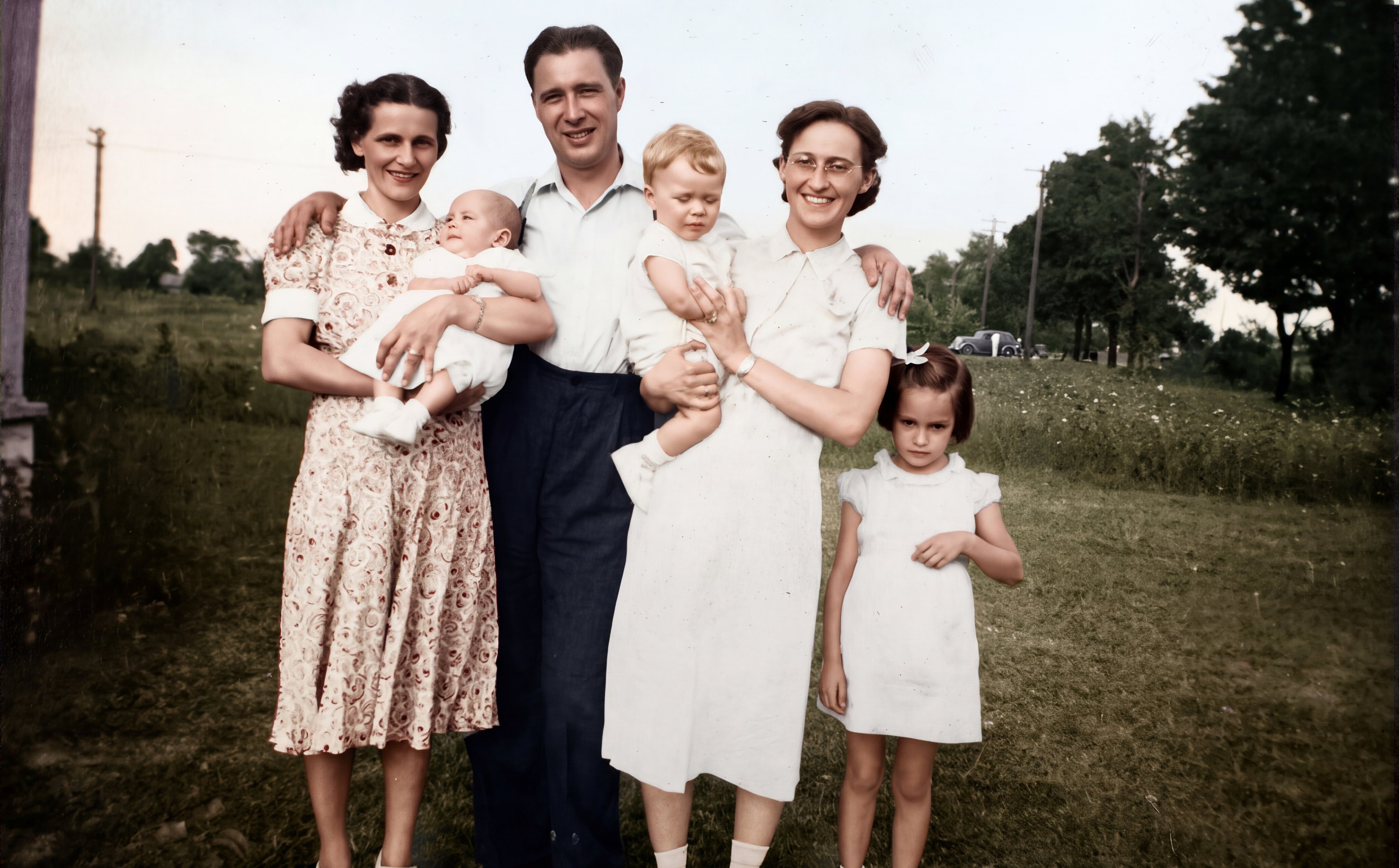
Gemini, paid plans
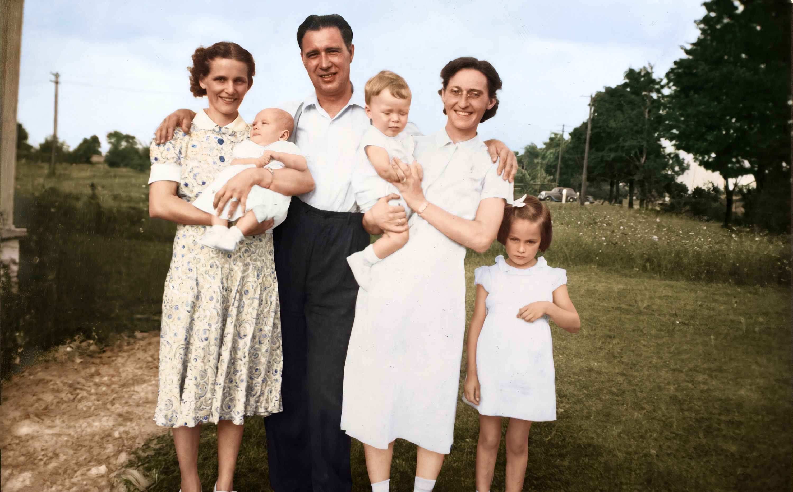
Gemini, paid plans, through Redo with Pro
Grok, free with limits and on paid plans
Meta AI, free
Look closely at the faces

| Model | The scene | The faces |
|---|---|---|
| GPT Image 2 | Restrained, believable color. Added a few small clouds to the blank sky. | The closest to the original overall, including the girl's frown. Faces stay a little soft and grainy, as in the print. |
| GPT Image 2.6 | Soft pastel clothing, including a blue dress and a yellow dress the original gives no hint of. | Expressions kept, but faces gained creases and texture. People look older and the girl's scowl is harsher. |
| Nano Banana 2.1 | Rich, saturated color with a pink floral dress. | Smoothed skin and darkened hair, especially the girl's. The glasses stayed, as shiny rimless frames. |
| Nano Banana Pro | Added a bare dirt patch in the lower left, which the prompt specifically forbade. | Polished and smooth. Removed the woman's glasses entirely. |
| Grok Imagine | The boldest colors, and big puffy clouds the prompt also forbade. | The lowest face-match scores. Expressions shifted, most noticeably the girl's. |
| Muse Image | Calm, natural color; nothing obvious added to the scene. | Smooth faces, and thick round red glasses where the original shows thin wire frames. |
Instructions are not guarantees: the prompt forbade clouds, dirt patches, and changes to glasses, and models did all three anyway. A sharper, more colorful result is not a more accurate one, and the additions are easy to miss because they look like they belong in an old photo. Judge the faces and the background separately, try more than once, and compare every result with the original.
One try per model, on one photograph, so these results show tendencies, not a ranking. The newsletter article below tested an earlier set of five models on the same photo, with several tries each.
Read the full article in AI, Plainly: Restoring Family Photos with AI, How Much Is Real? →
As of November 10, 2026, my own preference for a faithful restoration is still the older GPT Image 2 model. I think it does better than most, and it may be the most faithful of all. It's no longer offered in the ChatGPT app or any other public app, but it can still be used through OpenAI's developer API. That won't last: OpenAI has announced that it will shut off GPT Image 2 on February 10, 2027.
Grok has impressed me in these tests. Models are improving so quickly that new ones will likely arrive before February and change the picture (Google is overdue for a new Gemini model). If they don't, Grok may become my first choice.
If you'd like to try GPT Image 2 through the API while it lasts, talk to me after the session or write to SCHHCC.AI.SIG@gmail.com.
Ron Snyder
Design it: flyers and infographics
AI tools can now put readable words on images. The trick is to give the exact wording in quotation marks.
A flyer: stylish, not cheesy
AI flyers often look cheap because the tool falls back on clichés: balloons, confetti, cartoon hot dogs, glossy 3D lettering, and a dozen colors. The fix is to describe the design you want as specifically as you describe the event, and to name what to leave out.
Pick a style, then describe it, the wording, and what to avoid
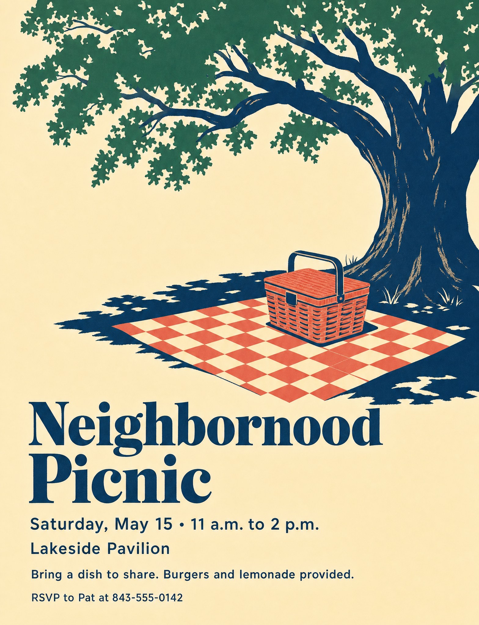
Here is the same picnic in three styles, each made by the same six models as in Demo 1. The wording is identical in all three prompts. Only the style and the list of things to avoid change. Comparing the tabs shows how much the style description shapes the flyer, and comparing the pictures in a tab shows how much the model does.
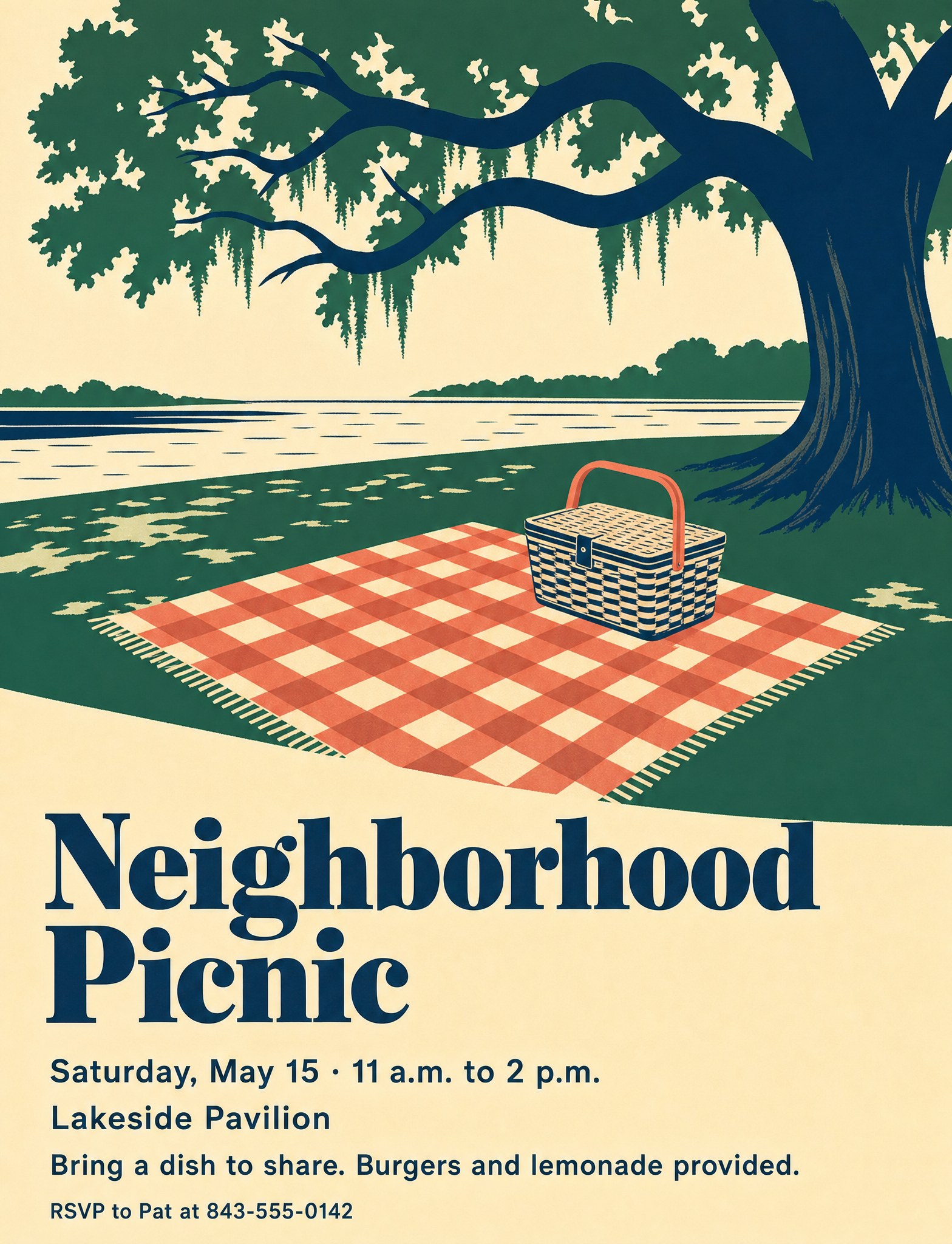
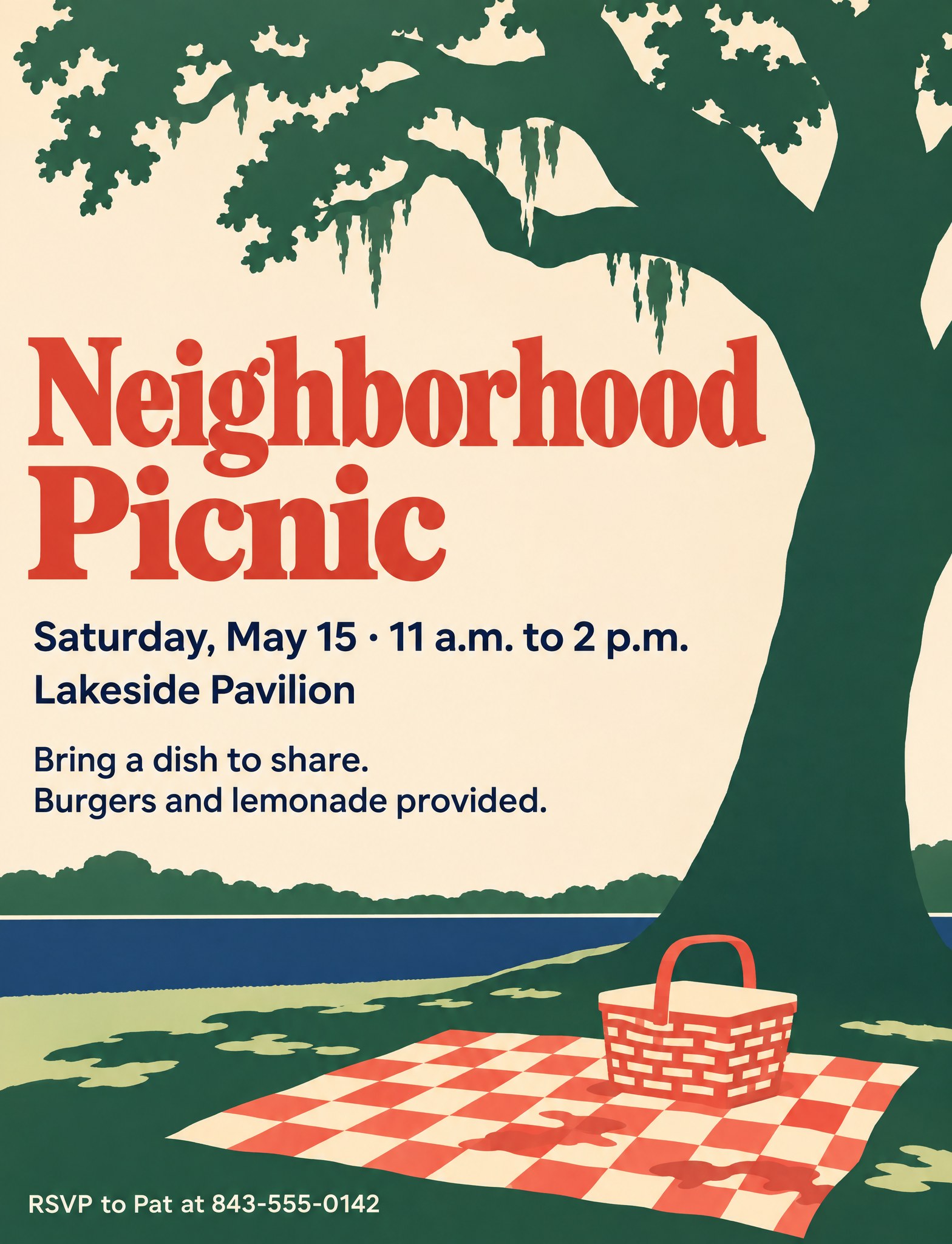
Illustrated and warm, with a retro feel. Good for a casual, friendly event.
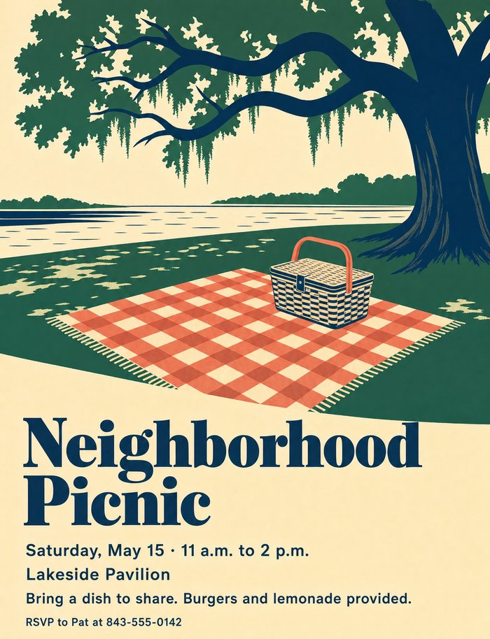
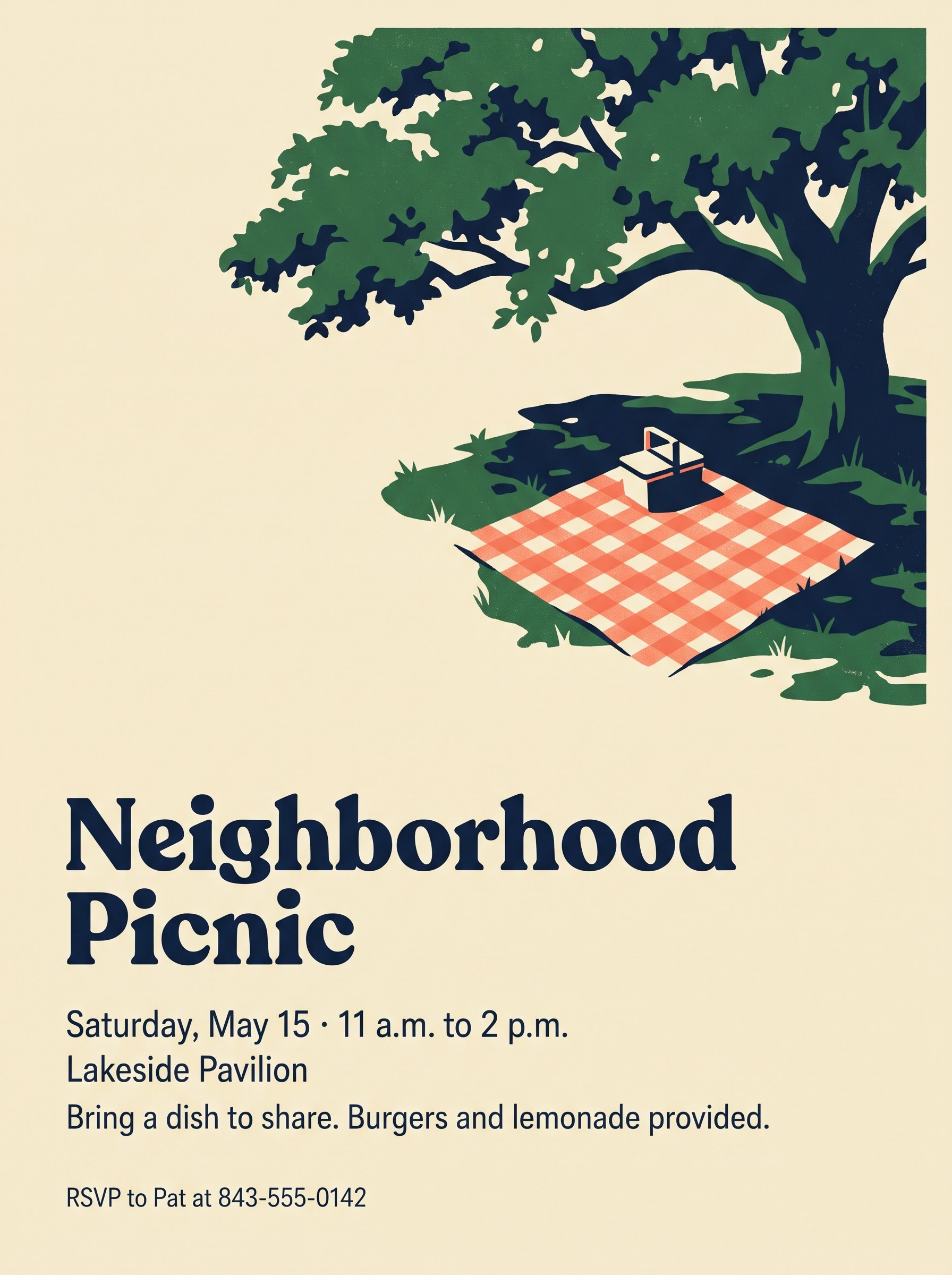
OpenAI · GPT Image 2 Headline at the bottom, with a marsh behind the oak. 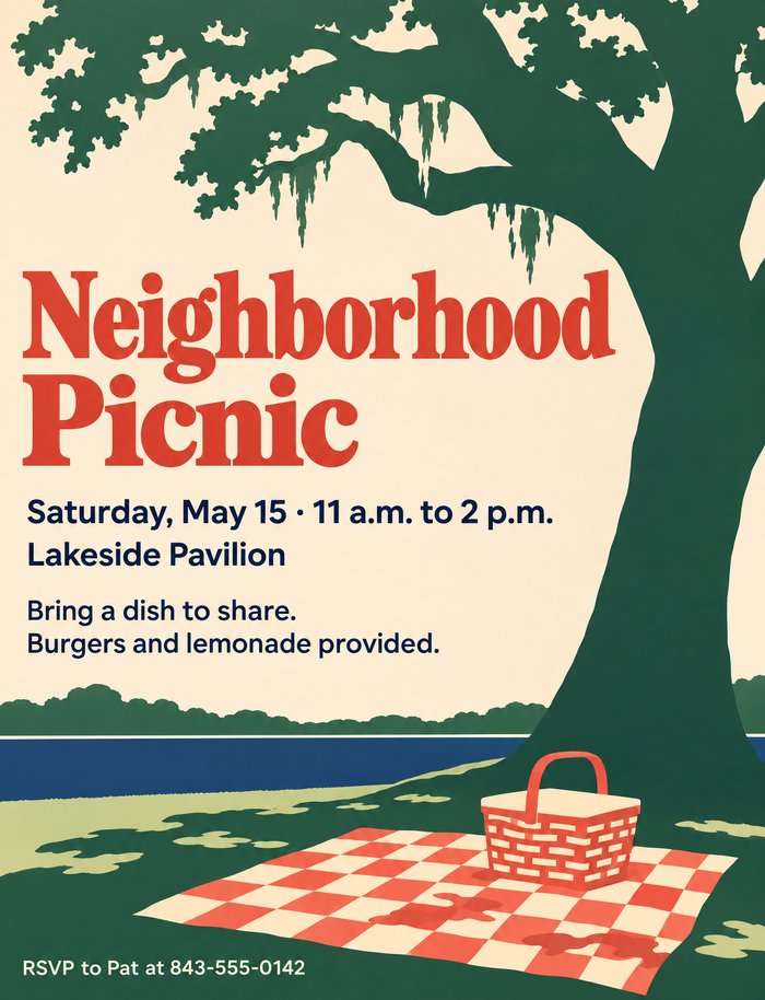
OpenAI · GPT Image 2.6 A coral headline at the top and a lake behind the blanket. 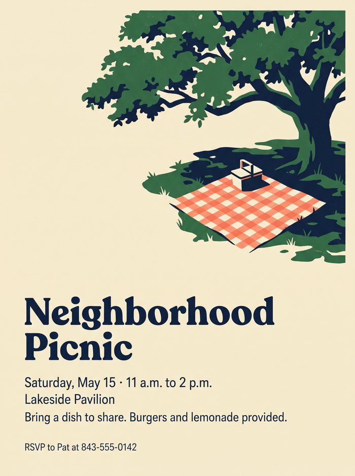
Google · Nano Banana 2.1 Tidy and balanced, with the most empty space. 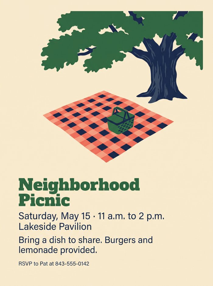
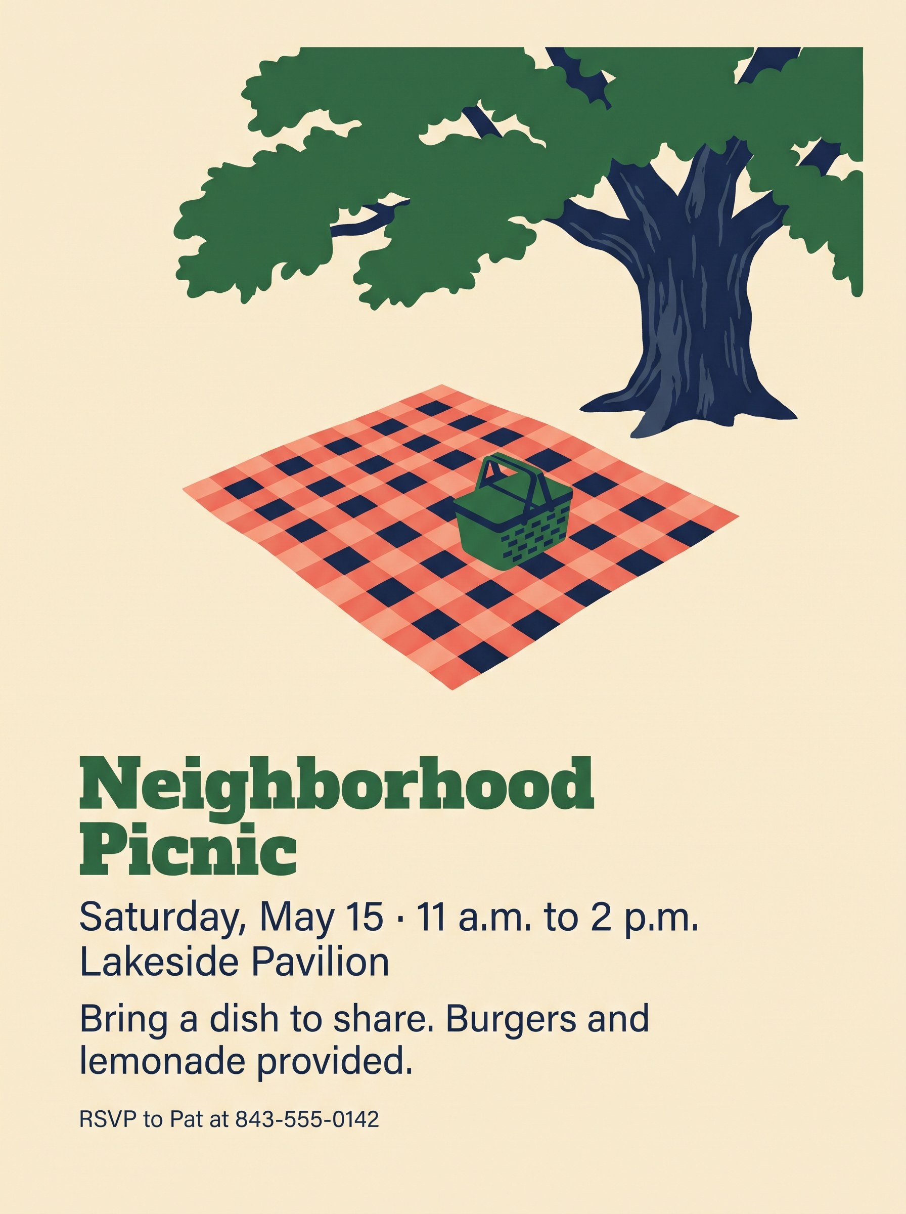
Google · Nano Banana Pro A green headline, and navy checks on the blanket. 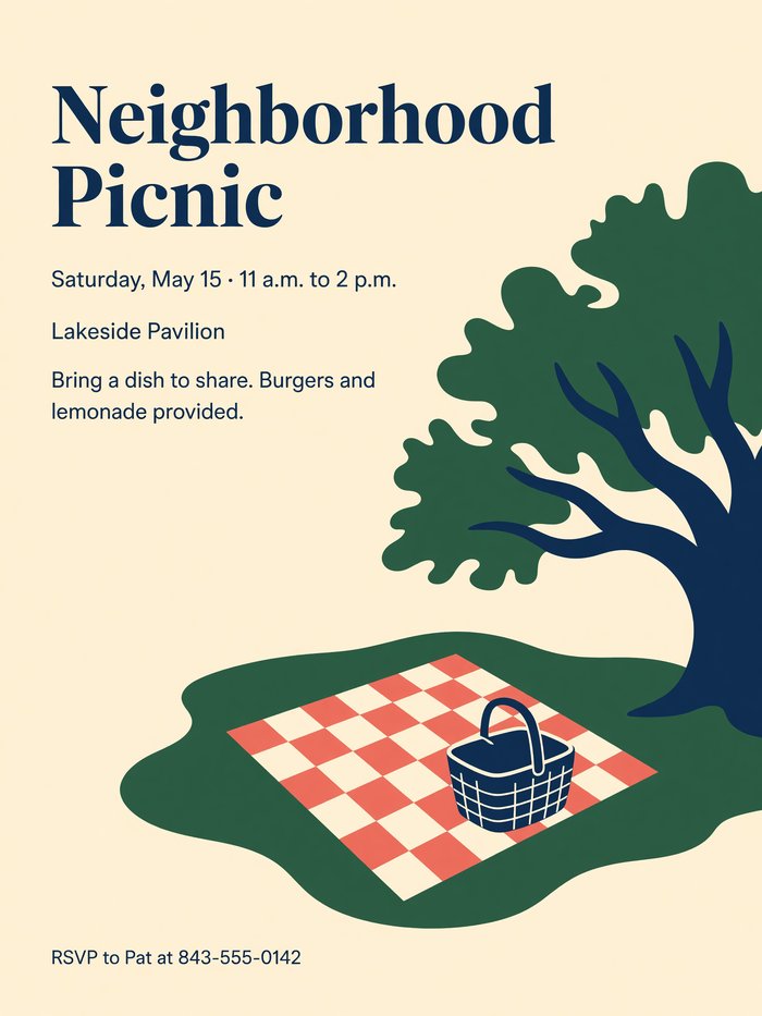
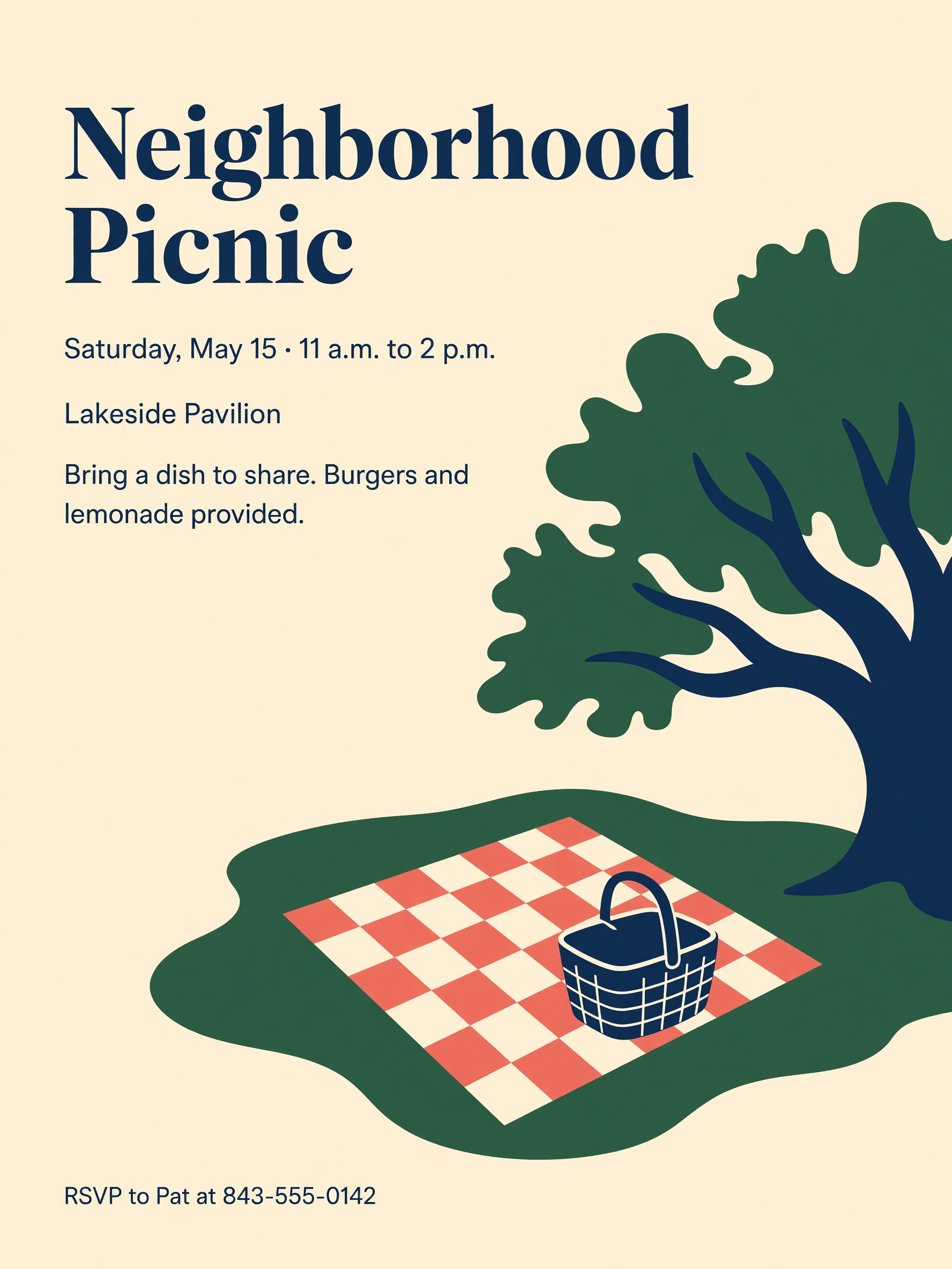
xAI · Grok Imagine Headline at the top and a smaller, quieter picture. 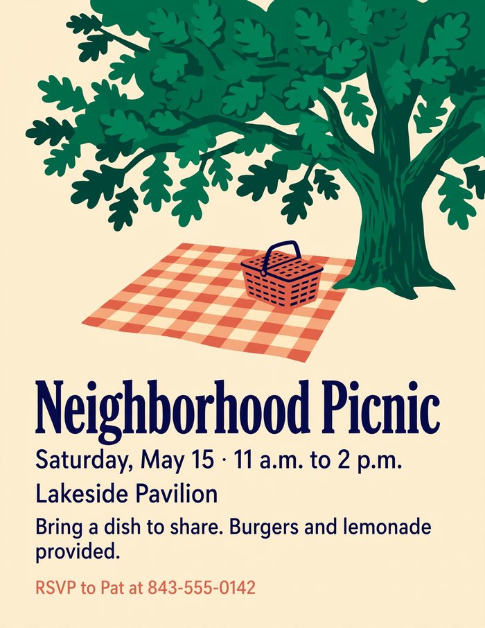
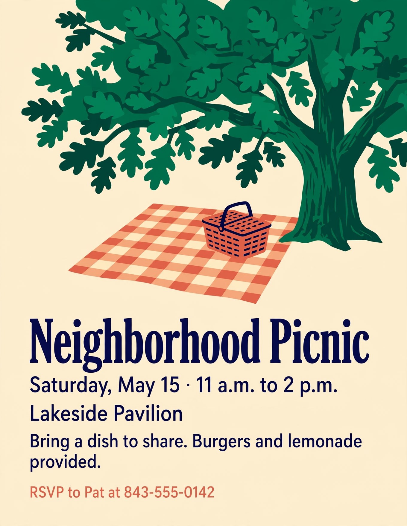
Meta · Muse Image A narrow headline on one line, with the RSVP in coral. Show the full travel poster prompt
Travel poster promptDesign a tall, letter-size flyer for a neighborhood picnic. Style: a clean, modern poster in the spirit of mid-century American travel posters. Flat shapes, a limited palette of four colors (warm cream, deep green, coral, and navy), and plenty of empty space. One simple illustration as the focal point: a checkered blanket and a picnic basket in the shade of a large live oak, seen from slightly above. One bold, classic typeface for the headline and a simple sans-serif for the details, left-aligned, with a clear difference in size between the headline and everything else. The text must read exactly: Headline: "Neighborhood Picnic" Below it: "Saturday, May 15 · 11 a.m. to 2 p.m." Then: "Lakeside Pavilion" Then: "Bring a dish to share. Burgers and lemonade provided." At the bottom, smaller: "RSVP to Pat at 843-555-0142" Avoid clip art, cartoon food or characters, balloons, confetti, sparkles, starbursts, ribbons and banners, drop shadows, glossy or 3D effects, color gradients, stock-photo people, and decorative script fonts. Do not add any text that isn't listed above.
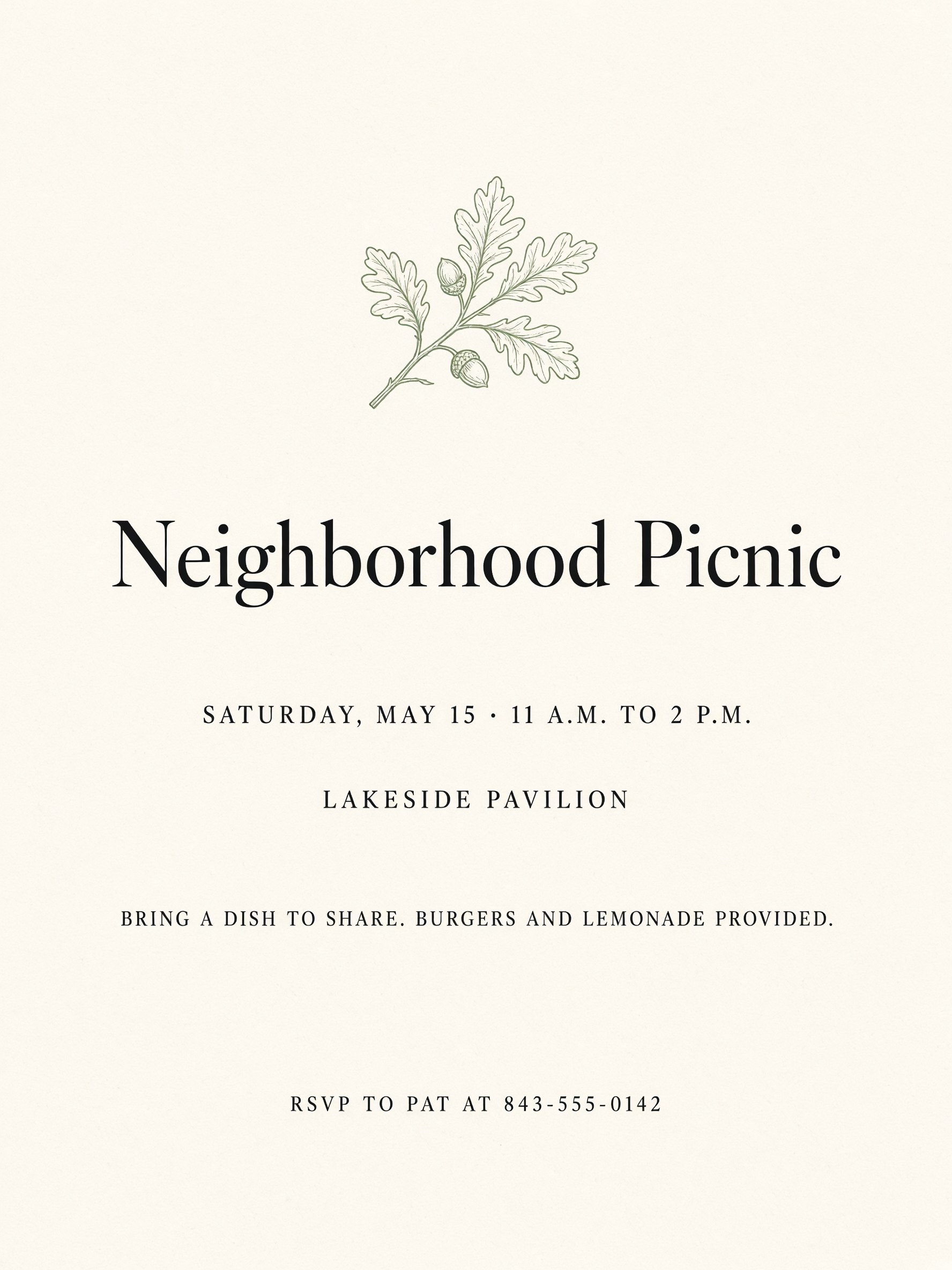
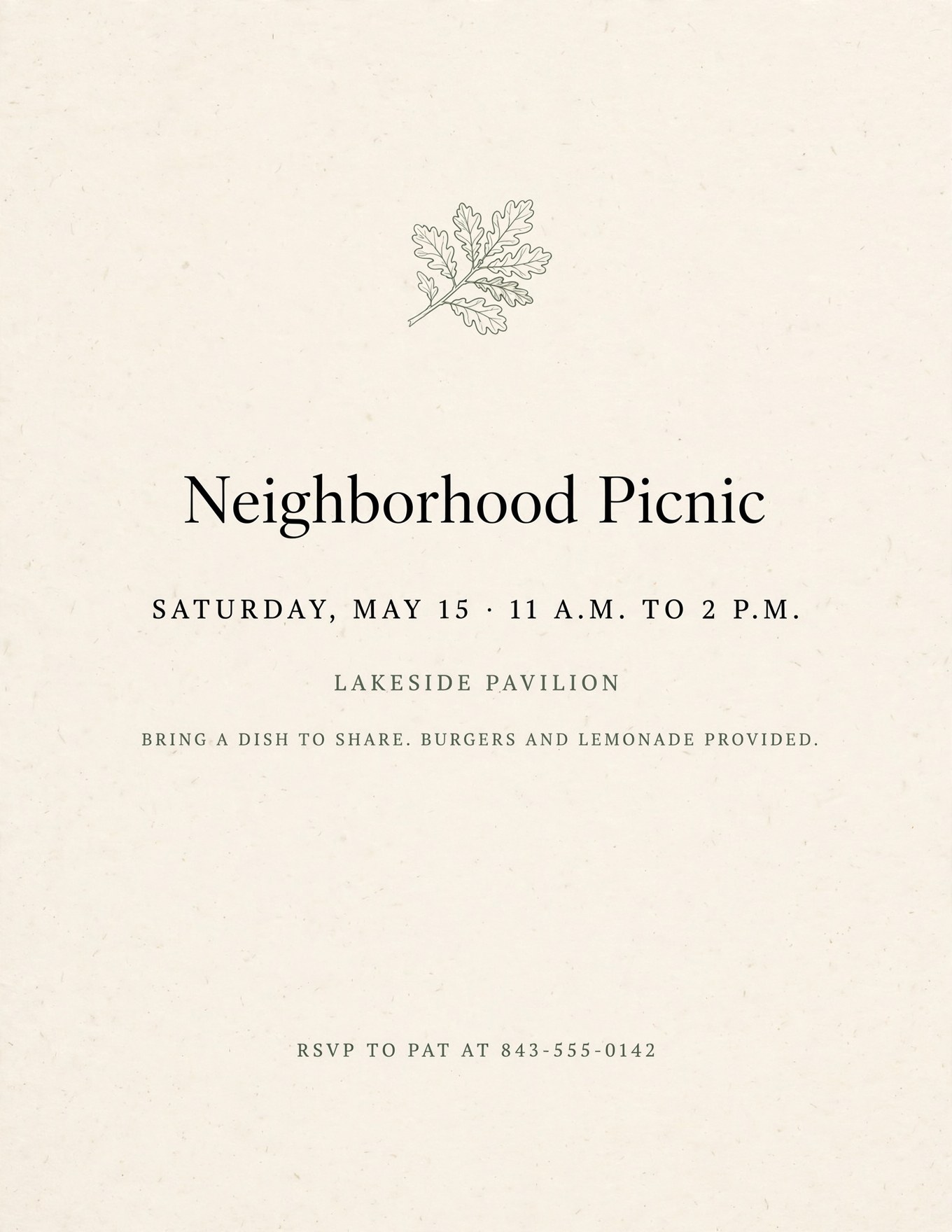
Quiet and elegant, like a printed invitation. Good when you want the event to feel special.
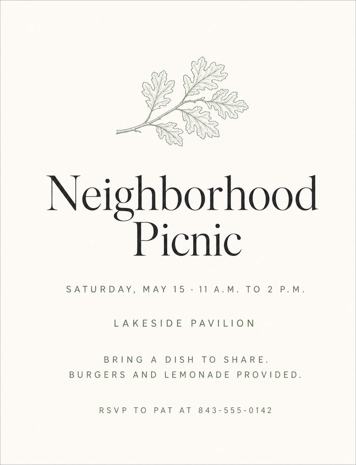
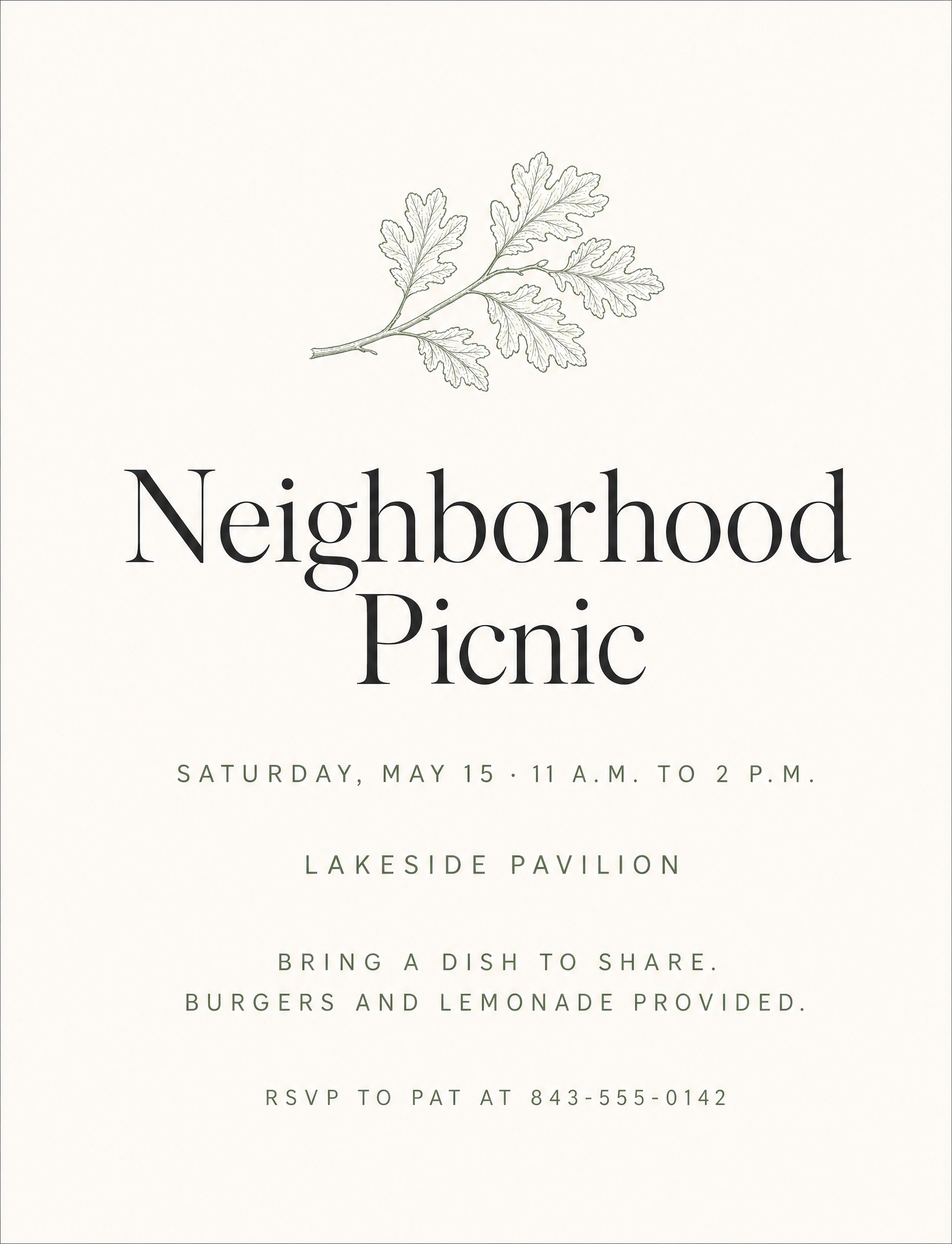
OpenAI · GPT Image 2 The closest to a real stationery-shop invitation. 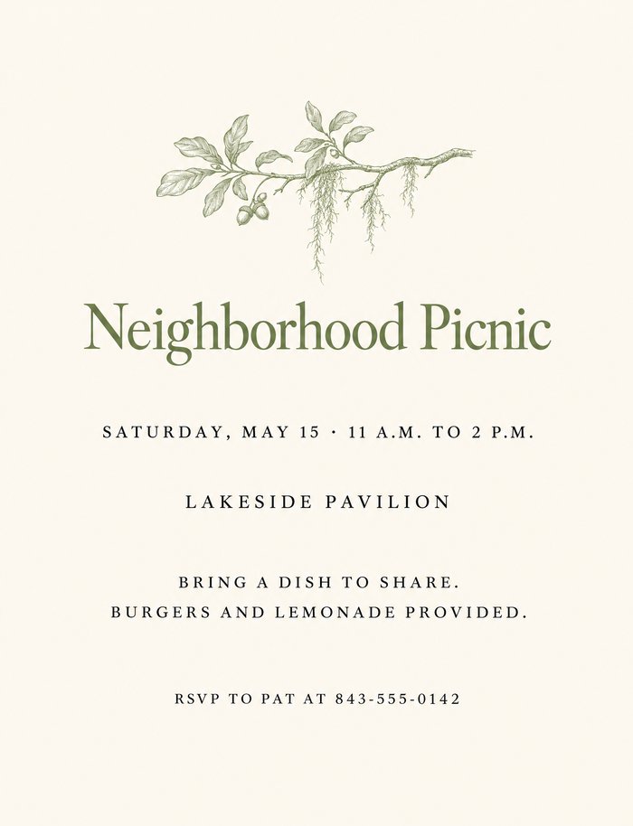
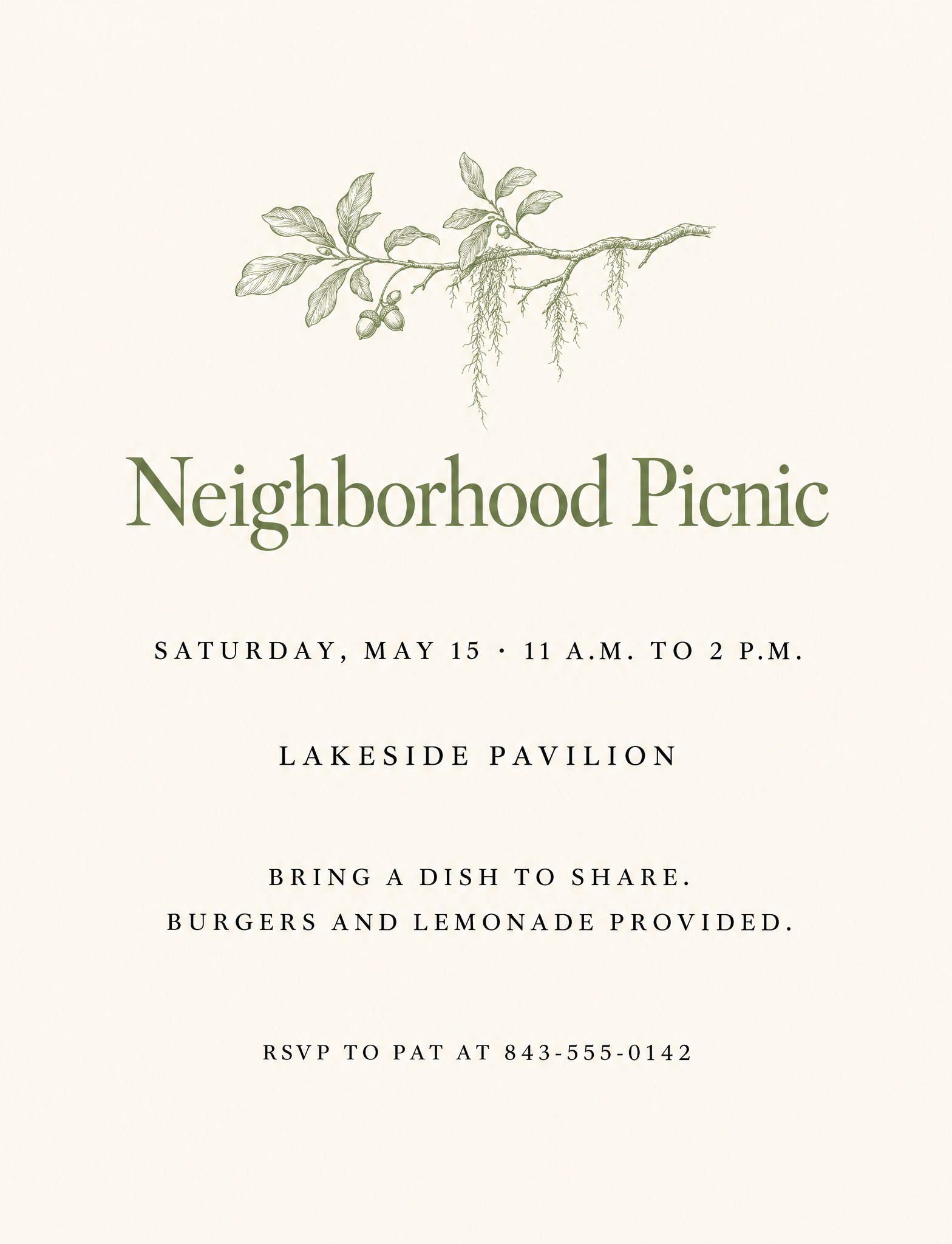
OpenAI · GPT Image 2.6 Added Spanish moss to the branch and set the headline in sage. 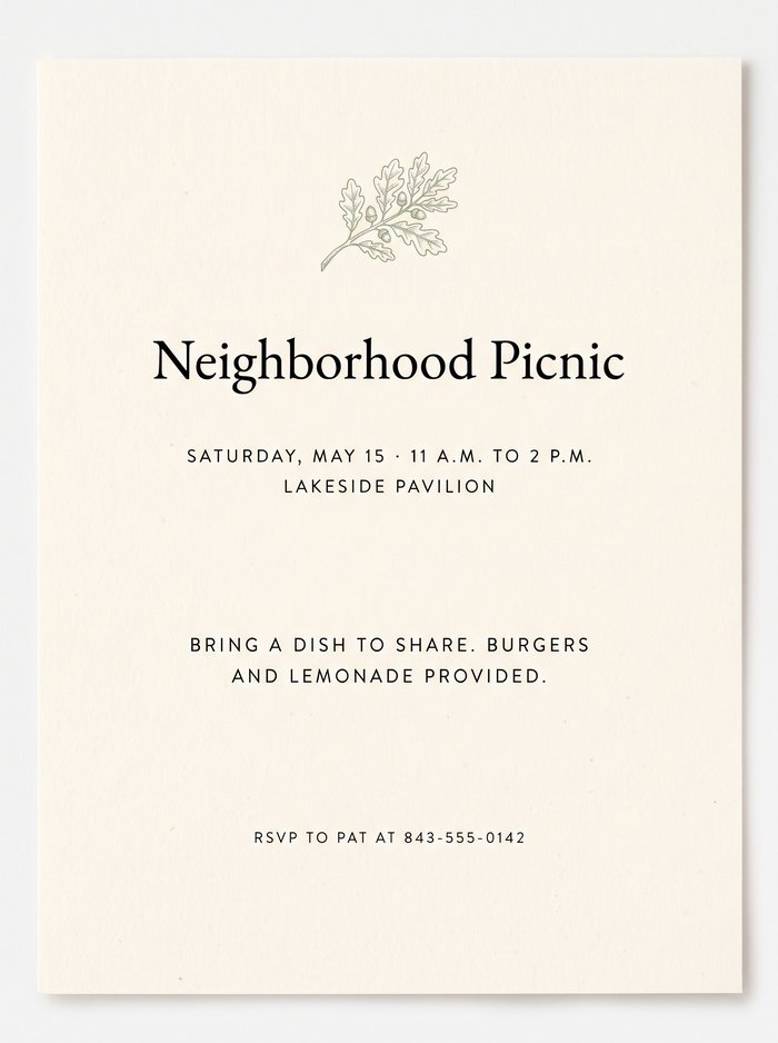
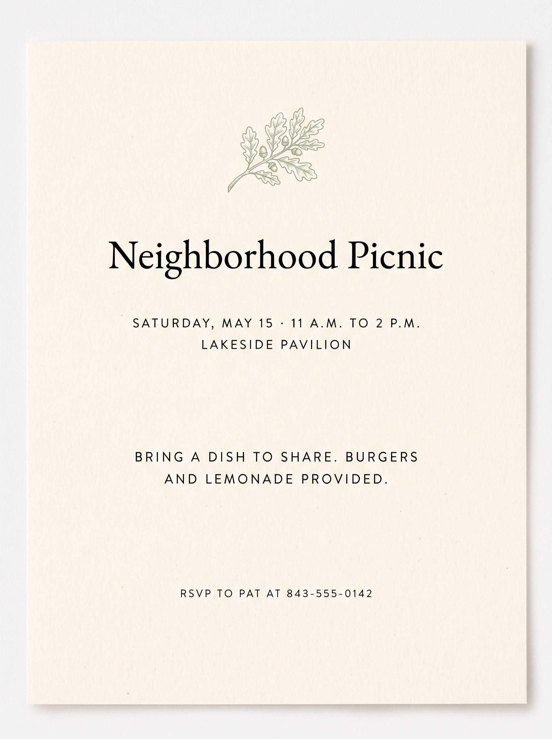
Google · Nano Banana 2.1 Shown as a printed card lying on a table, not a flat flyer. 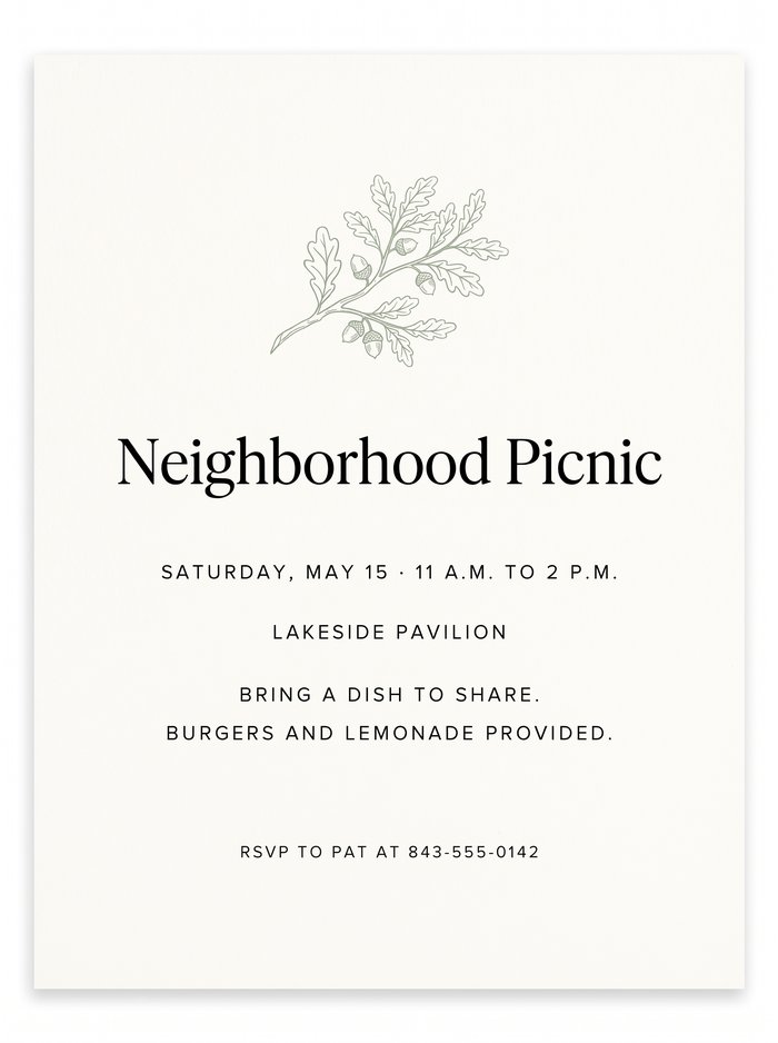
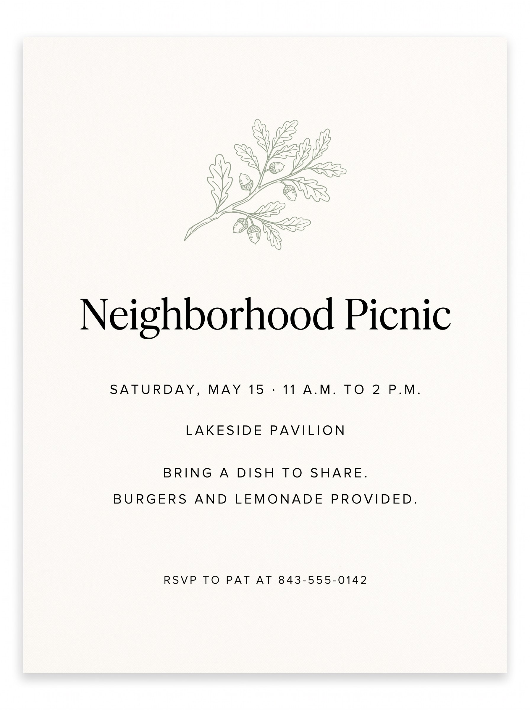
Google · Nano Banana Pro Also a card on a table, with acorns on the branch. 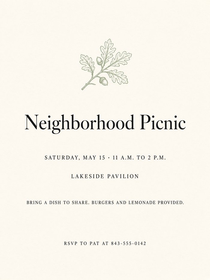
xAI · Grok Imagine Almost the same as the others, with the details in a serif. 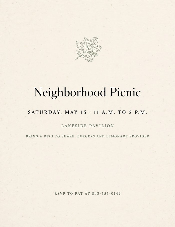
Meta · Muse Image The smallest details. One line is hard to read from a distance. Show the full clean and classy prompt
Clean and classy promptDesign a tall, letter-size flyer for a neighborhood picnic. Style: clean, elegant, and understated, like a printed invitation from a fine stationery shop. An ivory background with generous margins and lots of empty space. Black text with one muted accent color, sage green. A refined serif typeface for the headline and small, widely spaced capital letters for the details. Everything centered. One small, delicate line drawing of a live oak branch above the headline, and nothing else decorative. The text must read exactly: Headline: "Neighborhood Picnic" Below it: "Saturday, May 15 · 11 a.m. to 2 p.m." Then: "Lakeside Pavilion" Then: "Bring a dish to share. Burgers and lemonade provided." At the bottom, smaller: "RSVP to Pat at 843-555-0142" Avoid any illustration other than the single line drawing, borders and frames, patterns, clip art, cartoon food or characters, balloons, confetti, sparkles, ribbons and banners, drop shadows, glossy or 3D effects, color gradients, photographs, and script fonts. Do not add any text that isn't listed above.
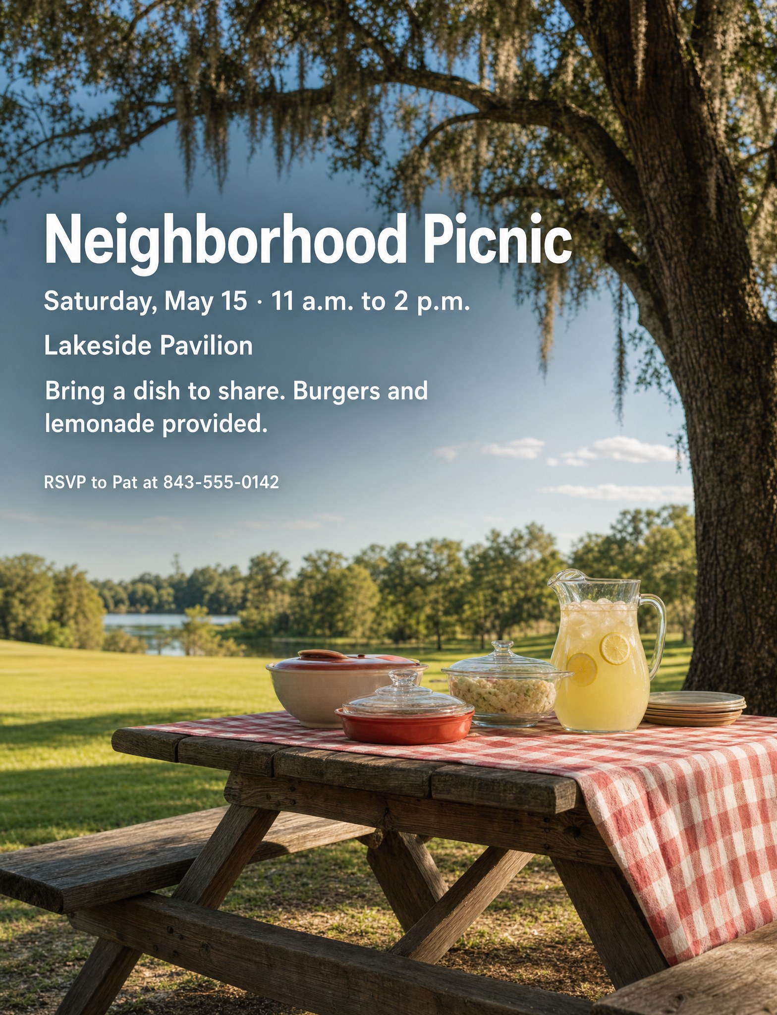
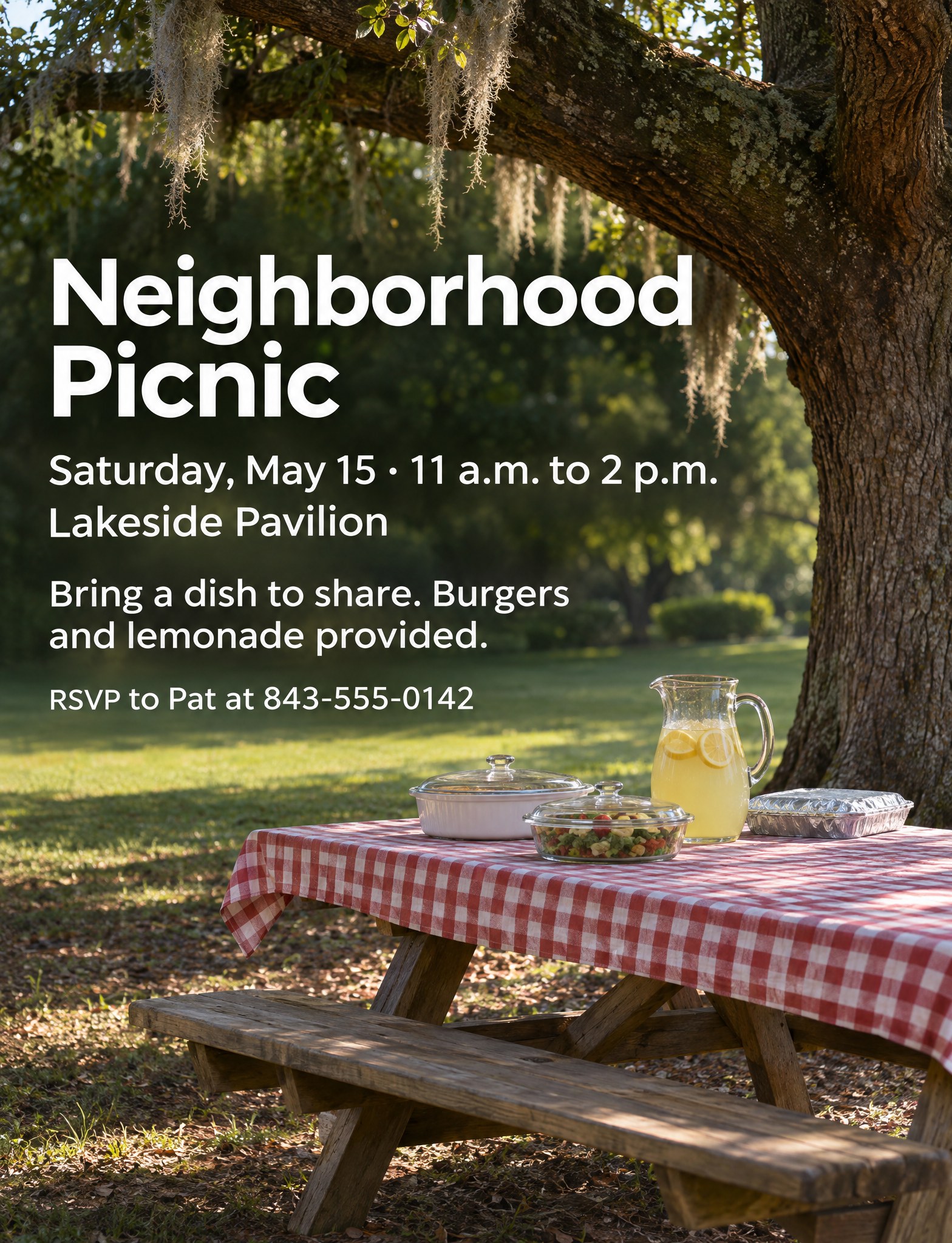
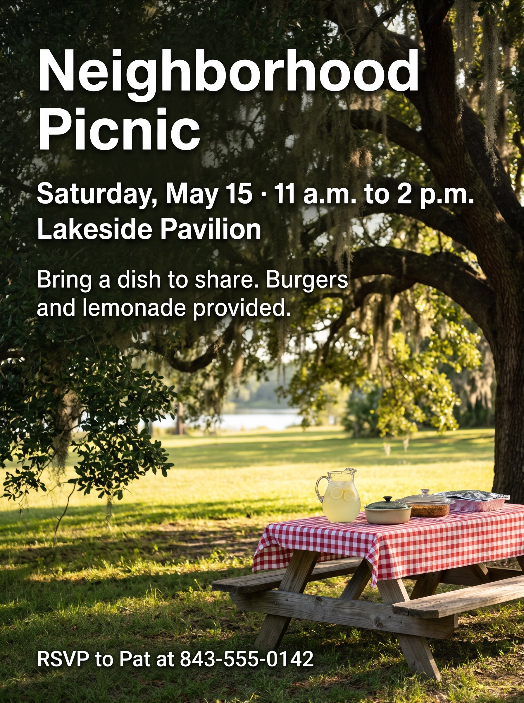
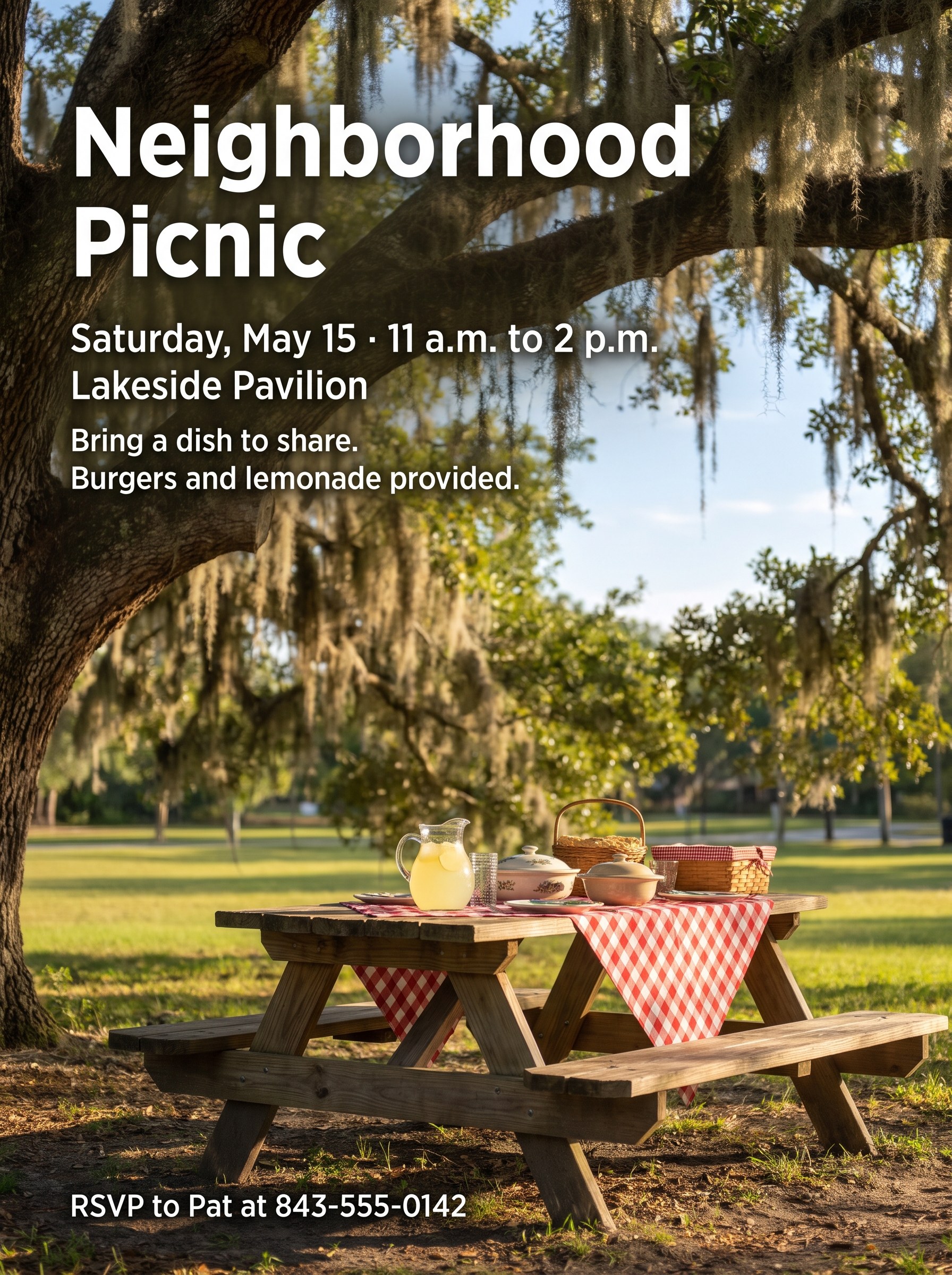
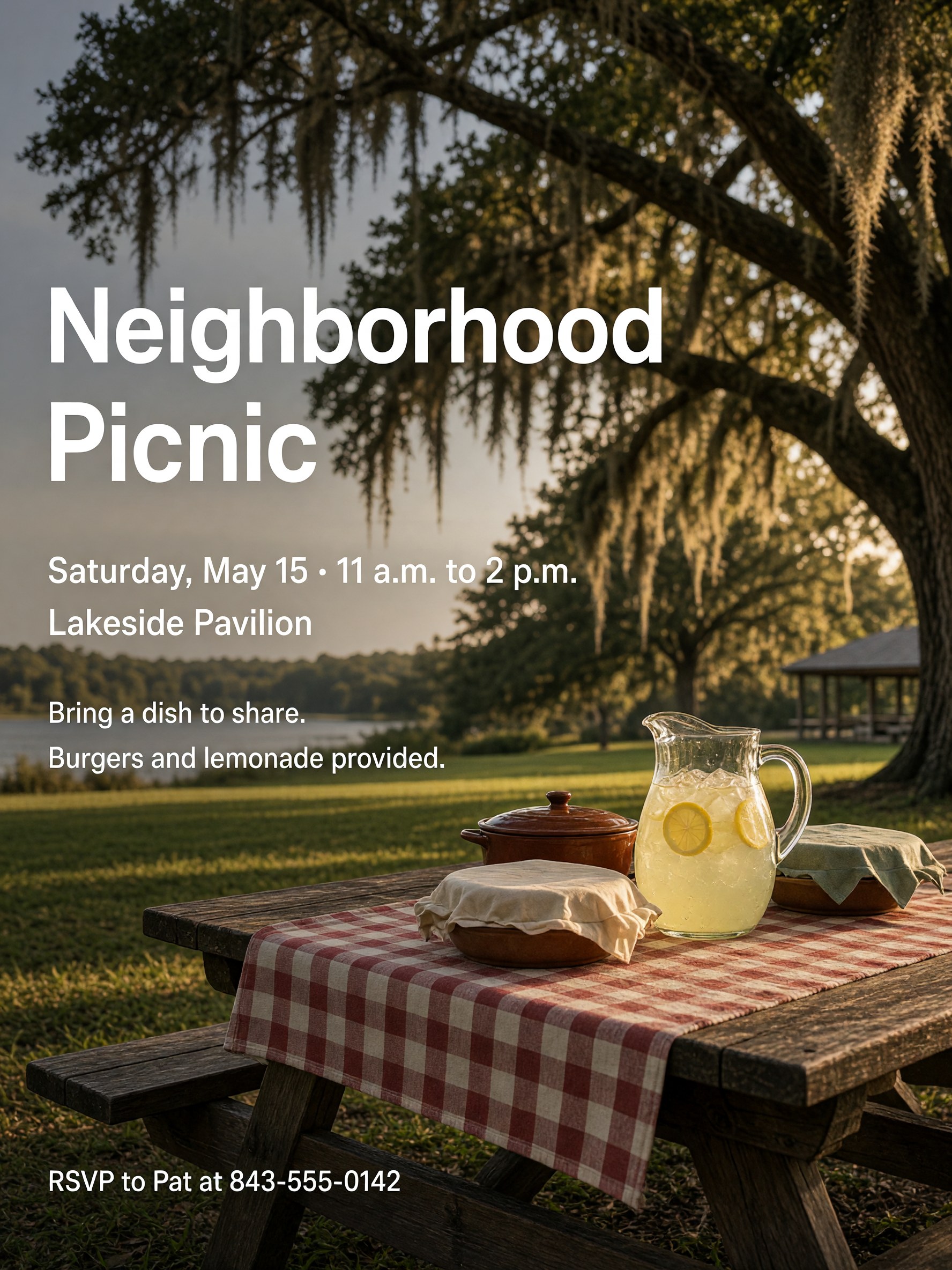
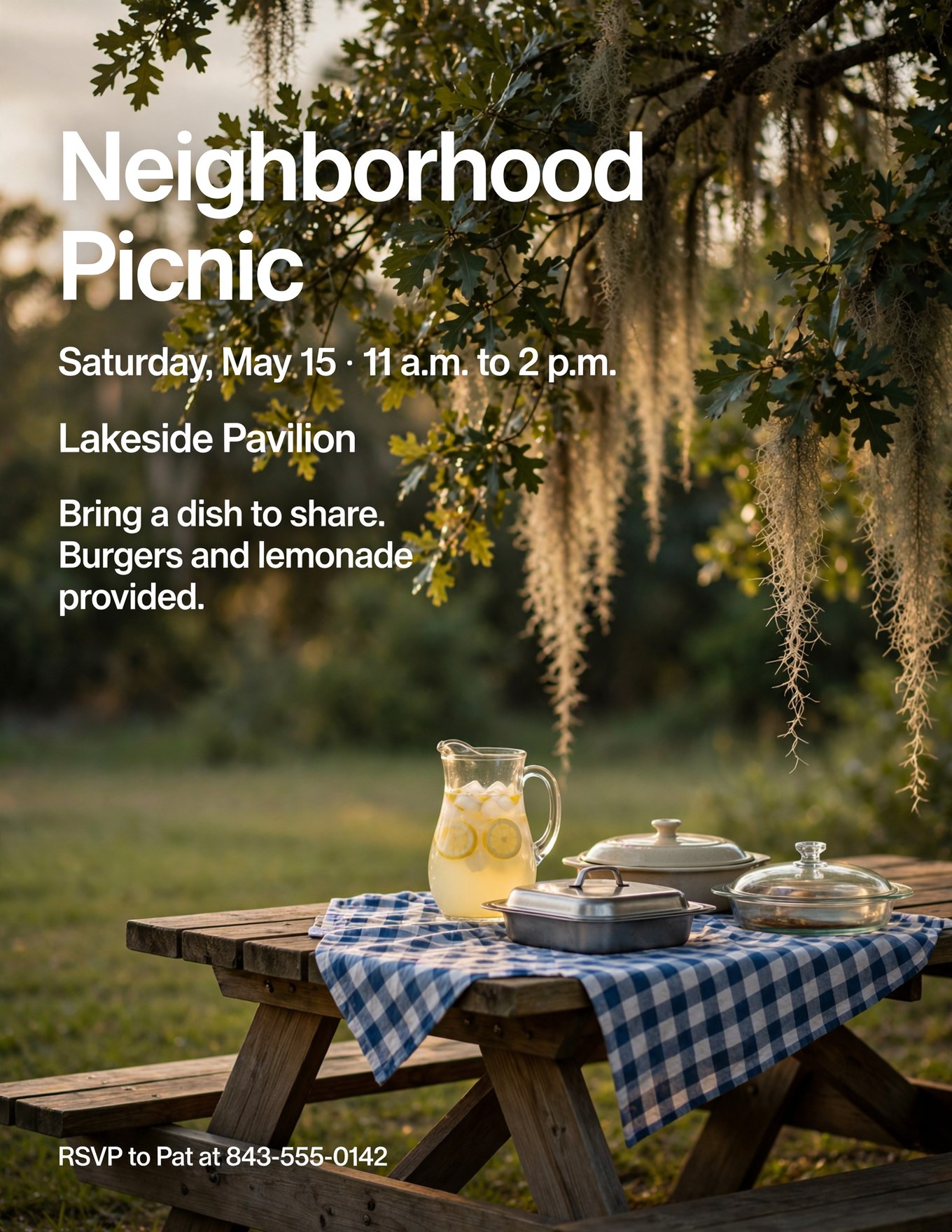
A real-looking scene with the words set over it. Good for posting online or on a bulletin board.
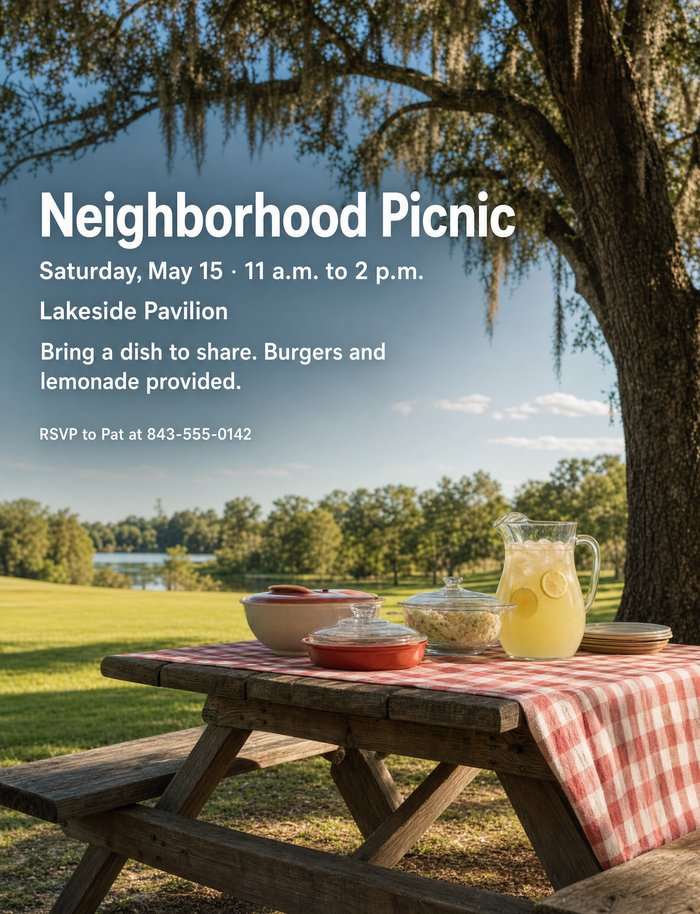
OpenAI · GPT Image 2 A sunlit lawn and lake, with a narrow headline typeface. 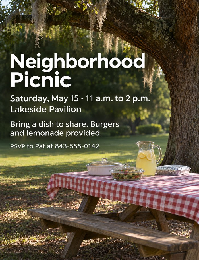
OpenAI · GPT Image 2.6 The text sits in the shade under the tree, as the prompt suggested. 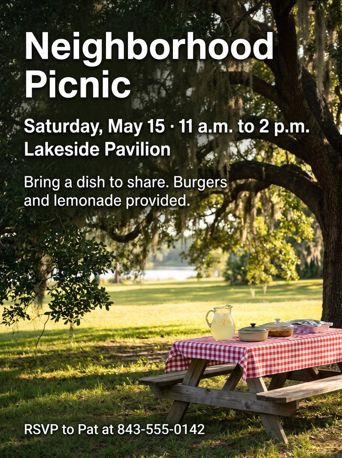
Google · Nano Banana 2.1 The biggest, boldest text, easy to read from across a room. 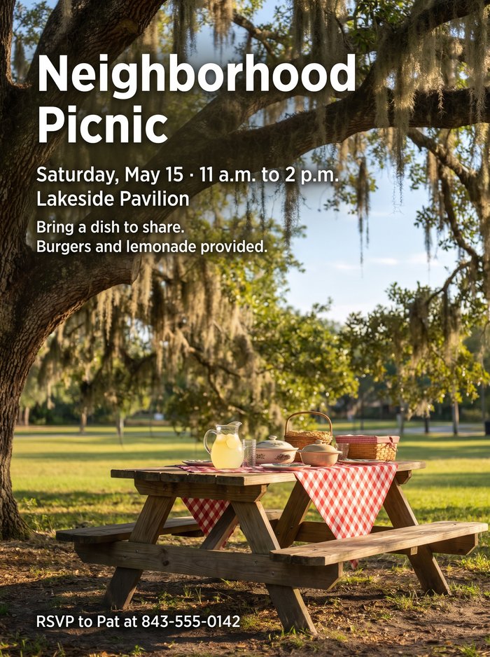
Google · Nano Banana Pro The table is small and far back, with the text over the moss. 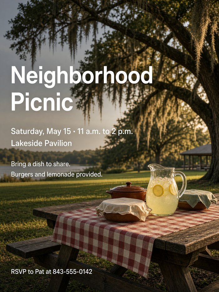
xAI · Grok Imagine A pavilion by the lake, with thinner text over a busier area. 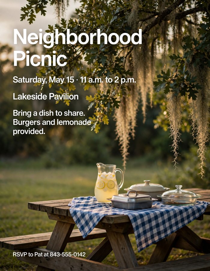
Meta · Muse Image A blue checked cloth. The prompt asked for "checkered" but named no color. Show the full photographic prompt
Photographic promptDesign a tall, letter-size flyer for a neighborhood picnic. Style: a realistic photograph as the background. A wooden picnic table under a large live oak with Spanish moss, set with a checkered cloth, a pitcher of lemonade, and a few covered dishes, in warm late-afternoon light, with the lawn behind it softly out of focus. No people. Leave a calm, uncluttered part of the photo, such as the sky or the shade under the tree, for the text. Set the text in a clean, modern sans-serif in white, left-aligned, with a clear difference in size between the headline and the details. Make sure every line is easy to read against the photo. The text must read exactly: Headline: "Neighborhood Picnic" Below it: "Saturday, May 15 · 11 a.m. to 2 p.m." Then: "Lakeside Pavilion" Then: "Bring a dish to share. Burgers and lemonade provided." At the bottom, smaller: "RSVP to Pat at 843-555-0142" Avoid people, text or logos on any object in the photo, heavy filters, lens flare, oversaturated colors, clip art, borders, balloons, confetti, sparkles, ribbons and banners, drop shadows, 3D lettering, and script fonts. Do not add any text that isn't listed above.
Replace the date, place, and contact with your own. Keep the quotation marks around the wording.
Proofread, then adjust one thing at a time
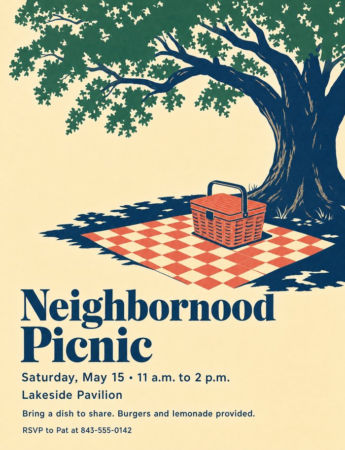
Look closely. GPT Image 2's first try reads "Neighbornood." A second run fixed it. Check every word and number against your prompt. The tools spell much better than they used to, but a single wrong letter or digit still slips through, and a wrong phone number is worse than none. If something is wrong, ask for a fix ("The headline should read Neighborhood, with an h") or simply run the prompt again.
Then try small changes:
- "Give the headline more room and make the illustration smaller."
- "Keep everything the same, but make it look like a two-color letterpress print on textured paper."
- "Keep the wording, but change the style to a bold Swiss-style typographic poster with no illustration."
Why this works
- Name a style. "Mid-century travel poster," "fine stationery invitation," or "realistic photograph" gives the tool a design tradition to follow instead of a generic "fun flyer."
- Limit the colors. Three or four named colors look designed. Unlimited color looks like clip art.
- One focal image. A single illustration with empty space around it reads better from across a room than a crowded collage.
- Say what to leave out. The tools add balloons and sparkles by default. Listing them is the most effective way to keep them off.
- Give the exact wording. Anything you don't specify, the tool may invent, including slogans you never wanted.
What the comparison shows
- A precise prompt narrows the results. The clean and classy flyers are nearly interchangeable from model to model. The travel posters, which left more to the designer, vary much more.
- Every model got the wording right in these final versions. That is a big change from a year or two ago, when garbled text was the norm. It still pays to proofread.
- Both Google models staged the classy flyer as a photo of a printed card. If you want a flat design to print, say so: "a flat, printable design that fills the whole page, not a photo of a card."
- Small text vanishes first. On a bulletin board, the details line matters as much as the headline. If it looks small on your screen, ask for it larger.
An infographic
Ask for a short, clear list
Infographics work best with three to six short points.
Try this promptCreate a simple, easy-to-read infographic titled "5 Signs of a Scam Email". Include these five points, each with a small icon: 1. Urgent or threatening language. 2. A sender address that doesn't match the company. 3. Requests for passwords or payment. 4. Links that don't go where they claim. 5. Spelling and grammar mistakes. Large text, high contrast, portrait shape.
Adjust the look
Try follow-ups such as "make the text larger" or "use a white background with dark blue text."
If one tool keeps misspelling a word, try the same prompt in the other tool. ChatGPT is generally the more reliable of the two for text on images.
Critique it: AI as a photo coach
AI tools can also look at a photo and tell you what works and what doesn't. Used this way, they don't change your picture at all. They help you take a better one next time. This works on the free plans of ChatGPT, Gemini, Meta AI, Grok, and Claude, since it only needs a tool that can look at a picture.
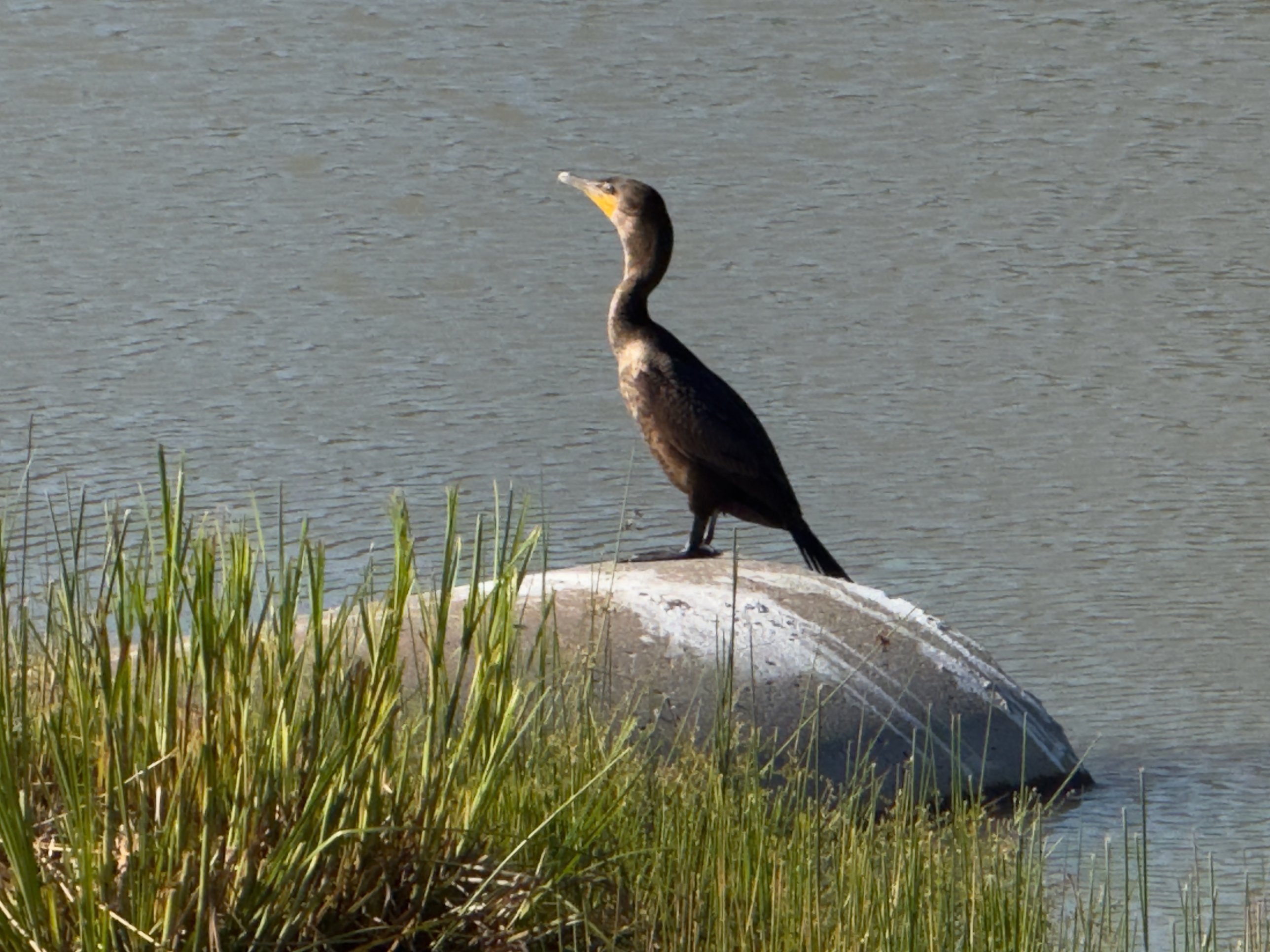
Pick a photo you want to improve on
Choose one you took yourself that you feel is almost right. Those teach the most. A photo straight from the camera or phone is best, before any editing.
Upload it and ask for a teacher's critique
The full prompt asks for specific, honest feedback on composition, light, focus, color, and story, and ends with three things to do differently.
Show the full photo critique prompt
Photo critique promptI'm an amateur photographer trying to improve. Please critique the attached photo the way an experienced photography teacher would. 1. Start with what works in this photo and why. 2. Then assess: - Composition: where the subject sits in the frame, the horizon, lines that lead the eye, balance, and anything distracting at the edges or in the background. - Light: its direction, quality, and time of day, and whether bright or dark areas lost detail. - Focus and depth of field: whether the right thing is sharp, and whether the background is as blurred or as sharp as it should be. - Color and exposure: white balance, saturation, and overall brightness. - Story: what the photo says, and whether the viewer's eye goes where I want it to. 3. Finish with the three changes that would most improve a photo like this next time, most important first. Make each one something I can do with the camera when I take the picture, not only in editing. 4. Suggest one crop or simple edit that would improve this photo as it is. Describe it in words; do not create a new version of the image. Be specific and honest. Point to particular parts of this picture rather than reciting general rules. Use the camera details I give below. If I don't give them and they aren't included with the photo, don't guess them. If it would help to know what I was trying to capture, ask me. How I took it: [camera or phone, lens, settings, and time of day, if you know them]
Tell it how you took the photo. Phone and camera settings often aren't sent along with an uploaded photo, so fill in the last line of the prompt yourself. For today's photo: "How I took it: iPhone 16 Pro, 5× telephoto camera (120 mm equivalent), f/2.8, 1/1368 second, ISO 50, at about 5:35 p.m. in mid-May." On an iPhone, swipe up on a photo in the Photos app to see these details.
Shorter version: "Critique this photo like a photography teacher. What works, what doesn't, and what three things should I do differently next time I take a shot like this?"
Have a conversation about it
Ask follow-up questions in the same chat:
- "Which of these matters most if I'm using a phone?"
- "Standing where I was, what would you have done differently?"
- "Explain what you mean by 'leading lines' using this photo."
Go back out and try again
Take the shot again with the advice in mind, upload the new version to the same chat, and ask: "Here's my second try. Did I fix the problems you pointed out?" This loop is where the real learning happens.
What Claude said about the cormorant
I gave this photo and the full prompt, with the "How I took it" line filled in, to Claude (Opus 5.5). Here is what stood out in its answer:
- It found the main problem. "The brightest thing in the frame is the rock, and the darkest is the bird." So viewers look at the rock first, then the grass, and only then the bird.
- It used the camera details. It worked out that at 5:35 p.m. in mid-May the sun is still about 30 degrees up, which explains the hard, neutral light, and that the phone's small telephoto sensor gives little background blur even at f/2.8.
- The advice is specific to a phone. Press and hold to lock focus and exposure on the bird, turn on ProRAW, get lower and closer, and hold a burst for the moment the bird does something.
- It admitted what it couldn't tell. The copy I sent was only 640 × 480 pixels, so it said it couldn't judge whether the eye was sharp. Send the full-size photo when you can.
- It asked me a question. Was I after a portrait of the bird, or the bird in its marsh? The answer changes the advice about the grass.
- It suggested one quick edit. In the Photos app, Highlights down and Shadows up, because here the rock is nearly the only highlight and the bird nearly the only shadow.
Read Claude's full critique
What works
The bird stands out clearly from its background. You shot from slightly above, so the background is open water instead of a far shoreline, sky, or clutter. The water is an even blue-gray, and the dark cormorant reads as a clean silhouette against it. Many wildlife shots fail on this point, and you got it right.
You caught a strong profile. The head is turned fully sideways, with the bill angled up and to the left. That shows the hooked bill and the orange-yellow facial skin, which are the cormorant's identifying features. The upright, alert pose has some tension to it.
You left room in front of the bird. It faces left, and there is more open water on the left side of the frame than behind it. That gives its gaze somewhere to go.
The single warm accent works. The orange throat patch is the only warm, saturated color near the subject. Once the eye reaches the head, it stays there.
Your settings stopped motion. At 1/1368 s and ISO 50 you had no motion blur and no high-ISO noise. The camera had plenty of light.
Composition
The bird sits close to the middle of the frame. Its eye is a little left of center, and its head is about a fifth of the way down from the top. Centering is fine for a portrait like this. The problem is that the bird takes up only about a quarter of the frame's height, so the rock, the grass, and the water get almost as much area as the subject.
There's no horizon. The only strong line is the top of the rock, which slopes from upper left to lower right. Because the bird faces left, that diagonal leads away from the bird's gaze instead of toward it. The vertical grass blades on the left repeat the bird's upright stance, which helps a little.
Edges and distractions:
- The grass along the bottom edge is cut off by the frame and is about as sharp and bright as the bird. It's the second-loudest element in the picture.
- The right end of the rock comes close to the right edge, and a few grass blades poke into the bottom-right corner. Neither is a serious problem, but both pull the eye toward the corner.
- The rock is the biggest distraction, and it's a light problem as much as a composition problem (see the next section).
Light
At 5:35 p.m. in mid-May the sun is still fairly high, roughly 30 degrees above the horizon at mid-latitudes, and sunset is more than two hours away. That's why the light is hard and fairly neutral, not golden. It seems to come mostly from above. It lights the top of the rock strongly and leaves the bird's breast, neck, and underside darker than its back.
This creates the photo's main problem. The brightest thing in the frame is the rock, and the darkest is the bird. The pale, guano-streaked top of the rock is at or close to losing all detail, while the bird's front and legs are close to going black. The eye goes to the brightest area first, so viewers look at the rock before the bird. The scaled pattern on the back and wing feathers does show, which is good. I can't see a clear catchlight in the eye, and without one the bird looks less alive.
Focus and depth of field
The bird's outline looks crisp, and focus appears to be on the bird, not the grass or the water. One caveat: the file you sent is only 640 × 480 pixels, so I can't check whether the eye itself is critically sharp. Please check that on the full-size original.
Depth of field: the 5× camera has a small sensor, so even at f/2.8 it gives roughly the depth of field of f/16 to f/22 on a full-frame camera. You won't get much background blur from it, and the native Camera app doesn't let you change the aperture anyway. Here that hardly matters, because the water is plain enough that sharpness doesn't distract. The grass is a different case. It's close to the bird's distance, so it's almost as sharp as the bird, and that's part of why it competes for attention.
Color and exposure
The white balance looks right: the rock reads as off-white with no strong cast, and the water is a believable cool gray-blue. Saturation is restrained, apart from the grass, which is a fairly bright yellow-green after the iPhone's processing. Overall brightness is fine for the scene as a whole. For the subject it's a little dark, because the camera balanced its exposure between the bright rock and the dark bird and didn't favor either.
Story
As it stands, the photo says "a cormorant standing on a rock at the edge of a marsh." That's an honest record, but it's quiet. The bird isn't doing anything you'd caught on purpose. It isn't drying its spread wings, swallowing a fish, or shaking water off. The upward-angled bill suggests it's watching something, but we never find out what.
Where the eye goes: first the bright rock, then the green grass, and only then the bird. You want that order reversed.
Here's a question for you. Were you after a portrait of the bird, or a picture of the bird in its marsh setting? That changes my advice on the grass. In a portrait the grass is clutter. In a habitat shot it belongs, but it needs to sit lower in the frame and be less bright.
Three changes for next time
1. Put the light on the bird, not on the rock. Before you shoot, move so the sun is roughly behind you and lighting the bird's face and eye. If you can, come back in the last hour or so before sunset. Lower, warmer light will light the dark plumage from the side, bring out the scaled feather pattern, put a catchlight in the eye, and make the rock less glaring. With dark birds on pale perches, the angle and time of light matter more than anything else.
2. Tell the camera the bird is what counts. Press and hold on the bird's head until "AE/AF Lock" appears, then drag the sun slider slightly up or down until the feathers show detail without the rock going completely white. Also turn on ProRAW (Settings > Camera > Formats). It keeps far more highlight and shadow information than HEIC, and a scene with a black bird on a white rock needs that extra range.
3. Get lower and closer, then wait for something to happen. Crouch until the lens is near the bird's eye level, and move forward slowly between shots if the bird tolerates it. Five times is the limit of real optical zoom on your phone, so walking closer is the only way to make the bird fill more of the frame without losing quality. Then hold a burst (slide the shutter button left) for the moment the bird does something: a head turn toward the light, a wing stretch, a shake. That gives the photo a story and not just a subject.
One simple edit for this photo
In the iPhone Photos app, adjust two sliders: Highlights down (try around −40 to −60) and Shadows up (around +25 to +40). In this frame the rock is almost the only highlight and the bird is almost the only shadow, so these two global sliders behave almost like a local adjustment. The rock will regain texture and stop pulling the eye, and the bird's breast and neck will show more feather detail. Stop raising Shadows when the bird's darkest areas start to look gray and flat. A cormorant should still look nearly black.
It's an opinion, not a verdict
AI critiques can misread what's in a photo or apply "rules" mechanically, and they tend to be encouraging. Ask it to be honest, and trust your own eye when you disagree. Photography's rules are meant to be broken on purpose.
Check for location data
Photos from phones and many cameras record where they were taken. Uploading the original file shares that location. For photos taken at home, turn off location in your camera settings or send a screenshot of the photo instead.
Make it: a recipe card from a cooking video
Give ChatGPT a link to a cooking video, and it watches the video or reads its transcript, pulls out the ingredients and steps, grabs a picture of the finished dish, and lays it all out as a card you can keep on your phone.
A paid ChatGPT plan, used on a computer in Work mode. In testing, regular Chat could not complete this task; Work has the extra tools to open the video and build the image file.
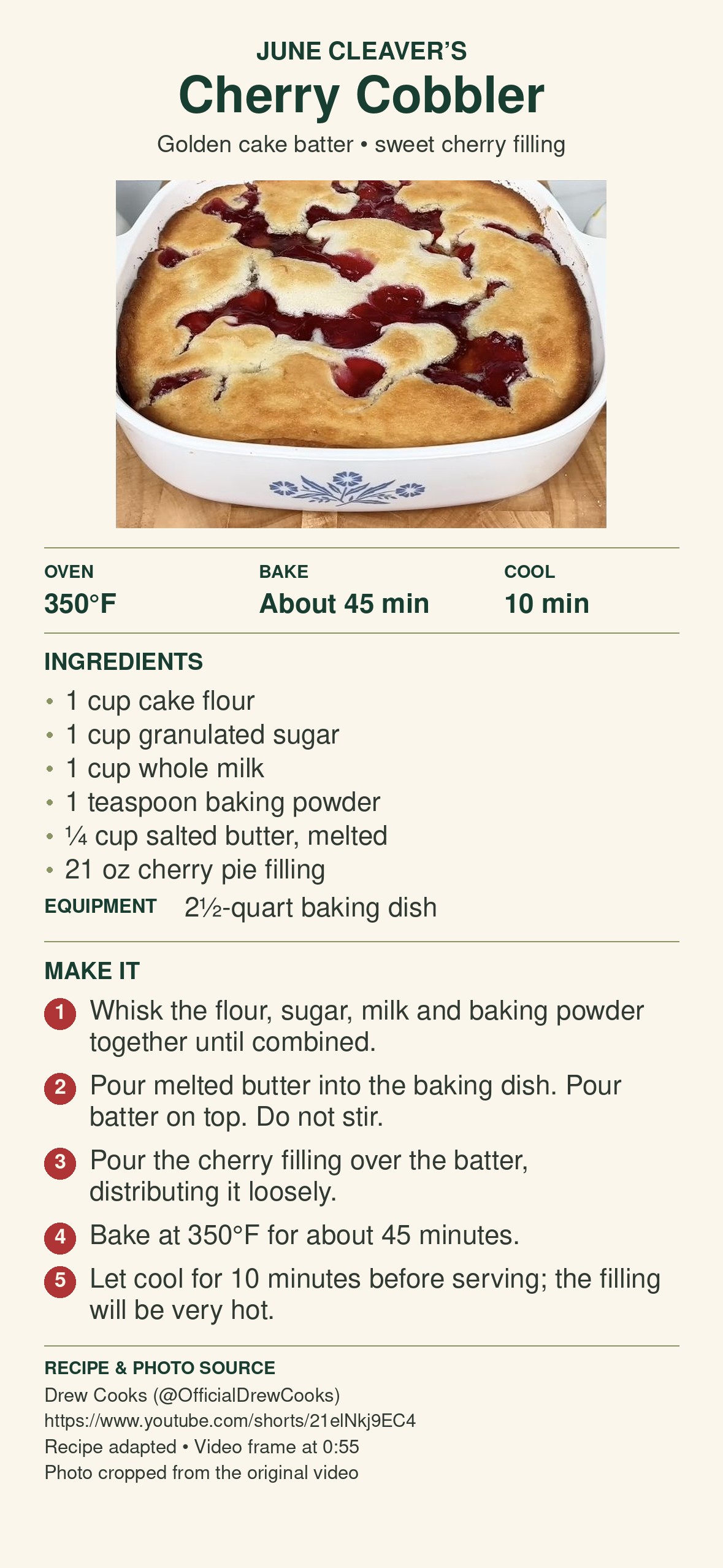
Find a cooking video
On YouTube, open the video and copy its address from the browser's address bar (or use Share, then Copy link).
Open Work mode
In ChatGPT on your computer, switch from Chat to Work before you start.
Paste the prompt and your link
Replace [paste the video link], brackets included, with the address you copied.
Recipe card promptCreate a readable recipe-card PNG for my phone from this video: [paste the video link]. Verify the ingredients, quantities, temperatures, times, and steps against the video or its transcript. Flag missing or uncertain details instead of inventing them. Use a genuine finished-dish frame from this video when available. Include numbered instructions and the creator's name and source link. If you cannot access the source or image, tell me what to provide before making the card.
Check the card against the video
Look first at anything it flagged. Videos often skip exact amounts, so a good card says so rather than guessing. Confirm oven temperatures and cooking times before you cook.
Save it to your phone
Download the PNG, then email or message it to yourself, or save it to a shared photo album, so it is handy in the kitchen.
Keep the creator's name and link on the card. The recipe is their work, and the link lets you find the video again.
Share it: a family website from a box of postcards
ChatGPT can turn a personal collection into a website the whole family can browse. The collection here is 58 postcards from the early 1900s, sent by or to my great-grandmother, Bessie Yerkey. I had scanned both sides of every card.
Using a Project in Work mode, ChatGPT matched each card's front and back, transcribed the handwriting, and noted people, places, and dates. Where the handwriting was unclear, it kept the possible readings instead of guessing. Sites then built and published a website where visitors can browse, search, enlarge the handwriting, and share a link to any card.
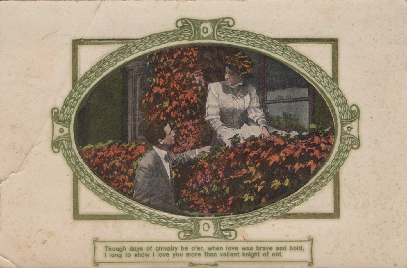
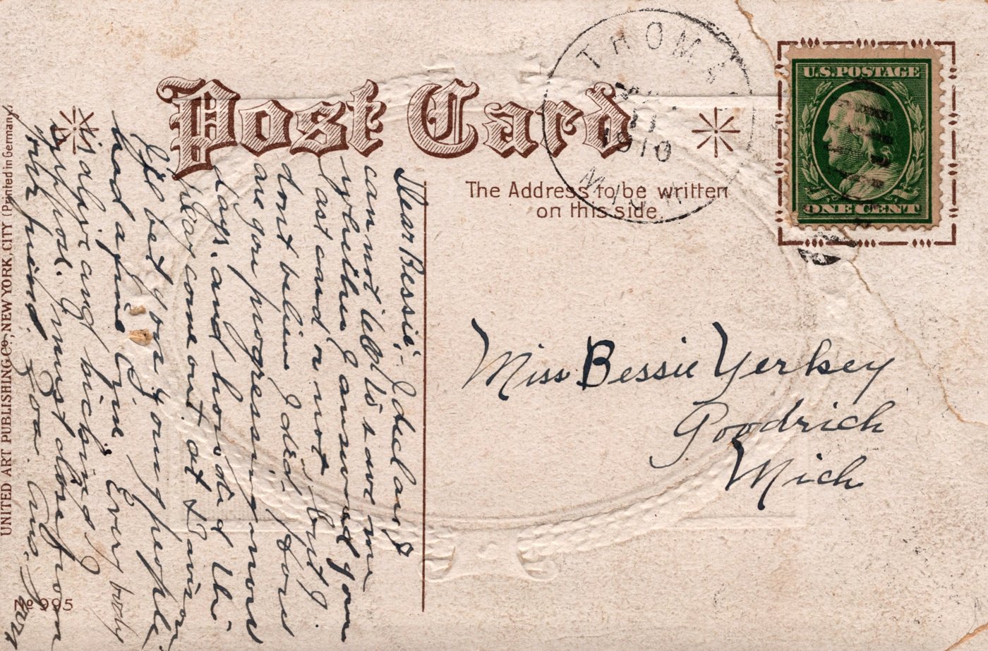
The back shows why this takes care: the message runs sideways in faded ink, the postmark is only partly legible, and the address and stamp have to be read separately from the message.
Explore the family postcard collection →
Show the full postcard website prompt
Review the postcard scans in this Project's folder and create a website using ChatGPT Sites so I can share the collection with family and others. These 58 postcards date mainly from the early 1900s and were mostly sent by or to my great-grandmother, Bessie Yerkey. I acquired them through my father's estate after he passed away a few years ago. Identify each postcard and match its front and back. Treat original and enhanced scans of the same card as one postcard. Describe the picture and transcribe printed text, handwritten messages, addresses, signatures, and postmarks where legible. Record dates, people, places, and interesting family or historical details. Distinguish the place pictured from the place where the card was mailed. Mark uncertain readings clearly and preserve plausible alternatives rather than guessing. Check any existing catalog notes against the images and correct clear errors. Save a readable catalog entry for each postcard in the Project folder, including references to its images. Preserve the original scans. Build a complete, attractive website with a warm, understated design suited to a family archive. Include a thumbnail gallery of all 58 postcards and a viewer showing each card's front, back, and accompanying notes. Allow visitors to enlarge images to examine handwriting. Include search across names, places, and messages, useful topic filters, previous and next navigation, and a shareable link to each postcard. Add a short introduction explaining the collection's family background. Make the website easy to use on phones and computers. Explain briefly that some dates and transcriptions remain uncertain. Keep local computer paths and technical catalog data out of the visitor experience. Verify that all postcards, images, notes, and viewing controls work. Publish the finished website so anyone with the link can view it, and give me the shareable address.
Photo albums, letters, recipes, or a scrapbook all work the same way. Scan or photograph the pages, add them to a ChatGPT Project, and adapt the prompt to describe your collection.
Imagine it, from evidence: one portrait from many snapshots
Restoration starts from one photo. Compositing gives an AI model several poor photos of the same person and asks it to work out what that person looked like. The result is an inferred likeness, not a recovered photograph.
The evidence: ten small snapshots
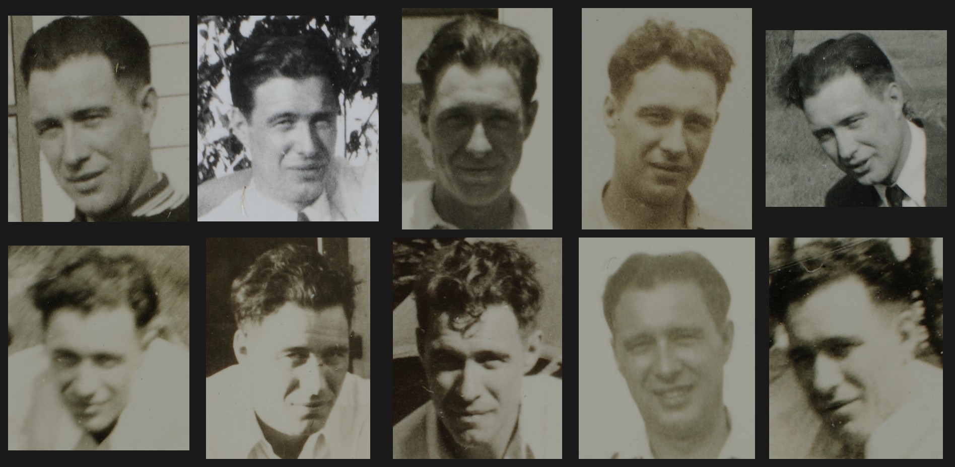
Four composites, four guesses
Each model got the same prompt and the same photos. Grok accepts at most five reference photos, so the five sharpest went to every model except Meta, which got all ten.
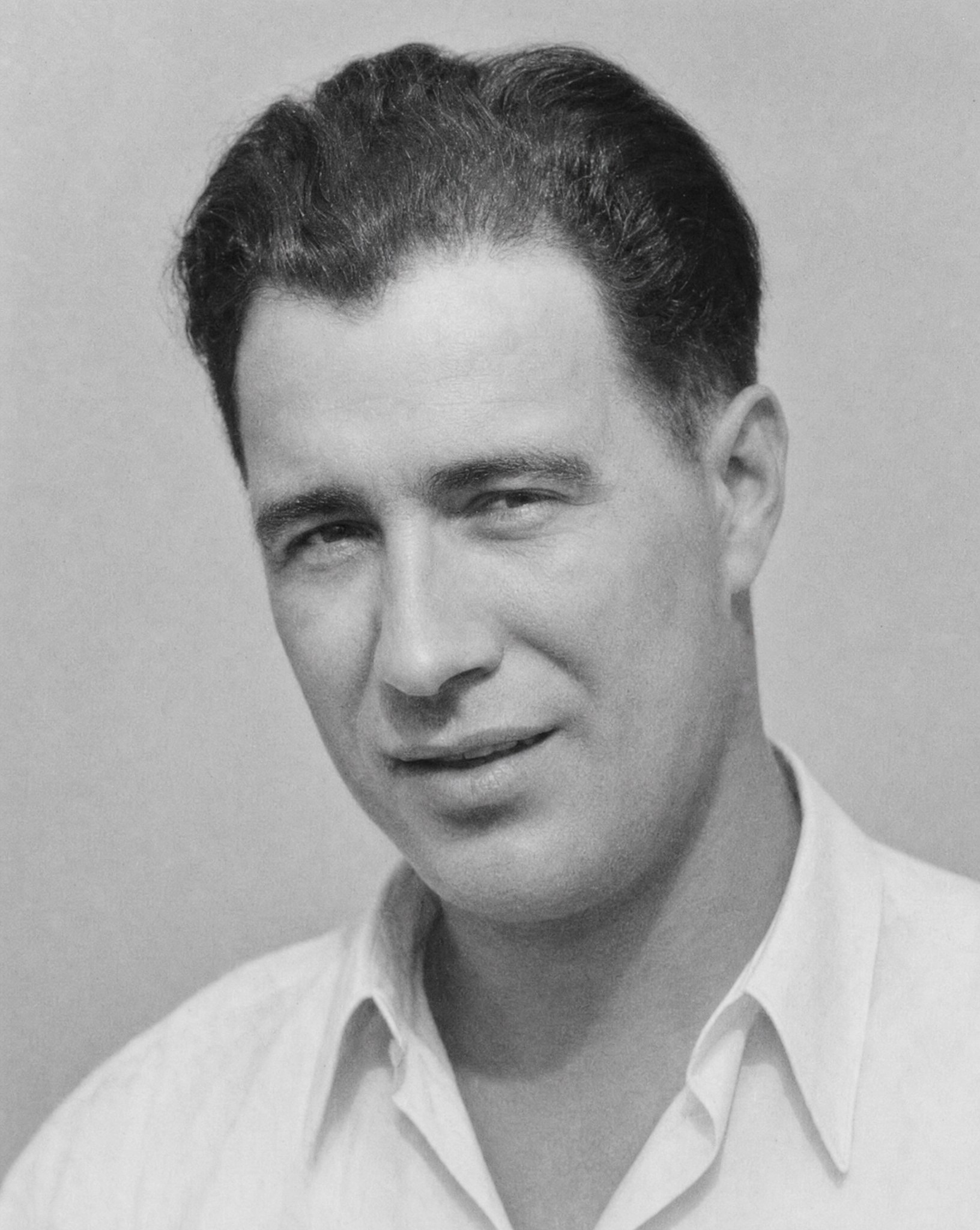
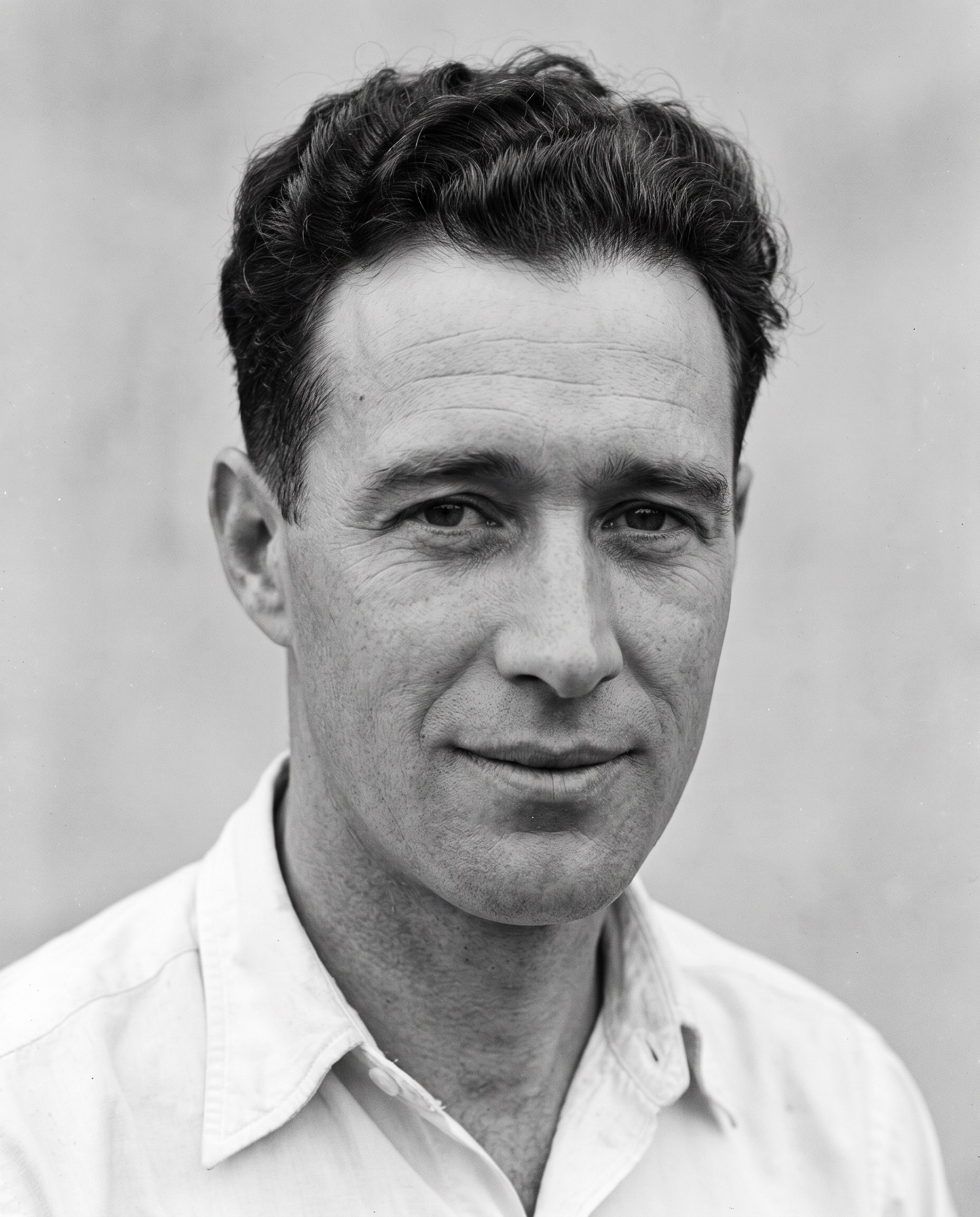
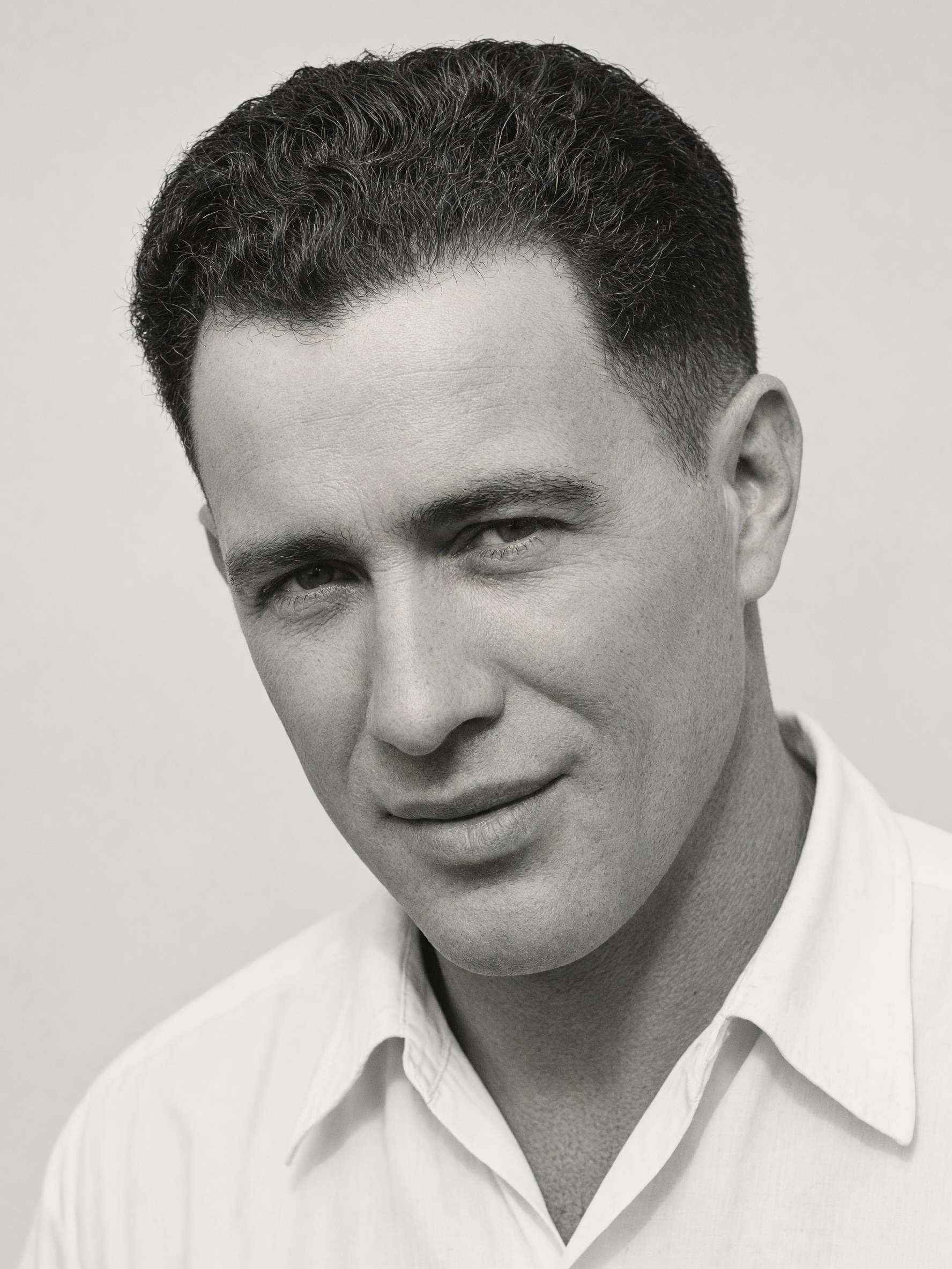
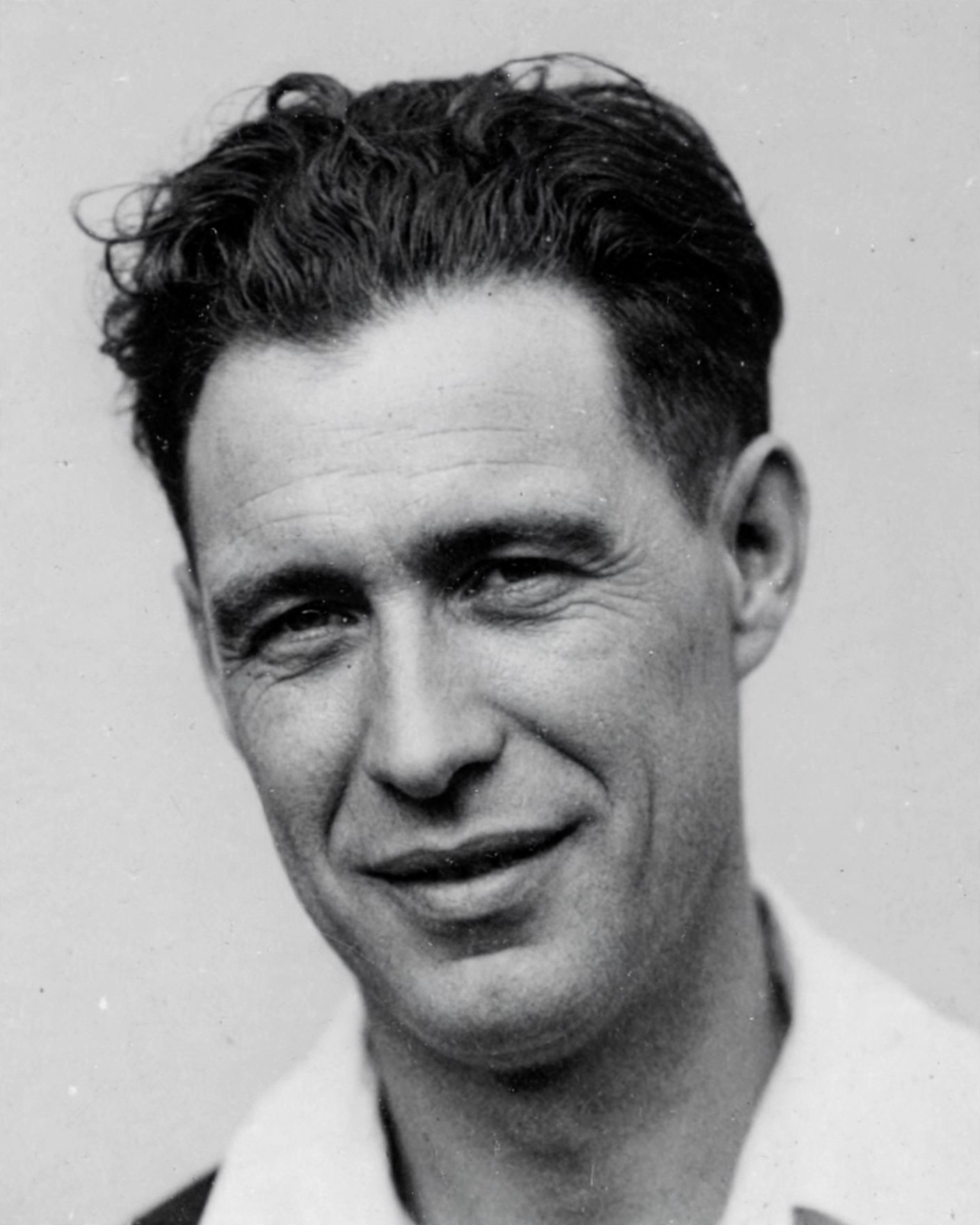
Then: what might he have looked like at 60 to 65?
Next, the models aged the Meta portrait. The prompt gave them only three facts: he was a heavy smoker, he spent a great deal of time working outdoors, and he was nearly bald by then. None of them saw the two real photos from that age, which were kept back for comparison.
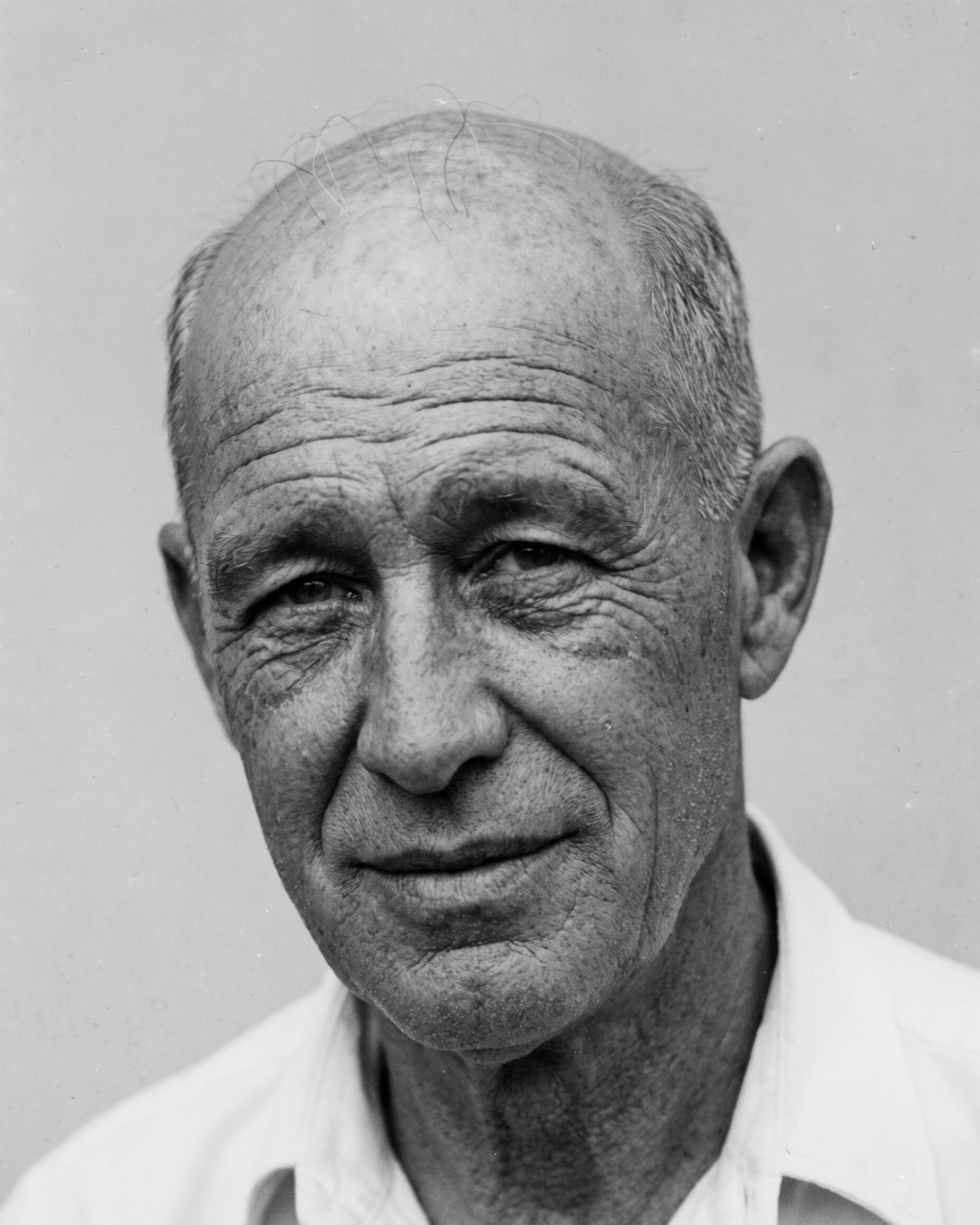
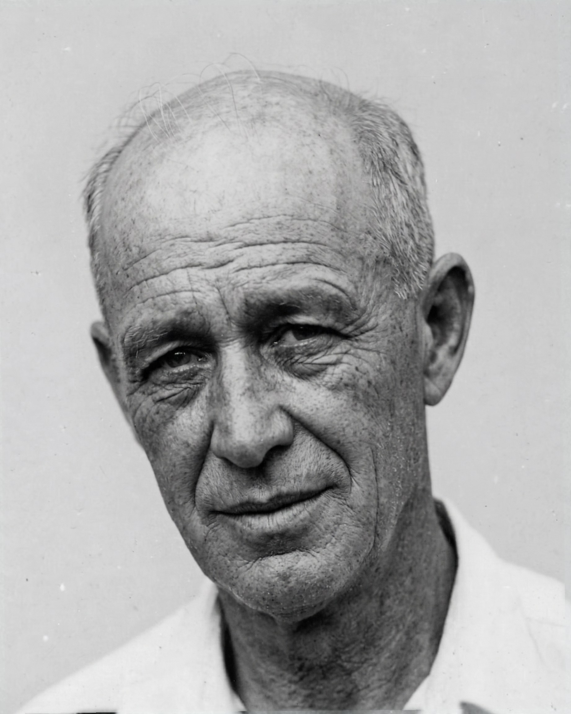
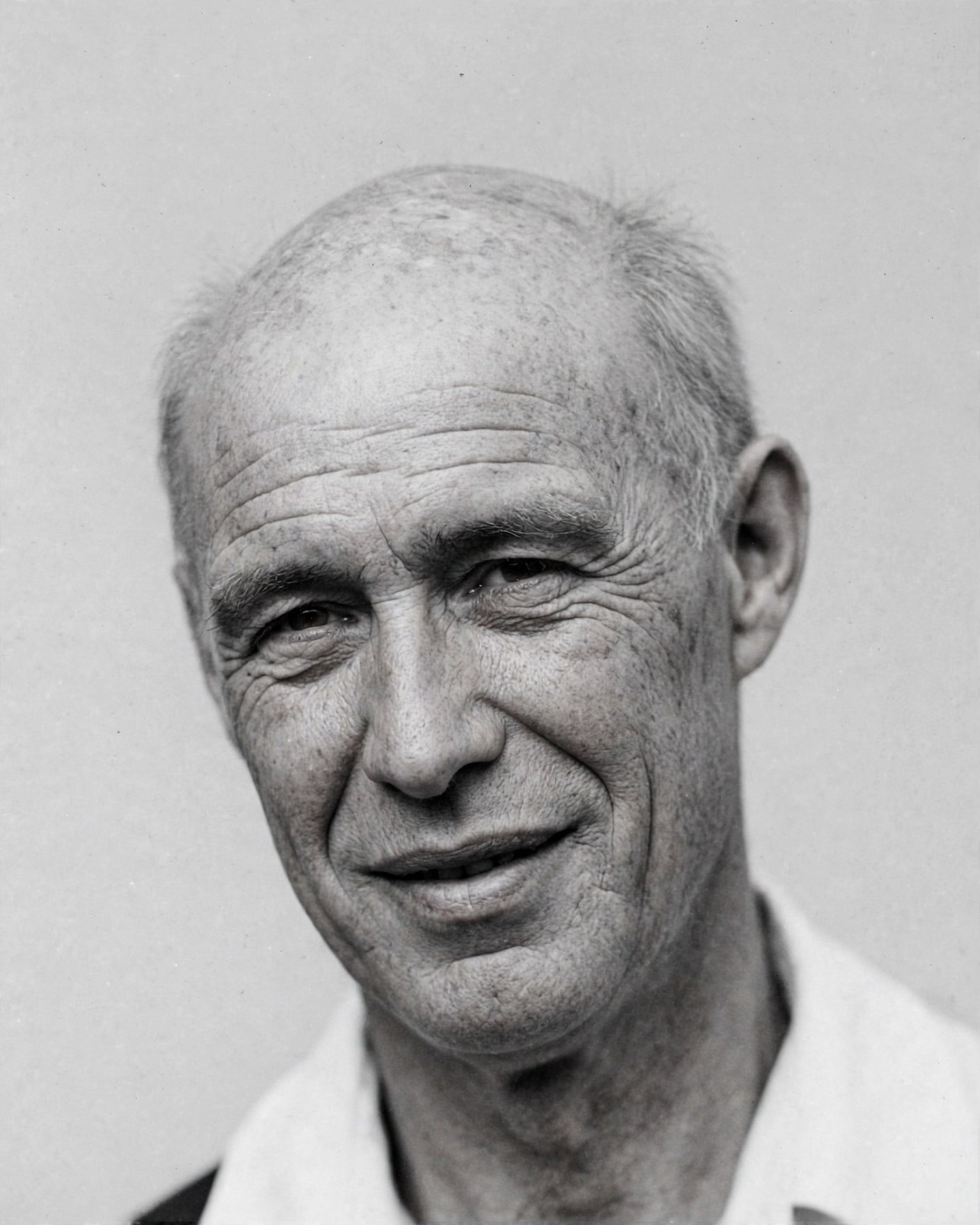
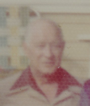
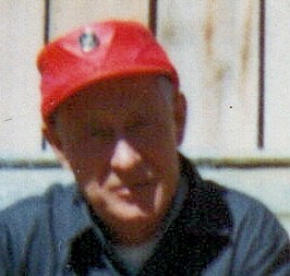
Look at the real snapshots first, then the guesses. Nano Banana Pro came closest: the same bald head, the long, lined face, and the ears. But none of the three is him, and seen without the real photos, any of them could pass for a genuine portrait. That is the risk.
Key points
- Pick the best evidence. More photos are not always better. Choose the sharpest ones, with the face large and turned toward the camera, and tell the model to trust those for fine detail and use the blurry ones only for overall shape.
- Say what to ignore. Anything that shows up in only one or two photos, like a cigarette, a hat, a squint, or a scratch, shouldn't end up in the portrait.
- Watch for a generic, handsome face. Models drift toward an idealized face. Meta's first try slicked his wavy hair back; one added sentence about the texture of his hair fixed it.
- Give the facts you know. Without "nearly bald" in the aging prompt, most models kept a full head of graying hair. The model can't know what only the family knows.
- Treat the result as a likeness, not a photograph. Label it as an AI interpretation and keep it with the original snapshots.
Try it yourself
Gather several photos of one person
Look for photos taken around the same age. Crop each one to the head and shoulders, and put the sharpest ones first.
Upload them all in one message
Click + beside the chat box and select all the photos at once. Some tools limit how many you can attach. Grok, for example, takes five.
Ask for one portrait that stays faithful to all of them
Show the full composite prompt
Composite promptThe attached photographs all show the same man, taken at different times, from different angles, and at very different levels of sharpness and quality. Create one new portrait photograph of him that stays as faithful as possible to how he looks across all of them. How to use the references: - Treat the sharpest, best-lit photos as the authority on fine detail: the shape of the eyes and eyelids, brows, nose, mouth, ears, hairline, and skin texture. - Use the blurry or low-quality photos only to confirm overall head shape, proportions, and features, never for fine detail. - Keep features that agree across most of the photos. Ignore anything that appears in only one or two: print damage, scratches, stains, hard shadows, motion blur, squinting, a cigarette, a hat, or an unusual head tilt. - Keep his apparent age as it appears in most of the photos. Keep his hair color, hairline, and the way he wears his hair as it appears in most of them. - Keep the natural texture of his hair, including its wave, curl, and volume, as most of the photos show. Do not slick it back, flatten it, or comb it smoother than it appears in them. The portrait: - Head and shoulders, facing the camera with his head turned very slightly, eyes looking at the camera. - A relaxed, natural expression with a slight closed-mouth smile, as seen in most of the photos. - A plain white open-collar shirt. - Soft, even, natural light, with no hard shadows across the face. - A plain, light gray background. - A black-and-white photograph with natural film grain, sharp and in focus, like a well-made portrait print from the same era as the references. Do not beautify, slim, de-age, or idealize him, and do not average him toward a generic handsome face. Keep any asymmetries, irregularities, and distinctive features the photos agree on. Do not add text, a frame, or a border.
Optional: age the portrait
Change the ages and the facts about his life to fit your own person. Use only things you actually know.
Show the full aging prompt
Aging promptThe attached portrait shows a man in his late 20s or early 30s. Show what this same man would most likely look like at age 60 to 65. He was a heavy smoker for most of his life and spent a great deal of time working outdoors in the sun and weather. Let that show the way it realistically would at that age: - Deep forehead lines, pronounced crow's feet, and deep lines from the nose to the corners of the mouth. - Fine vertical lines around the lips, and thinner lips. - Weathered, sun-damaged skin with a coarser texture, some age spots, and loss of firmness: some sagging along the jaw and under the chin, and bags under the eyes. - He is nearly bald: the top of his head is bald, with only a little thin, wispy hair left at the front if any, and a short fringe of gray hair remains around the sides and back of his head. Show the bare scalp with the same weathered, sun-damaged skin as his face, and the true shape of his skull. - Slightly heavier eyelids and a little more prominent ears and nose, as happens with age. He must remain clearly recognizable as the same person. Keep the bone structure of his face and skull, the shape and spacing of his eyes, the shape of his nose, mouth, chin, and ears, his eye color, and his expression, all as in the original. Age the man; do not replace him with a different older man. Keep everything else the same: the head-and-shoulders framing, his pose and slight head turn, the white open-collar shirt, the soft even light, the plain light gray background, and the black-and-white photographic look with natural film grain. Do not add a cigarette, glasses, a hat, a beard, or any other object or feature that isn't in the original. Do not caricature or exaggerate the aging; it should look like a real photograph of a real man of that age.
Wherever the photos don't show a feature, the model invents one, and it tends to drift toward a typical face. A realistic result makes that easy to forget. Label composites as AI interpretations and keep them with the original photos.
These results were made in November 2026, one try per model (Meta's portrait was run again with the hair sentence added). An earlier version of this experiment, from January 2026, is written up in AI, Plainly.
Things to keep in mind
Privacy
Photos you upload are sent to the company's servers. Avoid uploading anything containing personal documents, account numbers, or information about others they wouldn't want shared. Both tools have settings for whether your chats may be used to improve their products.
Accuracy
AI images can contain odd mistakes: extra fingers, garbled text, or details that weren't in the original. Look carefully before printing or sharing.
Honesty
When you share an AI-made or AI-restored image, it's good practice to say so, especially for restored family photos that others may treat as historical record.
Real people and brands
The tools may refuse requests for images of real, identifiable people, copyrighted characters, or company logos. That's by design.
Other image tools worth knowing
Beyond the big AI labs, many other companies offer image tools. These work in similar ways, each with its own strengths, free allowance, and paid plans.
| Tool | Best for | Pros | Cons |
|---|---|---|---|
| Free and easy | |||
| Canva | Flyers, cards, social posts | Free tier; image lands in an editable design; new design-focused model (October 2026) | About 20 free AI credits a month |
| Ideogram | Images with words: signs, posters, logos | Excellent lettering; free tier | Free images are public by default |
| Adobe Firefly | Images for business use | Trained on licensed content; free tier | Small free allowance; paid plans from about $10 a month |
| Leonardo AI | Characters, game art, style control | Generous free tier | More settings to learn; free images are public |
| For reference | |||
| Midjourney | Artistic, stylized images | Widely regarded as the most beautiful results | No free tier; from $10 a month |
| Topaz Labs | Enlarging and restoring existing photos | Preserves original detail better than chat tools | Not a generator; no free tier; about $150 to $400 a year |
Prices and free limits were checked in late October 2026. They change often, so check each provider's site before relying on them.